Context and Significance
Going into the midterm project, my work with my previous group inspired me to want to work with lights and buttons. To elaborate, while our work on the initial group project produced something interesting and potentially usable concept in the year 2119, I was excited to take the general concept further by creating something truly interactive with the help of a relatively simple and easy to comprehend interface for those who experience it. Our midterm project followed the definition for interaction I layed out previously in that it involved a back and forth exchange between the user and the product. One thing I wish we added before the final presentation was some sort of instruction explaining how the game functions, maybe in the form of text, or flashing the LEDs in a certain pattern to prompt the user to perform the intended actions. We came to understand by the end of the process that not everyone would be familiar with the game “Simon,” so was encountered some trouble as people began to press buttons without first learning what the objective was. The way we designed the game generally fit the model of others like it, except we made it larger so as to make it more presentable to a larger audience.
Conception and Design
Aside from our mistake in not including an effective prompting mechanism, we decided to make the project fairly simple, so as to not add any additional confusion in operating the game. We were considering adding different interactive elements like vibration sensors, or something to do with the user stepping on a sensor on the ground, but decided on a more simplistic approach for the sake of easier usability. For the same reason, we chose a design that would not clutter the space, or make it difficult for the user to intuitively understand what to do, or at least what would or would not be an option to engage with.
Fabrication and Production
After implementing our initial code for the game, we had a fair amount of tinkering to do. For example, we decided to extend the allotted wait time between button presses so as to not catch the user off guard, especially if they had just begun a new game for the first time. After user testing, we noticed those unfamiliar with the game’s concept would start pressing buttons during the somewhat drawn out intro of all three LEDs flashing simultaneously 5 times. For this reason, we chose to cut the number of times they flashed to three, and reducing the wait time between flashes. We learned that this decision worked to grab the user’s attention without necessarily prompting them to start pushing buttons before the game actually began.

Conclusions
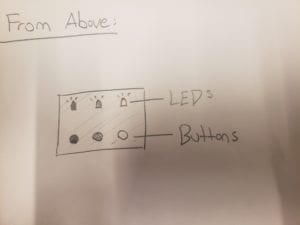
The main goal of our project was to create an interactive experience that would not alienate the user. While one may not know how to play the game “Simon” initially, we wanted to ensure that there would be little to no confusion about what in the project the user could, and could not engage with. By creating a large, plainly decorated box with three buttons, each parallel to corresponding LED lights, we noticed that. despite in some cases users’ initial difficulty understanding the goal of the game, people were rarely, if ever, confused by how to go about operating the device on a base level. As stated previously, despite the simple and easy to understand layout of the device, additional planning was necessary to effectively prompt the user to engage with the product as it was intended; in instances where the user did not understand the premise of the game itself, the intended usability collapsed to an extent.
Key takeaways from this project included:
- Prompting is a key aspect of a successful interactive experience. Even though our interface was presented without too many distractions and clean, users often had difficulty understanding the parameters of the game itself.
- Without proper directions and/or an obvious and clear prompting mechanism, people will use their own discretion in engaging with the project. For example, we decided to shorten the time of the simultaneously blinking LEDs because users would spring to mash buttons expecting some result, and will not wait for the project if they see no clear reason to do so.