When go in the Chronus exhibition, the first art work we saw is this one.
It is trying to prevent people from getting in. It will suddenly shaking when people pass by. I noticed that some of my friends were frightened by it and ran away when it suddenly moving. I think this interaction in more intense compare to some paintings I saw before. The painting can have an emotion interaction with people letting them feel the happy or sad of the artists, but is not as intense as this one to scare people away.


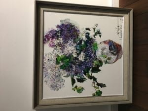 (This is the paintings I saw in the gallery next to the Chronus exhibition).
Comparing to the painting, the movement supported by technology makes the art work more interactive, and let the user have a stronger feeling of what the artist is expressing. The second artwork we saw is also very appealing.
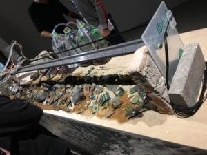
The machine is moving pouring liquid on the Arduino. Every time the liquid pouring in front of me, I can directly feel the destruction. The machine is destroying the Arduino in front of me, comparing to some statues I saw before, the movement of the art work really engaged me, making me feel the sense of loss. Also, along with the movement, I can hear the sound when the water hit the sand. The sound of the art work make it more interactive and strengthen the feeling of loss. Then I saw the third art work.
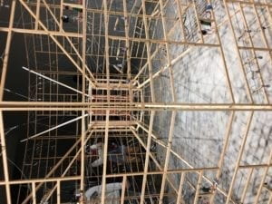
I noticed this one is using motor we used in class but create a completely new effect. Each movement created by the motor influence the movement of the other lines. The whole process is connected and continuous. Each movement having an influence on the whole project. Comparing with the statues and the paintings, this art work make me feel the process and it looked like each line is interacting with other line contributing to the whole project. It make me feel the strength is converting. The fourth art work is also really interesting, it shows our walk on the screen. Some of us even tried the dance movement, and it is really fun.
The fifth project is the rolling gear.
The movement become slower and slower, making me feel the obstruction and the time is floating. The movement of the gear let me having a direct feeling of the concept of slow. It let me feel the moving of the time which is great. The last art work is like a moving bridge.
It make me have the same feeling like the third art work(the motor one). Every movement is connected and interact with the other line. I have a stronger feeling of what is interaction here. It is like a back and forth movement, you do something, then other give you feedback, then you respond back, then the whole process(the interaction) happen again. In general, the technology-based art pieces creates movements that make great interaction with the audience and make me have a stronger feeling of what the artists trying to express. Compare to the non-technology based art work like the paintings and the statues, the technology-based art pieces have more interactions with the audience. Also, the technology-based art pieces not only use the visual effect but also the sound effect to intense the interaction.
One interactive project inspire me for my final project is a game named Little Nightmares. It is a game that the user control the character to run and move escaping from a cage. The first reason I think this is a good interactive project is because you have to respond to the movement of those monsters who are trying to catch you in the game. They may suddenly appear and trying to catch you. You have to make quick interaction which is to run away. Also, the interaction in a continuous process because for different scenarios in the game, there will be different monsters coming from different places creating different interaction to escape(to hide or to run). This make me fully engaged in this game and it is really fun because each time I have to think of a different solution to escape.
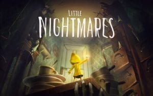
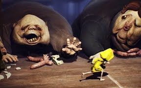 (to run)
 (to hide)
The second reason I like this game is when you playing the game, you need to think about the solution when you are playing. You need to change the solution base on the circumstance which I think is another good interaction with the player. Even two circumstance look similar, there are still differences you need to observe then change the solution. The third reason I like this game is besides the visual effect, the sound effect increase the excitement of the game. For some scenarios, you need to listen carefully because the monsters only make noises instead of showing up to warn you running. This make the game a multi-sensory interaction game which make the game more funny. The fourth reason I like the game is the thesis of the game. I really love the plot of the game. You escape from the monsters and finally you beat the strongest monster, then you become the strongest monster. In the beginning, you feel you are weak because you can only hide and run. Then by beating some monsters, you feel you are growing and become stronger. Then at the end, when you beat the monster, you are standing on the top of the stage and those monsters who you once afraid of are afraid of you. I feel a sense of growing through each level of the game which I feel it is like an emotional interaction the play convey. This is why I like this game.
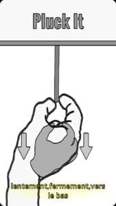
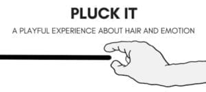
Another interactive project inspire me for my final project is the pluck it. It is letting the users explore different ways to pluck the lines. For each stage, how to pluck the line is different. When you touch the line, the line will shake. Every time, you need to think of different way to pluck the line down. Also, the game trained players’ observation skill and improve our creativity to explore different solutions. Plucking the line is like solving a problem in daily life. From playing the game, the player is actually training their mind and have educational meaning which I think is great for a game.
The project I think less interactive is an interactive webpage. It is the Dutch strategic design and development studio Bolden’s website. The webpage looks like this at first.
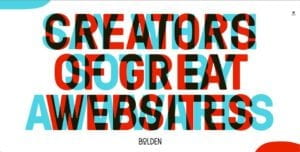
Then if the viewer’s mouse move to the corner of the page they can see the messages properly.

I think this is a bad interactive webpage because it make its users confuse by what the webpage is trying to convey. If they move the mouse, they will never know what is the meaning of this webpage and the designer’s idea will never known by his customers. Although it contains interaction but the interaction don’t support the conveying of the thesis. The interaction make the thesis of the project confusing rather than help the users better know the thesis and that’s why I think it is a bad interactive project.
The definition I gave in group project is: Interaction is an action (communication, emotion express, feeling changing) with mental thinking which people make while can using inanimate objects, computer, technology or media to support emotion expressing then have self-reaction or emotion changing on themselves after this action. Basing on the definition and the research, the first character I think a successful interaction project should have is the interaction should be a continuous process. During this process, the interaction should be appealing enough for the user to make further interaction with the project but not stop in one loop of interaction. The interaction giving from the project needs to attract the user to do more interaction with the project. So a successful interaction project can let the user keep giving back interaction and willing to engage in the project. The second character I think a successful interaction project should have is multiple sensing interaction. The interaction should not only be visual interaction but can also be sound interaction, like the sound effect warning the players in the game Little Nightmare. The third character I think a successful project should have is a clear concept and the concept need some informative meaning. Seeing the webpage interaction, I learned that a clear thesis is very important and the interaction is to support the convey of the thesis. Learning from the game Pluck Me, I learned that a game can have educational concept throughout the whole game. Besides engaging the players in the game, they are also improving their observation skill and problem solving skill. So I think a successful project should have an interaction supporting concept and the concept needs to be clear and informative helping the users learn something when using your project.
References:
1.“Bad Design vs. Good Design: 5 Examples We Can Learn From.” Interaction Design Foundation, https://www.interaction-design.org/literature/article/bad-design-vs-good-design-5-examples-we-can-learn-frombad-design-vs-good-design-5-examples-we-can-learn-from-130706.
2.“Little Nightmares.” Wikipedia, https://en.wikipedia.org/wiki/Little_Nightmares.
3.“Pluck It.” Feeling Game Company, https://www.feelinggamecompany.com/pluck-it.
4.The Art of Interactive Design, Crawford