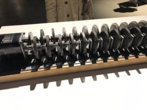
I can’t say that the Chronus exhibition was my favorite art exhibition, but I did like certain aspects of it. It’s interesting because normally when you go to other non-technology based art work exhibits, the artwork is protected by some barrier, but at this exhibit, you could move as closely to the project as you wanted. Since I could see all of the gears moving and have a 3d experience, I felt more connected with the art pieces. The one that left an impression on me and was the most engaging was Beholding the Big Bang because the gear-design was so simple, but it had a great meaning. While I was looking at the gears move, I felt like I was looking into the future because the last gear would not turn for another 13.82 billion years.

—-
I have found some great interactive art works that can serve as inspiration for the final project! The first one is a project called The Wishing Wall. The idea behind this project is: people can put their wishes and hopes into the atmosphere and watch an animated version of butterflies move around the wall. People so often are quick to put other peoples’ ideas down and tell them why a dream won’t work, but imagine if you could gain confidence from seeing your dreams turn to butterflies. This is a great interactive experience, because not only is it simple to understand, but each user can leave motivated after interacting with the piece. On a side note, this is the first interactive project I have seen this semester that has changed my perspective on coding and putting art together. It was really interesting to see how the authors took an abstract idea like dreams and used coding to manifest the project.
Another project/person that has given me inspiration for the final project is Zach Lieberman’s Play the World. I watched his interview before I read about his project and it was cool to see him in my city, New York, walking around to different stores trying to find different materials to use. It first of all showed me how easy it can be to create one of these projects by yourself, but it also reminded me that a successful interactive art piece is not just about coding, but should also be carefully designed. And, the Play the World project is one that invites people to press different keys on the piano and the device can somehow match the note with a real time sound from radio stations around the world—- how cool! So, if you play middle C key, for example, this could play a matching C note from a Nigerian sports radio. I love this project as well because, again, everyone knows what to do when they see a piano so the project is self-explanatory and the project shows people that the fabrics of the world are more interconnected than we think.
One project that did not have a successful interactive experience was Interactive Mario Mushroom Block. The design of this project is nice because it looks animated and is simple, but I would not know what to do if I saw the box. In addition, while this is an interaction piece, it doesn’t seem like there would be a significant meaning behind lifting a box and seeing a mushroom come out.
A successful interactive experience is a combination of everything we talked about above: it is simple to understand, is engaging, and somehow leaves the user with something to think about afterwards. This semester, I have referenced Tigoe’s reading a lot, because his idea is what creators should strive for in an interactive art piece: “Set the stage, Then Shut Up and Listen.” The word “listen” is important as well, because a great interactive piece is one that incorporates user’s feedback. Izzy and I in our midterm project tried to incorporate all of the aspects listed. For example, we disguised our button in a flashy price tag because we wanted people to understand that obsession with prices is what fuels this unhealthy consumer culture. In addition, we did our best to design the project in a way that people understood it looked like a human, but also had to think about why we used plastic bags for the lungs and a toy box case for the heart.