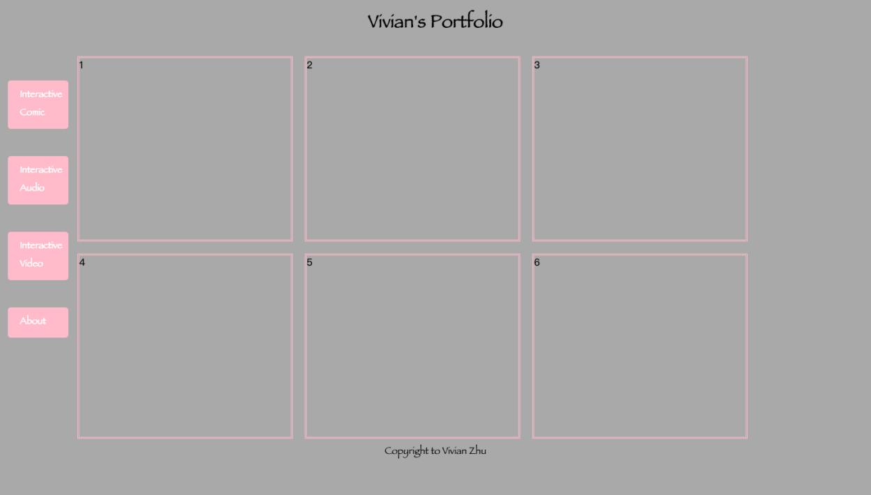
Here is a screenshot of my portfolio site, with the link to my site. Most of the work is done by referring to the lecture slides, as well as the W3school instructions. Just for fun, I changed the navigation part into button-like boxes, instead of hyperlinks that many other classmates may use. I may add the link towards them in order to add some interactivity. One of the two biggest challenges I ran into may be the margin between the blocks. Initially all the blocks are stick to one another, making the whole website really noisy. Yet when I tried to manipulate the “margin” as well as the “width” variables in defining my blocks, I found that’s exactly where the problem came from.
Another challenge is somehow I couldn’t let the navigation bar be in a line with the six boxes. In other words, they are in separate lines. I finally solved this problem as I changed the “justify-content: center” to “justify-content: flex-start”, without a hint of why. I will ask professor/TA about it next week.