http://imanas.shanghai.nyu.edu/~zc1151/commLab/VideoProject/index.html
This is the link to our interactive video website. In this project, I worked with Angel, Lily, and Kat.
I have to confess that group work is a lot more frustrating than partners work, and our cooperation is not that enjoyable from the beginning. We changed our ideas for the project a couple of times, for the reason that it was hard for us to get together and discuss. I’ve been trying to push forward a meetup, but there were always one or two of us missing, without notifying us. We had our basic idea during a discussion in class, but it was very vague and a lot of the detail storylines were missing. I discussed with Angel about it later during one class, when Kat and Lily were missing, and we settled some plots of our story. I drafted a transcript for our shooting and shared it with our group mates, but did not get much feedback. I also did the storyboard since only me and Angel were familiar with our later idea about the story. It was not until we started shooting the video did I realize that Kat and Lily were not very familiar with our idea. We invited some of our friends to be the actresses, and four of us were all there working on the shooting. The shooting was actually an efficient process since our actresses were very talented and gave us many solid suggestions. It was also the most enjoyable part since all four of us participated in it.
As for the video editing, we had four scenes and four people, so each one of us chose a scene to edit. Angel was the most devoted person in editing the videos tho, and only me and she managed to finish our parts before the presentation for rough cuts. Angel also made great efforts in searching for suitable music for our clips, although we eventually decided to use different parts from the same music for the background music for all of the clips, which is suggested by Kat. It was hard since all of us use different video editing tools, and the settings are not consistent. I used Premier for my part and played around with the special effects and editing functions it offers. However, since I am busy building the entire webpage, I could not do much about other clips except for putting all of them into Premier and re-export them, so that I would get the ideal file size for displaying on the webpage. For the four scenes, Angel did the editing for the first one (Monday’s diary), I did the second scene (Tuesday’s diary), Kat did the third one (Wednesday’s) and Lily did the last one (Thursday’s). Angel also helped with me with adding music to my part.
For the webpage, I built it entirely on my own. For our initial work distribution, Kat was suggesting that she could help part of the coding work. But she was not available for the whole weekends, which is the time I worked on most part of it. I found it really inefficient to discuss on WeChat, where nothing could be done except for bringing up more confusions and misunderstandings. Therefore I decided to work as much as I can by myself. To my frustration, when I explained what I did for the webpage to my groupmates, they were not that responsive, and Kat questioned many of the ideas without offering valuable help or suggestions on the work. We finally come to an agreement after discussing more after class, and I continued my work on finishing up the webpage.
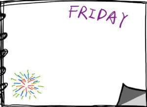
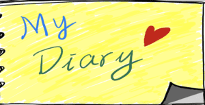
For the website content, I decided to mimic the context of a “diary book”, and embedded the video clips as scenes in lines of texts. I drew the background pictures on an IPad, intentionally making it seems girlish so as to fit in with our story setting.
These are my drawings.
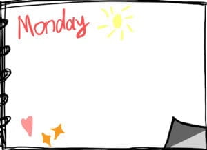
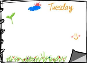
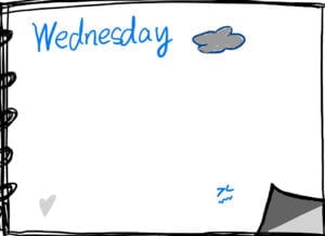
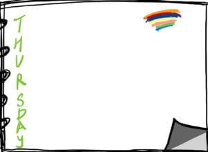

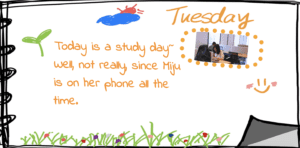
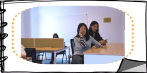
I also chose a font family that seems more like handwritten. For the background pictures, I originally drew them smaller, which did not make much sense since the page turning effect I used only functions in the corner of the webpage, which is separate from the diary book corner. Professor Ann suggested me to enlarge the page to make the two corners meet. In addition, I originally put the video clip on one single page above the diary book, which seems a bit off the context, and Ann challenged me to think of another way to display the video. Therefore I later made it smaller as a picture you can stick on your diary book, and added some colorful frames to them. The videos would not be played until the users click on it. To suggest how this effect works, I wrote another function to make the frames of the videos blinking when not being enlarged, and thus the users would intuitively try clicking on them to explore the effect. The blinking stops when the videos are enlarged and began to play. The two screenshots below are the display of the webpage before and after the users click on the video.
And the front page looks like this.
For the coding, I studied and made use of the turn.js library(jquery) myself, for its effect of flipping pages. I also learned from the class notes of the functions to resize the videos for better displaying. Although the code file seems to be quite long, a lot of the functions are similar, because they are just for different content on different pages. It was time-consuming to decide for and adjust the layout though, which took me lots of time. I also used the rotating CSS variable for the first time, making the look of the contents more cute and stylish, making the webpage more obvious as a diary book.
I ran into some problems when displaying the videos, as some clips just do not show up on the website. Dave helped me look into it and suggested that it was because the files were too large. I re-exported them by Premier and it worked. Also for the flickering effect of the frames, I originally set the frames to be none during the small time period that they disappear, and this turned out to move the positions of the videos, for the frames themselves take up places. So I figured it is more efficient if I just set the color to be white.
I am not as satisfied with this project as with my previous ones. I originally wanted to focus more on the videos, exploring how different variables such as the exposure, paces, colors, and background music can do to video contents, making the same content into different genres. But this idea was denied by Kat and we were not able to do it. Moreover, I would expect our edits of the videos to be more delicate, tuning the lights and the fadings. But I really can’t decide for others’ choice, and do not have enough time to polish all the video clips while writing the website. It seems like we did not have an efficient division of our work in the beginning, but it was really hard since we were all quite busy, and people are not responsive to meet up. For most of the time, it was just me and Angel to meet and decide for the detail settings. This is a potential problem since Kat is always offering new ideas when we’ve already finished up most of the works, but before, when we were actually working on it, she was either not available or missing. She always shows up on WeChat to ask about the progress, but it was really hard to explain and display everything on WeChat, and even harder for decision making. I feel like I am personally more familiar with webpage and coding, and were determined to challenge myself more with video shooting and editing. I did learn much from the process, but I would certainly find it more meaningful if I can have more time exploring this field instead of working on the website.