Link: http://imanas.shanghai.nyu.edu/~yh2330/week02_project1/my_portfolio.html
When making the final HTML/CSS website, I solved a lot of questions that I encountered and added more color, type and some layouts on the page. I also added the link to the “about me” page that we made in week 1 so that it looks more like a personal website.
I first write the basic size and position of the navigation box and the content box. I keep the navigation box in a fixed position with the flex-direction: column. But I change the left margin and the height with the percentage. This will enable the navigation box to move proportionately if users stretch the window and it will be easier when making future adjustments. I justified all the content and items in the center and align them with space-between.
For the content box, I did mostly the same. When writing the flex direction, I searched the tutorial and found a simpler way to combine wrap and direction, which is flex-flow, so I improved this part of my code. On Monday, I found some problems when setting the padding and the margin. I tried several times in the example code we wrote in the class and finally got it correct. After the Monday class, I found an important part that I missed, which is the first html{ } part that defines the initial height to be 100%. With this initial height defined, the following height can be calculated from this initial value. Then I fixed the problem that I didn’t remove the default margin which causes some misplacing in the “boxes”.
I also solved the problem of the footer. Originally, the footer I made is a fixed box that will roll with the page. Then I added the margin-bottom and the bottom value and define the position as relative. Finally, the footer can be placed at the bottom of the page no matter how the user rolls the page.
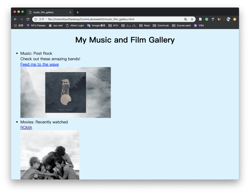
In Monday’s exercise, I changed the color and the font type of the boxes and texts. I also tried different styles of the border, for example, dotted, to make it more suitable to my web page. For the final portfolio, I found the background image function so I searched in the tutorial and figured out how to upload an image as a background and how to adjust its size or place. I couldn’t find a way to adjust the image’s transparency in the CSS so I just use photoshop to edit the picture first and then upload the image. I decided to combine the “about me” web page with this portfolio so I change the title of the items and add one link of the “Music & Film Gallery” which will link to a similar page that I made in week 1. In this way, I can enrich this personal website and add more pictures, videos or links to the page in the future.
The screenshots of my website are the following:
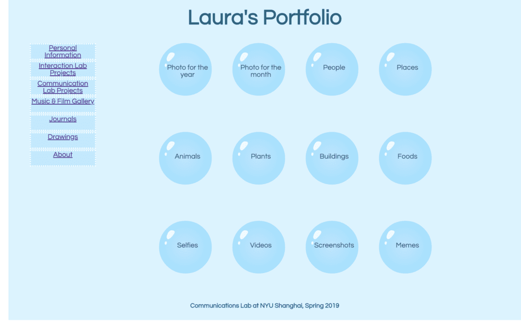
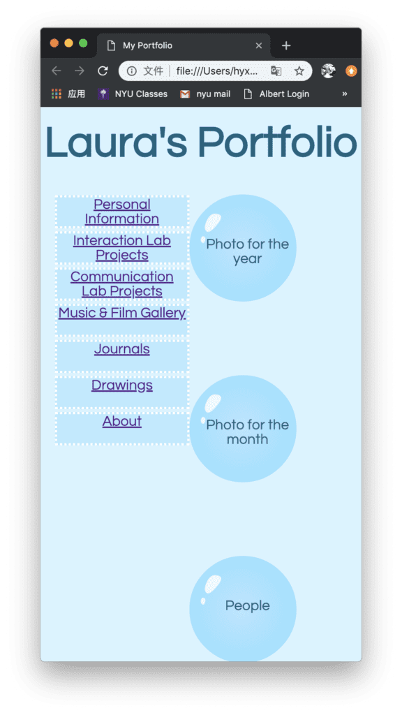
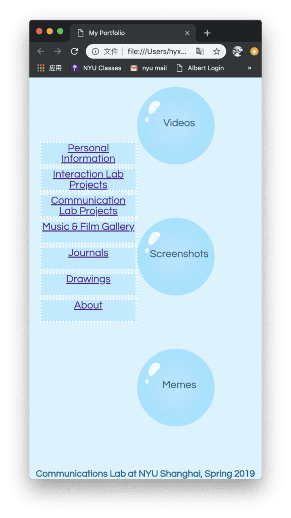
A new small problem I come up with is that the navigation box and the content box may overlap if I shrink the window smaller than a certain amount.
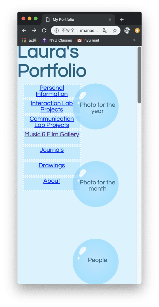
I tried to add the margin of the navigation box and the content box, but it doesn’t work. Then I tried to change the position type of the two boxes but when I use the “fix” position, the content container couldn’t stay in the center of the whole page according to the size of the window. I also tried to change the padding of the content box and navigation box but they still overlap. I may still work on this problem in future improvement.