Link: http://imanas.shanghai.nyu.edu/~ys3041/final/index.html
Partner: Susie
Description:
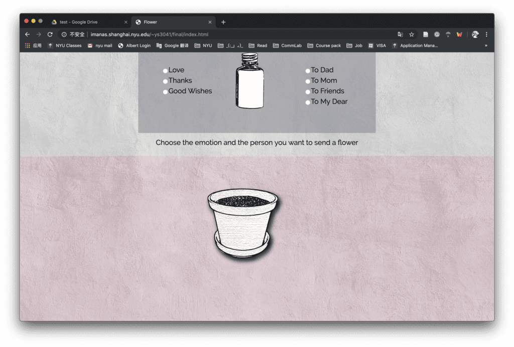
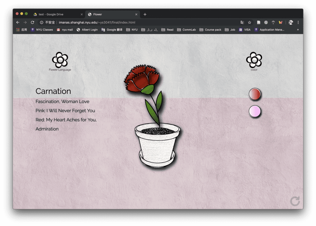
Our project is a website which the user can generate a unique flower by choosing the emotion and the specific person they want to send to. They will choose by clicking the checkbox and follow the instructions of clicking the bottle. After the flower is generated, they can open the color choices or check the meaning of the flower, or refresh to create the flower again.
Process:
We came with this idea because we want to create something related to flower and color and customizing your own flower by adding the emotions and filling the colors seems feasible. I was responsible for all the visual parts and helped Susie with the code. At first, we want to make the color filling on every petal and small parts so that each flower can be different and unique. I first did some research on the p5 drawing and found some functions like curvevertex. I tried to load the original image first and draw the stroke based on those images. However, since we related flowers with their specific meanings, the flowers have to be more distinct and based on some real-world models. In this case, the curvevertex may not achieve this goal as it requires a lot of work on recording the points on each petal if we want to make it more natural and delicate. I also tried Bézier Curves but it can only draw ellipse-based curve which might not imitate the flower naturally and successfully.
Therefore, we choose to draw the flowers in the illustrator which is also easier to make adjustment in the later stages. I added different layout and exported all the combination of colors and flower petals for preparation.
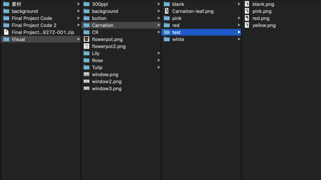
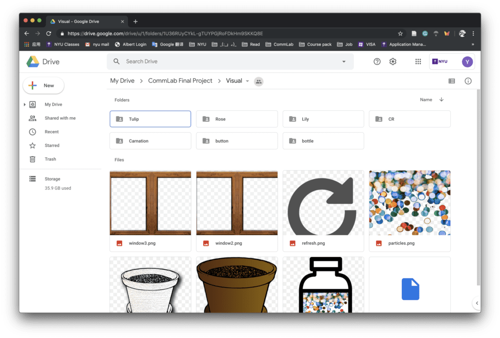
While I was painting in the Illustrator, I explored some different brushes and ways to stylize the images. Inspired by the professor, I also found ways to make the picture less stiff and bored, we can totally add some artistic effects and details intentionally to make it more vivid. So the final design of the flower is more hand-painting and comic style. I also add the shadow effect to all the elements to make them more solid after we change the original background-selecting idea and use textures as the background.
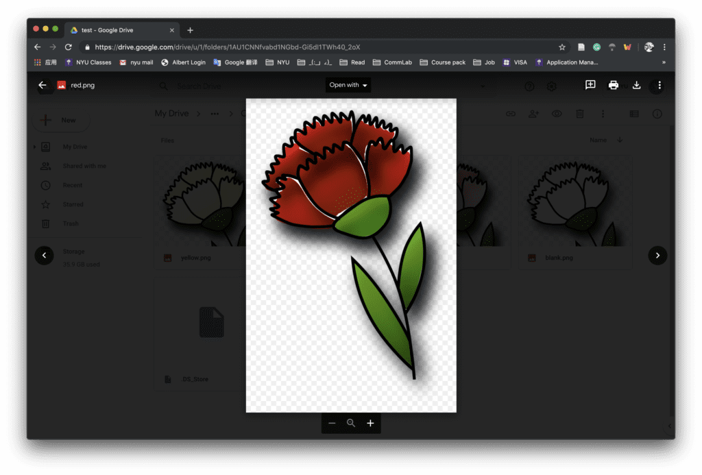
When we come to the coding part, we met some problems deciding the way of filling the color. One problem is that we can’t confirm the position of each petal to constitute a complete flower. Although we tried different positions and divs, they didn’t work very well. Due to time limitation, we decided to change the whole color of the flower instead which will be more stable for the project.
As for the layouts, at first, we want to place the flower pot on the window sill and change the outside view through mouse scrolling right and left. After I draw the images of the flowerpot and put all the design into the webpage, we found the background is a little bit distracting to the whole visual experience, which is also suggested by the professor that it’s better to eliminate the elements and only emphasize one point at a time. Since we already two functions of choosing the color and flower language, changing the background is indeed difficult to match the whole style and design. So we move the background selecting part and only focus on the main object of flower and two functions.
When writing our code to realize the function of select one emotion and one person to generate the corresponding flower, we spent a lot of time struggle with the value that we get from the checkbox, which later turns to be more efficient using the array and the radio checkbox. The rotation of the bottle is realized by the keyframe function in CSS and I also added the hover effect to the selection button to signal the user to click them.
The final version of the project is shown below:
Reflections:
We make many adjustments in our process of this project but we also explore much on different ideas, layout designs, and coding.
We also received a lot of feedback for future improvements. For the design of the website, a good and important suggestion is the choices of texture. Although we explore different styles and backgrounds for several times, there is still some inconsistency in the texture, which is a direct effect on the user’s visual experience. We may want to change the style of the two buttons related to color and flower language to make them more coherent.
Other improvements may be a further development on the interaction. The choosing color part, as we wrote in the proposal, can be further developed into the palette and enable the user to select more patterns. We may also want to add the share choice at the end or just add the screenshot hint.
Overall, Susie and I made a lot of effort on the project and we’re happy to finish it within a limited time. We’ll still work on the suggestions and explore more approaches and possibilities of this project.
Credits:
Background image and bottle references:
https://unsplash.com/photos/P8XV99FyzCk
https://pixabay.com/vectors/bottle-jar-pills-medicine-954645/