My portfolio

SO this is how it looks like.
Throughout the whole process, I have tried looking up at the w3school, and this site is really helpful that I literally learn everything.
For the heading, I use a liner-gradient image as my background. Initially, I found that the picture couldn’t appear even though I saved my documents and refreshed it for times. It turned out that if you want to insert an image in css, that image must be in the css forlder.
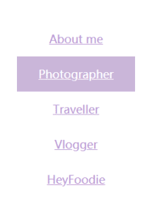
For the navigation part, I used display:block and hover to make it look that this.

For the content, I made it somewhat looks like the layout of instagram. However, I encountered a problem which is the text-align, I couldn’t make my words next to the little heart, which remains a great trouble.

Generally, my portfolio page seems to be merely good, I would like to improve it somehow when those problems are answered. I will try to learn from the w3school more to learn some advanced skills.
Hi, Selina!
Could you provide the link of the portfolio website? I didn’t see it in your blog post.