Project title: Grey Net – Invisible Chaos
Partner: Daisy Chen
Instructor: Moon
Here is the link to our final project:
https://imanas.shanghai.nyu.edu/~yc2966/Grey/index.html
Description:
For this project, I and Daisy try to focus on the topic of the internet itself. Due to the fast rise of the internet before the regulations are ready in the past few years, the issue of “internet safety” and “internet morality” become increasingly heating to be discussed. Therefore, like what our project is called as the “Grey Net”, we try to use the concept of “grey zone” to indicate the “invisible chaos” and potential threats on the internet. This project is mainly aimed to raise people’s awareness to think of internet safety and morality. As a result, we may develop the environment of the internet and related fields in a healthier way.
Process:
Researches
Before we start, we first did plenty of researches about internet safety issues on the internet, and we mainly sorted them into three topics: data breach (personal information issue), cyberbullying and also computer virus. We leveled the cases by its number of people get influenced or the financial problems it resulted and selected the ten top cases to write a summarized paragraph for each year from 2013 to 2018. However, in the end, due to our time and labor limitation, we only choose two from ten of each year to show in our project.
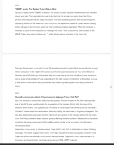
Researches we did
Concept and Form Changes
At the beginning of our final project proposal, we intended to make a game that let the user play with the harmful issues on the internet. However, along with the progress of our researches and setting up of project, we finally settled down the format of our project as an interactive digital museum. The cases would be “stored” in the floating bubbles and drift by the users, which is imitating the data flow on the internet as well as the process of linking to the internet (surfing the net). And each time when the user is attempting to approach a bubble, the information is stored (the case) would show up on a “big screen”, which represents for the computer screen.
Besides, with the suggestion from professor Moon, we decided to use the 3D environment to display this project.
Development
As we are facing a brand new coding field, which is related to the 3D environment and not an easy task for both of us, we collaborate on the coding almost like half and a half for each of us. We tried to learn several 3D-environment libraries, like A-frame, three.js…But eventually, we went back to WebGL on p5.
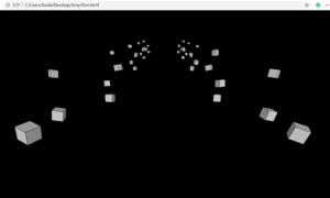
The biggest problem for us at first is to generate a series of 3D containers, for example, boxes to move from distant location towards the computer screen. To reach this purpose, we need to know the usage of “class”. Thanks for Moon’s help, we sit down and learn from the beginning of WebGL and class to generate the array for hours. This is probably one of the most helpful and interesting things I have learned from this project.
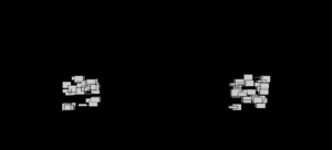
learn how to generate box and the 3D environment in p5 (1)
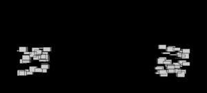
learn how to generate box and the 3D environment in p5 (2)
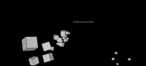
Then we keep working on adjusting the angle of view, also I added the gentle rotation of it to make the floating object more elegant. During this stage, we use the x position of the mouse to control the angle of view and mouse click to move forward, but soon we discard it for it’s in comfortable and not able to come back.
Change the rotation angle and number of boxes
Change the angle of the camera view
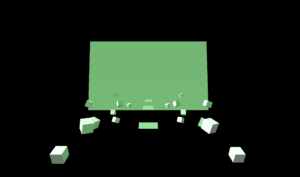
Later on, we settled down the location of the screen plane and years, also did experiments with the lights and textures.
Experimented with light & added the year planes
Experimented with texture
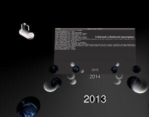
The version presented in class
As for the version we presented in class, it’s almost the final one that could interact with the viewers by key up to go forward and key down for backward; space for pause and mouse hover for content explore. We did most of the textures in PS by ourselves that have a shining effect. As it is difficult to get the exact location of an object in the 3D environment, I tried to get the current year’s Z position and then detect the x, y position of the mouse to create the hover effect that shows the labels of the bubble as well as changing to the corresponding content on the center screen.
From the user test in class presentation and the feedback, we got many helpful suggestions from professor Ann and Leon as well as other students:
1. Discard the spotlight models which are not consistent with the general style.
2. Adjust the location of the instruction that is overlapped with the content screen.
3. Add the source credits.
4. Probably need to change the texture of bubbles to make it more clear to see.
…
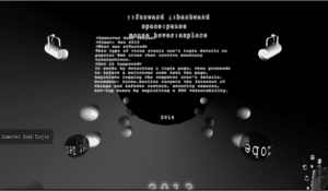
Final Version
Therefore, from the suggestions mentioned above, we adjusted the design and get the final version as following:
Index page:
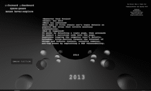
Hex background represents the internet connection; light to explore the internet that indicates the way we explore the internet; the random little squares make up the title, which is a metaphor of the way that data carries the information on the internet.
index page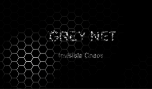
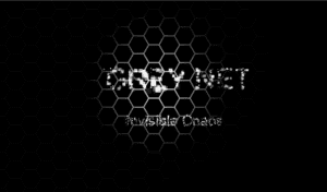
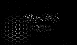
After the adjustment, we deleted the two spotlight models and put the instruction on the left top corner. Also, we add the name and sources credits on the right top corner for this page.
content page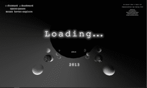
Coding record
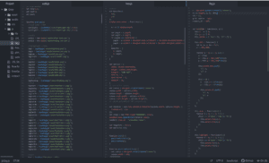
Overview of all js files
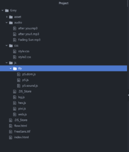
Overview of all files
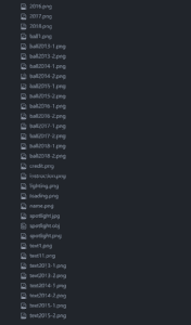
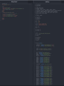
Overview of all textures & loading
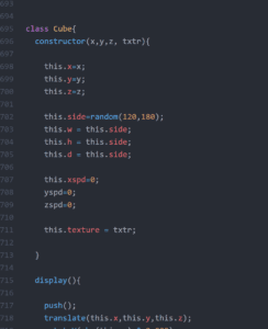
Learn to use the class to create cubes
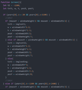
The screen changes content according to the different location of the current year
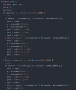
The labels appear according to the different location
Problems Met & New THings learned
- local server: as p5 libraries require the API, it needs to create a local server to run the page. Thanks for Cindy’s help, we installed Python and find the way to create it in Windows.
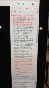
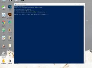
2. Basics of WebGL: it’s my first time to encounter with the 3D environment on the web. Though suffered when learning the new thing, it’s really interesting to explore this new area.
3. Usage of class: it’s extremely useful to learn how to use the class to create pre-formatted objects and store them in the array.
Further Improvement
Like the feedbacks and suggestions we got in the in-class presentation, we’d like to add more cases we found to the bubbles to make this project become more strong and persuasive. Besides, the design of light and textures of bubbles also need to be improved to be easier to recognize. And probably some hints for movement instructions instead of pure text would be better Also, the hover effect, if we could truly detect the position of each bubble, then the hover effect could be more interactive and accurate.
Anyway, I really appreciate the process of working on this project, thanks to my partner Daisy and professor Moon, we finally come out with this lovely outcome. I really love it!
Sources Credit
Songs:
Fading Sun & After you
Cases:
https://www.identityforce.com/blog/2018-data-breaches
https://en.wikipedia.org/wiki/Computer_virus
https://zh.wikipedia.org/wiki/%E7%94%B5%E8%84%91%E7%8A%AF%E7%BD%AA
