For this project, I worked with Tenielle and Susie, a three person team.
The first step was to brainstorm an idea, and we were inspired by the idea of a timeline, and the idea of houses was our interest, and so that became our thesis: a timeline of different era/country houses.
Tenielle first did research to make sure the information was accessible. The research portion wasn’t hard, as all we needed were to get pictures and read up a little bit on what materials were required for the houses, and flags and descriptions for each of them.
After research, the only thing left was to do the coding, which wasn’t especially hard but was time-consuming. Susie drew a couple of stick figures to use for the project, but only a few were used because of time-constraints.
We ended up with two css files, two html files, and two javascript files, one of each for two sections of the project.
Part 1:
The first part mainly consists of HTML and CSS, only a wee bit of Javascript to create a smoother transition into the next page. We wanted a cool title screen, so we made a nice fade-in title with a button to transition into the next page.
I started off writing the code for the fading in:
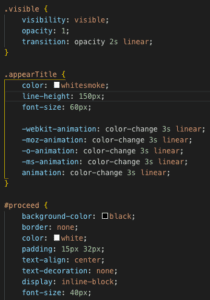
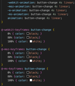
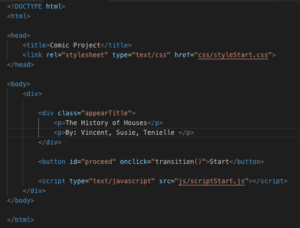
And then some quick javascript for the transitioning to be smoother:
Part 2:
The actual part of the project was split into three parts: flex-box, picture hover, and image follow mouse.
Flex-box:
This was the most frustrating of all the code, as flexbox isn’t easy and having to figure out how to layer pictures on top of each other also took a couple of fellows to help out, but in the end we got it to work.
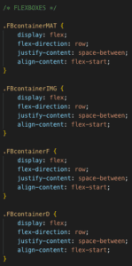
Picture hover:
This was the part where I am pretty proud of myself, especially understanding the logic and writing the functions myself. I didn’t look anything up or ask for any help, just a couple tries and I got the coding down.
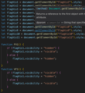


The basic logic is using the style “visibility” and if else statements. If hover, then visibility hidden/visible. Now that I think about it, it actually isn’t hard to do, but I feel pretty proud because I figured it out on my own.
Image Follow Mouse:
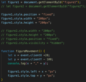
I had trouble on this part mainly, and it was a dumb problem because all it was was me using firefox instead of chrome. I had wanted to use something similar to visibility for the cursor so that the image would change on a hover, but I ended up running out of time because of other projects and wasn’t able to implement that part.

![]()
Results:
Conclusion:
After the presentations, I realized how different our project was from others, and I had completely missed the “comic” part of the project, and I feel sad because I actually had other ideas for the project but ended up not doing them because I was working with a different perspective in mind. Although the coding isn’t much, I felt that I really learned a lot throughout the process of the project, and I am happy with what came out of it.
Another thing I learned was to look more openly, not to stay tunnel-visioned on doing a timeline, because I think that was what made our project not comical.
Overall, I had a great time working on the project, though it was tiring, I learned a lot and it was great to be able to work so freely on a project.