Link: http://imanas.shanghai.nyu.edu/~zy1193/project4/project4.html
Description: In the project “Food Map of China”, Angel and I decided to create a map of China with 5 different well-known foods from 5 different provinces. Our goal is for the audience to be able to move around on the map of China freely and then learn more about the food and the cultures of each place. Since we both love traveling, we see that food is a huge aspect when choosing where to go.
Process: We decide that we want to draw everything by ourselves so I worked on the drawings whilst Angel started the coding page of the map and then the page for the food. We then recorded the sounds of that food together. For instance, with the hotpot, we recorded the sound of the water boiling and for the lamb skewer, we recorded the sound of the oil on high heat. We find that a little bit challenging because the sounds were not loud enough through the microphone. Therefore, we also use other techniques. For instance, the sound of the oil was not loud enough so we added water to the oil and that increases the sound a lot. Later on, I went into audacity and edit those sounds. One of the most significant edits was on the amplifier so that the sound can be at its maximum level. After having all the images and the sounds, Angel sent me the codes that were used on the page. Then basing on her codes, I created the other 4 pages.
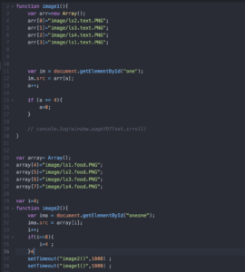
Challenges: The codes were challenging. We have an image in our minds since the beginning of the project and we want to stick to it. For instance, creating a map that the user can navigate themselves was something that needed a lot of research. Other challenging codes were the curtain function when we transitioned from one page to the other. A lot of those codes were trial and errors. We really went beyond what was taught in class in order to get our ideal project.
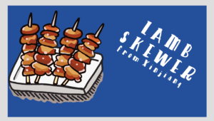
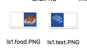
However, there are a lot of things that we could improve on. For instance, we couldn’t find a code that would divide the image into half and then the curtain effect would apply. So what we did was cropping the image manually and then naming the 2 parts differently. Then we set one side to be the text whilst the other to be the image of the food. This was really confusing at first since the order was not what I expected. For instance, we have to leave white spaces on the left of the food and the leave white spaces on the right of the text (images below). It wasn’t the position I expected. From manually creating it, the positioning contains imperfections as the image does not fit perfectly next to each other. I tried really hard to minimize the faults, however, it is really hard to position it, especially when the food overlaps into the textual part. If we have more time, I would spend more time searching for better codes so that it can be done by the computer instead of manually.


Post Mortem: This project turned out somewhat similar to our plan. However, there were changes along the way, especially after user testing. I feel like user testing was really useful because we see a lot more from the audience perspectives and not from the creator perspectives. For instance, they tell us what is not clear in our project and that we could make the text more readable. The project ended up with a lot more research than what we expected. We went in search of the backgrounds and the cultures behind this food. I am really proud of how the project turned out because we are able to incorporate many aspects into one. Even though the time for this project was considerably short, I really like working with Angel and believe that we are of great teamwork.