Final Communications Lab Project – Reflection Post – Taylah Bland
Project Title: The Phenomenon of Catcalling
Partner: Julia
Design
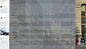
The final project “The Phenomenon of Catcalling” takes the form of an infographic which aims to inform a general audience about what catcalling is, its prevalence, societal and individual effects as well as resources to use to take a stand against it. The chosen phenomenon is actually very prevalent around the world, its transnational and doesn’t discriminate, although usually experienced by women. The website has inbuilt distractions that are intended to mimic the catcalling that someone might actually experience (on scroll events, hyperlinks and alerts).
The project features a ‘wikipedia’ style approach where content is presented in a page scroll format with hyperlinks integrated within the page (as seen below). There is also a selected Tweets section that Julia suggested for inclusion as it illustrates the phenomenons prevalence in today’s world.

However, the website presents a number of distractions and interruptions such as the alert which is called every 10 seconds.


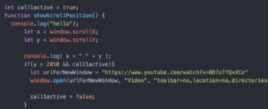
The website also presents a youtube video redirect ‘onscroll’ at position 2050 pixels. The coding that I did for that section is presented in the screenshot down below.

The website also has hyperlinks that contain important videos and information on catcalling. They are presented in a way that looks like you have stumbled or invaded the privacy of someone else’s viewing. For example, one of the videos pops up but plays halfway through, as if you have interrupted. This is meant to mimic the invasive nature of catcalling. In another example, you read what appears to be the conversation of two individuals experiencing catcalling.
![]()
Process
The process of making the project was actually really enjoyable. My coding skills are by no means professional level but Julia and I decided to play to our strengths and do something that was not only important to us, but something executed simply but effectively.
We split up the work, with Julia doing the CSS styling and HTML and I did the Javascript and HTML. I also wrote a lot of the content for the project which was really interesting and I learnt a lot in the process. This worked really well as I was able to concentrate on the interactive elements of the project. I created the wolf-whistle on load of the page, the scroll position and all of the hyperlinks as well as the function that enables the alert to play every 10 seconds. Content writing and the interactions is definitely my strength and Julia has a really strong writing style and creativity side which suited her perfectly to the CSS.
The code for those elements is found here:


We both worked together on the project and by having clear tasks it meant that it was a smooth project to create.
If I had to do it over again, I don’t think I would actually change anything in terms of work distribution or the process we took in making the project. We definitely could have added more interactive elements and changed the styling of the index page but this is something I will address in the ‘future’ section.
In terms of discoveries, I definitely discovered the ability to make really deep and meaningful metaphors and connections by using HTML and Javascript elements. I was really proud that I was able to use the skills I had learnt in class to produce a project that I am very proud of. Simple things like adding the wolf-whistle or the on-scroll youtube popup meant a lot to me. Even though they aren’t necessarily difficult coding concepts – I discovered a new confidence in my abilities to really just try to do something that I ordinarily wouldn’t do.
Future
Given more time, I definitely agree with the feedback provided to myself and Julia by the critics and also the class.
The feedback included:
- Add vocals to make more of an impact, window popup of eyes looking at you
- More visual elements
- Present huge chunk of text in a better information structure to encourage viewers to read it
- Draw more attention to links as they are essential to the website
- Add more features that emphasize catcalling- maybe more pop-ups or longer lasting Pop-ups
I would like to expand upon the use of popups and change the text each time an alert is called. I would also change the design of the text on the main page into smaller more reader friendly paragraphs.
In addition, I would love to add a pair of eyes to the page to make it look like the reader is being followed. The more realistic, immerse elements to really transform the page would be my priority action items.
I am a really focused writer so content creation was key for me, in my next pieces of work I definitely think that I will look to examining the more creative elements to really transform the work. I would love to revisit this piece.
The final project really reinforced that I am able to combine content creative with web expression. Communications lab has taught me so many skills that I will definitely be taking into other works. Thank you so much for the opportunity to learn and develop in an area that I would never had looked into. Thank you to Julia for not only your expertise but being such a great partner to collaborate and work with!