Link: http://imanas.shanghai.nyu.edu/~vsw227/comicProject/start.html
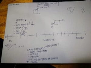
Idea: In the beginning, making up ideas for the project was fun but eventually we had to come to a mutual agreement about what to focus on. I suggested we focus on something specific so that the idea of our project wouldn’t get lost. We eventually came to the conclusion that we would focus on houses, because it wasn’t too common and we thought it would be interesting to compare houses from different time periods and different continents. To mainly see the stark contrast.
Aside from a typical timeline, we wanted to make it fun for the users, so Susie came up with the idea of having a comic person as the “cursor” that would kind’ve lead the viewer through the timeline. We then had to split up the work, so I volunteered to do the research aspect, Susie with the visuals and drawings, and Vincent would lead the coding process of the website.

Description: When the user accesses the website, they will be led to a start screen of the history of houses. It will then lead to a simplistic horizontal time periods dating from 20,000BC to 2019. However, when the user puts their cursor on each time period, there will be a vertical description, flag of origin, and materials of each house. We thought this would be an interesting concept to focus on, especially because of the horizontal swiping and not having to click on anything, but just a simple hover over of the cursor.
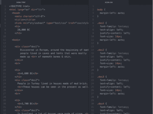
My part: My part of the project was conducting the research for the houses. This part was a bit time consuming for me, because although it seems that researching houses from different time zones could be easy, I was also trying to make sure that the pictures I found accurately represent each time zone and continent/country. I looked for the time periods as well and made up the descriptions for each house. I was really shooting for information accuracy and houses that could be fun to contrast. I also looked up the pictures for the materials that the houses were made up of. Lastly, I wanted to challenge myself and try to pitch in with coding — descriptions on the website. I used our class examples and some of the demos on the PPT to guide me. It was a bit difficult at first because the html index and css styles weren’t linking. However, afterwards it was easier because all I had to do was copy and paste the same coding, but just change the description, time period, and class name. I was happy to help out Vincent with his coding process.

Process: Overall, I think we did a great job. We were all open to meeting after class and working on our project. I also think that our website was different because we went based off original ideas that we wanted in the beginning and stuck with it the whole way. I also give a lot of credit to Vincent, because Susie and I gave him the foundation and tools to work on the whole website and put together everything to complete the project. I also do believe we achieved our goal because as I said previously, we stuck to our original idea of the timeline and although certain ideas were left out in the end, I can say that we did achieve part of what we wanted and definitely saw our vision come to life! There is always room for improvement, and I would definitely work on the design of the website more to make it more fun and interactive! I would also add more inclusivity with the comic person and the timeline. Although this wasn’t a story, it was definitely fun to put together and this just simply shows another side of a comic website 🙂