Title: “Pause, take a moment.”
Link: https://samantas.github.io/net_art_project/
Description:
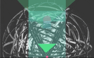
“Pause, take a moment.” is a website that randomly generates shapes and colors on top of a SVG variation of M.C. Escher’s Concentric Rinds. The background music is a piano cover by Vincent Corver of my song “Lies”. This piece encourages the user to explore shapes, movement, and color – to pause, slow down, and appreciate things for how they appear without moving too fast. The central theme is that if you move too fast, you won’t have time to appreciate. If the user scrolls too fast and reaches the bottom of the page, the experience stops and their only choice is to restart. The goal is for the user to interact with the piece in such a way that they feel mesmerized and relaxed, perhaps even encouraging self reflection.
Process:
For this project, I was clear on the theme I wanted to address, but I struggled quite a bit with the execution of it. I spent a lot of time trying to figure out the best way to use simple shapes and movement to represent moments in life and progress. I tried a lot of variations of how the shapes were instantiated on the page, where they appeared, how fast they should appear, number of shapes, and so on.
At first, I didn’t use any color and the experience felt quite lifeless and boring, so then I decided to implement a random color generator. The random color generator along with the random shapes generator created quite a mesmerizing experience. After coding for several hours, and as I was QA-ing the experience, I found myself sitting on my couch staring at the random shapes and colors, getting lost into the music and into thought. I wondered: what is really the point of all of this? But then I also thought: wow, I just sat here for 10 minutes watching random shapes and didn’t even realize it.
As for the code, I decided to use this project as an opportunity to practice OOP. I used github to track all of my changed, so if you look in my commit history, you will see a lot of frustration in the comments (lol). My project is just short of 400 lines of JavaScript, which for such a simple experience, sounds like a lot, but I really enjoyed creating this piece. (Even though, at times, I would yell I HATE JAVASCRIPT ¯\_(ツ)_/¯).
Throughout my process, I tried to be diligent about organizing my code. Below are some examples of how I structured my code.
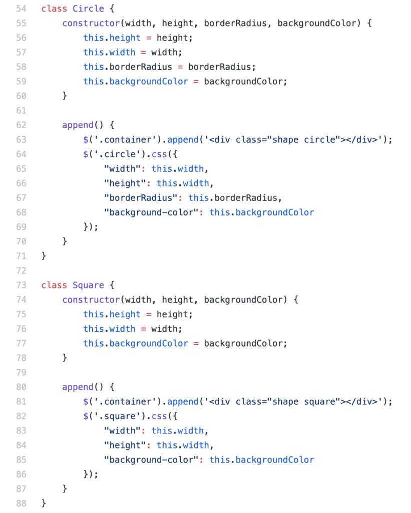
I utilized classes to define the basic parameters for the shapes.
Then, I instantiated these shapes using my triggerShapes(); function, which I call in the toggleMusic(); function, so that the movement and the music is connected. toggleMusic(); then gets called in the init(); function, which gets called upon document.ready.

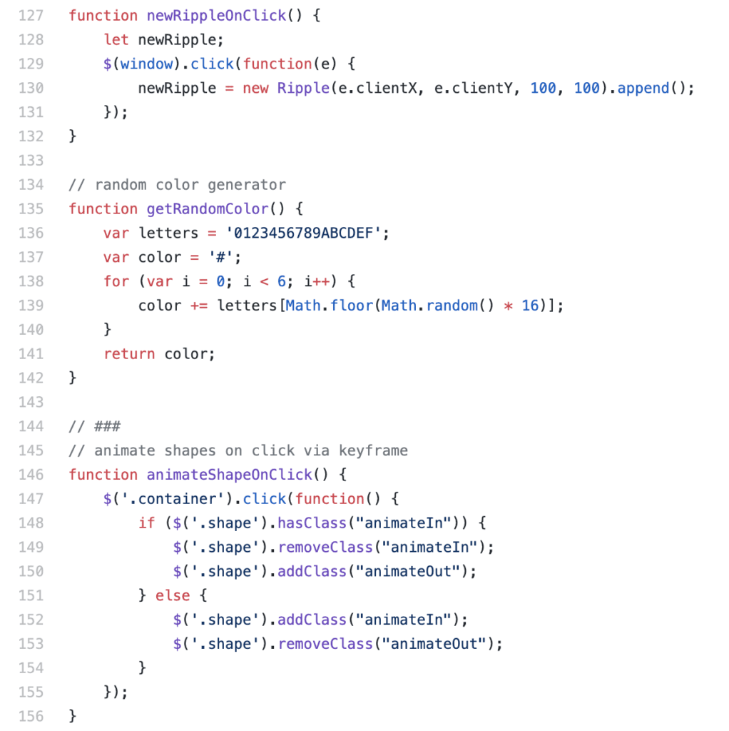
I also created separate functions for features such as the circle that ripples based on mouse click, generating a random color (found online!), and animating the shapes on click. The function animateShapesOnClick simply toggles a class in the CSS which utilizes a keyframe animation to transform the scale property.
As I shared my project with friends, I realized that it would be helpful to make a mobile friendly version of the piece, so that people can access it on the go. So I implemented a media query to make it responsive. I changed the introduction to make more sense for mobile, for example instead of “press enter to start” you tap a start button. I also removed the background image (Concentric Rinds variation) on mobile as the dimensions were not mobile friendly.
Challenges:
One thing that I struggled a lot with was utilizing scroll to instantiate shapes at a reasonable pace. Triggering shapes based on user scroll proved to be very difficult because, if the user scrolls too fast, then too many shapes would instantiate and the browser would slow down and stop functioning. I tried to incorporate a scroll speed listener as well as a setTimeout function, but none of these solutions worked well enough for me. This is why I ultimately decided on triggering shapes only based on a setTimeout function and not upon scroll. However, since the page auto scrolls, it appears as if the shapes occur upon scroll. So I ended up hacking together a solution.
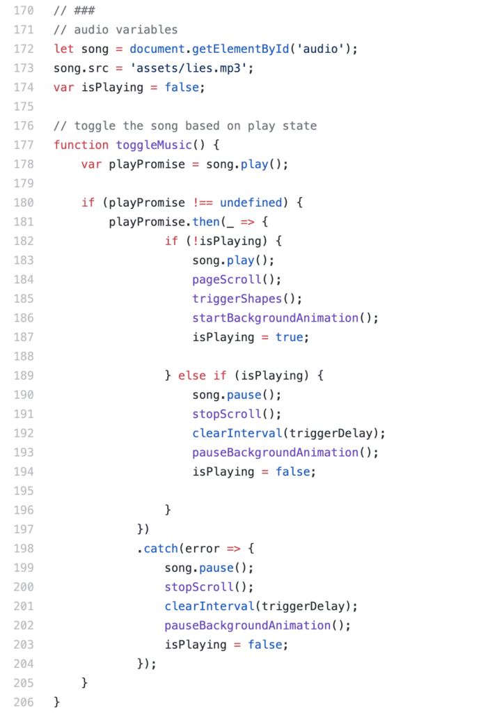
I also struggled a bit with the audio, learning that Chrome does not allow audio autoplay. I found a solution online that helps catch an error with audio playing:
Post mortem:
I believe my project was successful in accomplishing the goals I set for myself. I was able to create an internet art piece that utilizes JavaScript to provide an experience and convey a message. If I had more time, I would have added more features, such as changing the saturation of the color based on scroll position. I also would have made a mobile friendly version of the M.C. Escher background image. However, I wouldn’t have added too much, as I enjoy the simplicity of the project.