Link: https://imanas.shanghai.nyu.edu/~yc2966/Grey/index.html
Title: The Grey Net – Invisible Chaos
Partner: Milly Cai
Instructor: Moon
Date: May 15, 2019
Concept
As we said in the title, our project called “The Grey Net” aims to explore the topic of the “dark side” of the internet, covering topics like data breach, cyberbullying and also computer virus. The word “Grey” indicates the grey zone on the internet which the laws and regulation in the real world may not be able to cover. This project serves as an awareness-raising project which encourages people to think more about the internet environment. As the internet becomes a significant part in our daily life, we as the netizen should also be aware of the crimes and other negative things happening on the internet instead of just recognizing the good impact brought by the internet.
Process
Final Version:
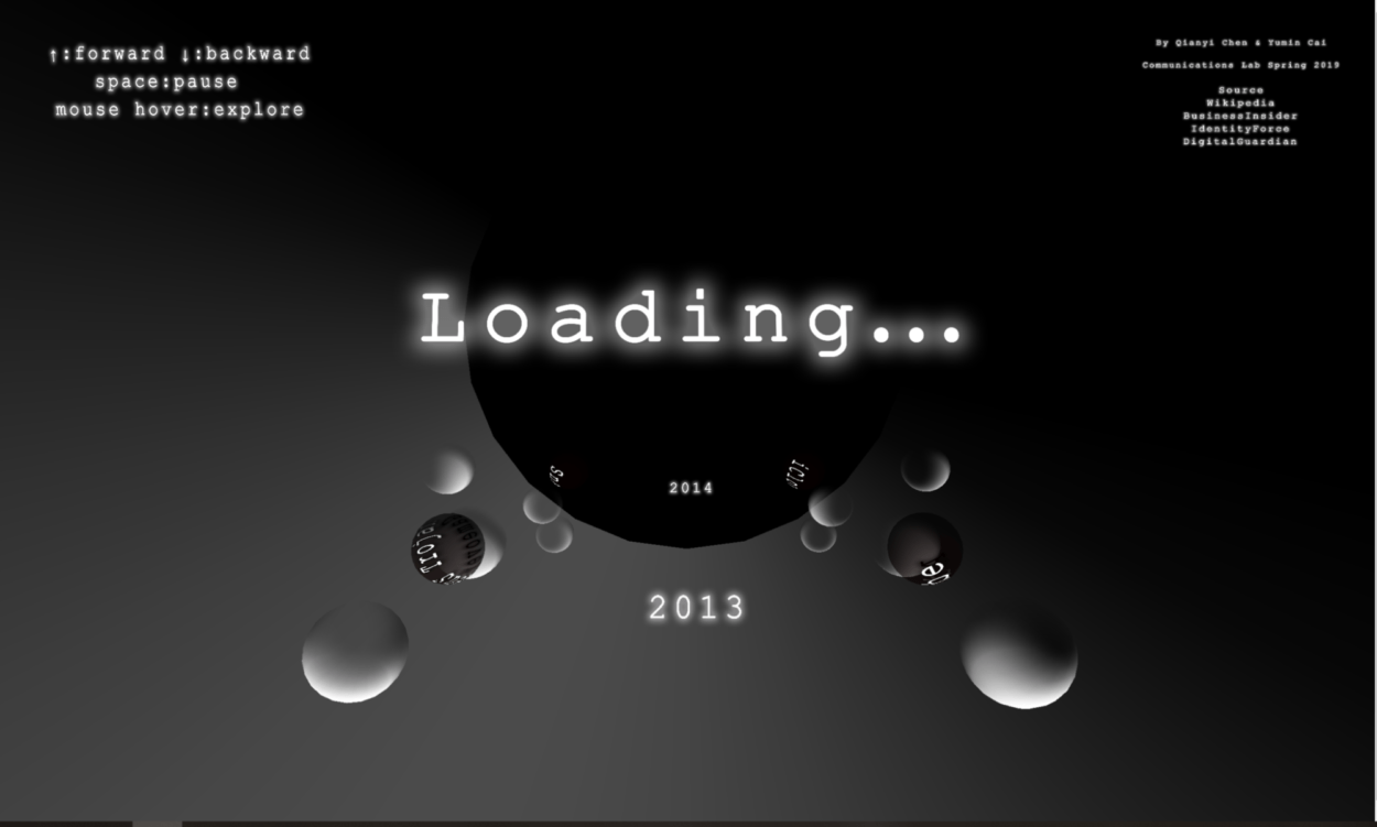
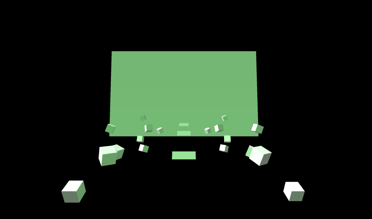
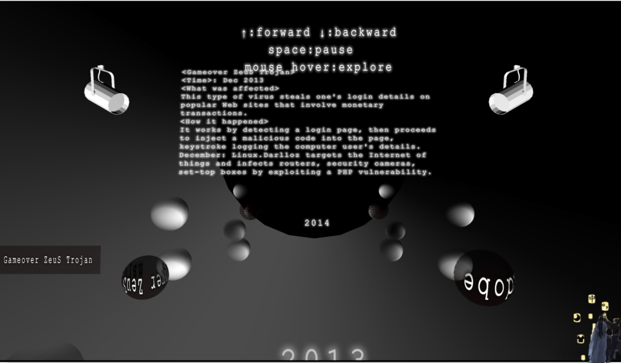
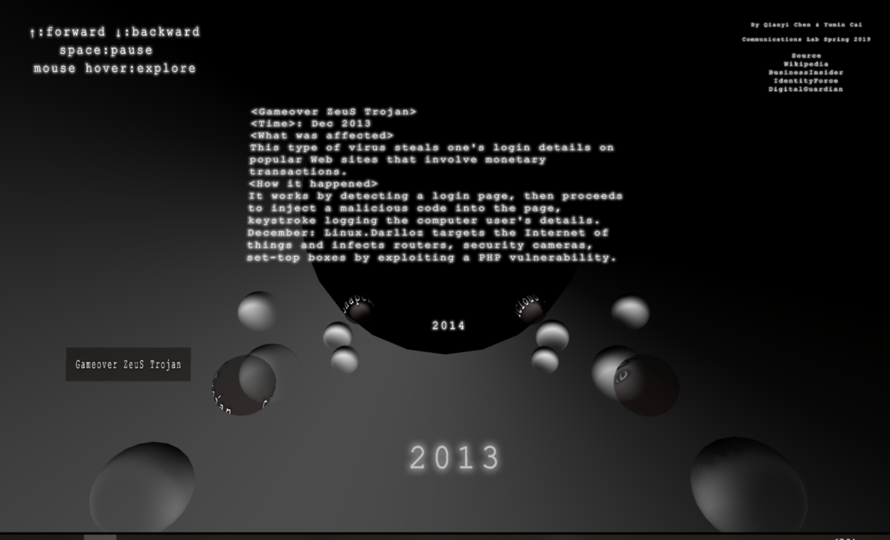 Basically, the interaction is as shown above: click the title on the first page, then the user will see texts indicating different years. Using arrow up and down and space key they can control the movement of the spheres. By hovering on certain spheres with a special texture and see more information about the event in the middle of the page.
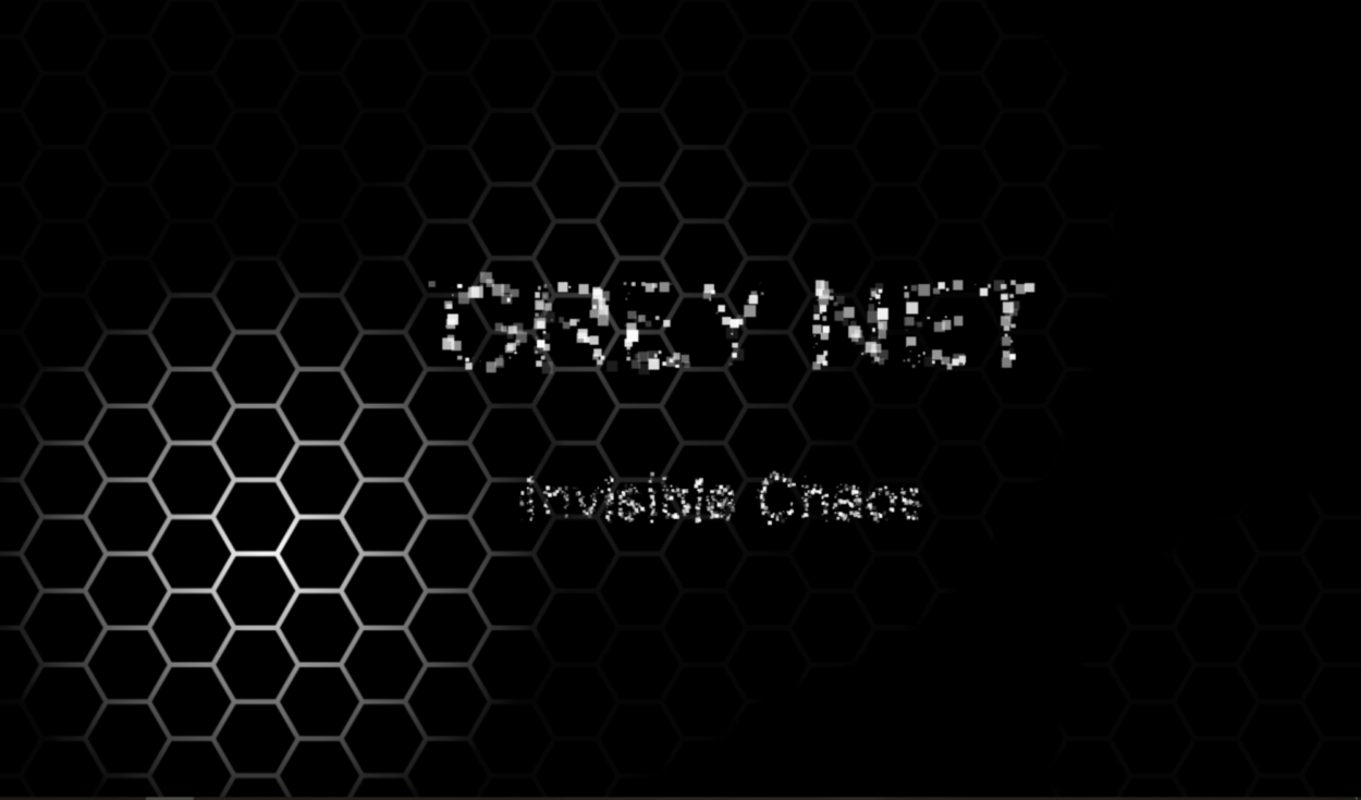
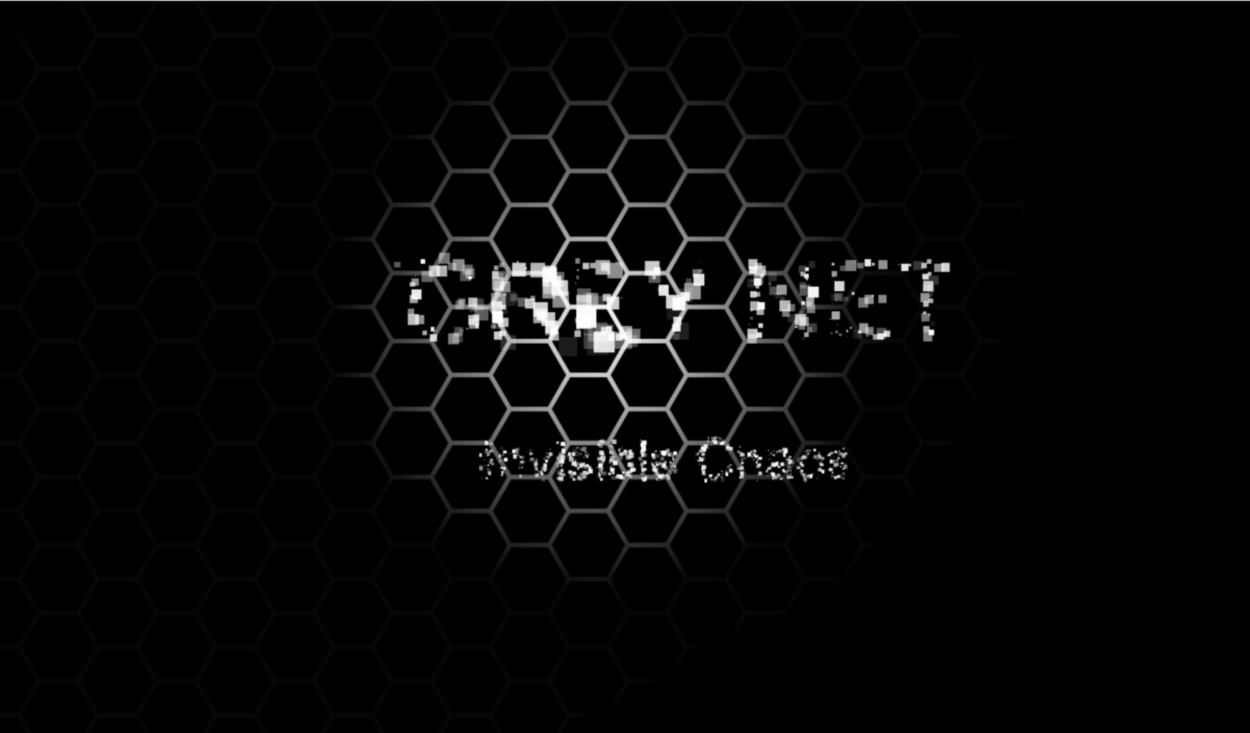
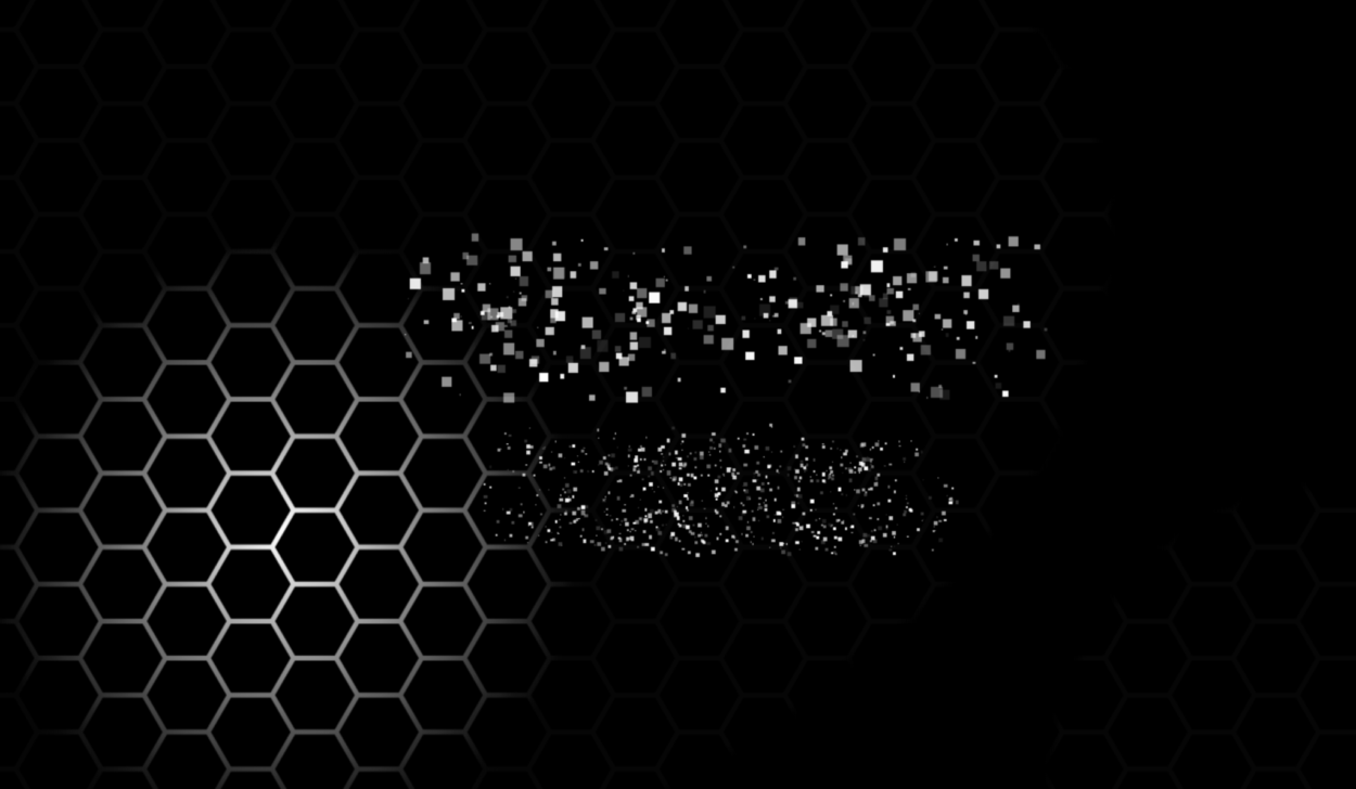
For the intro page, we actually intentional design the layout. The hex indicates the newtork; light to explore the internet that indicates the way we explore the internet (and imply that there are many invisible, hidden things); the random little squares make up the title, which is a metaphor of the way that data carries the information on the internet.
Developing Process
-Research
Before we start, we first did plenty of researches about internet safety issues on the internet, and we mainly sorted them into three topics: data breach (personal information issue), cyberbullying and also computer virus. We leveled the cases by its number of people get influenced or the financial problems it resulted and selected the ten top cases to write a summarized paragraph for each year from 2013 to 2018. However, in the end, due to our time and labor limitation, we only choose two from ten of each year to show in our project.
-Coding
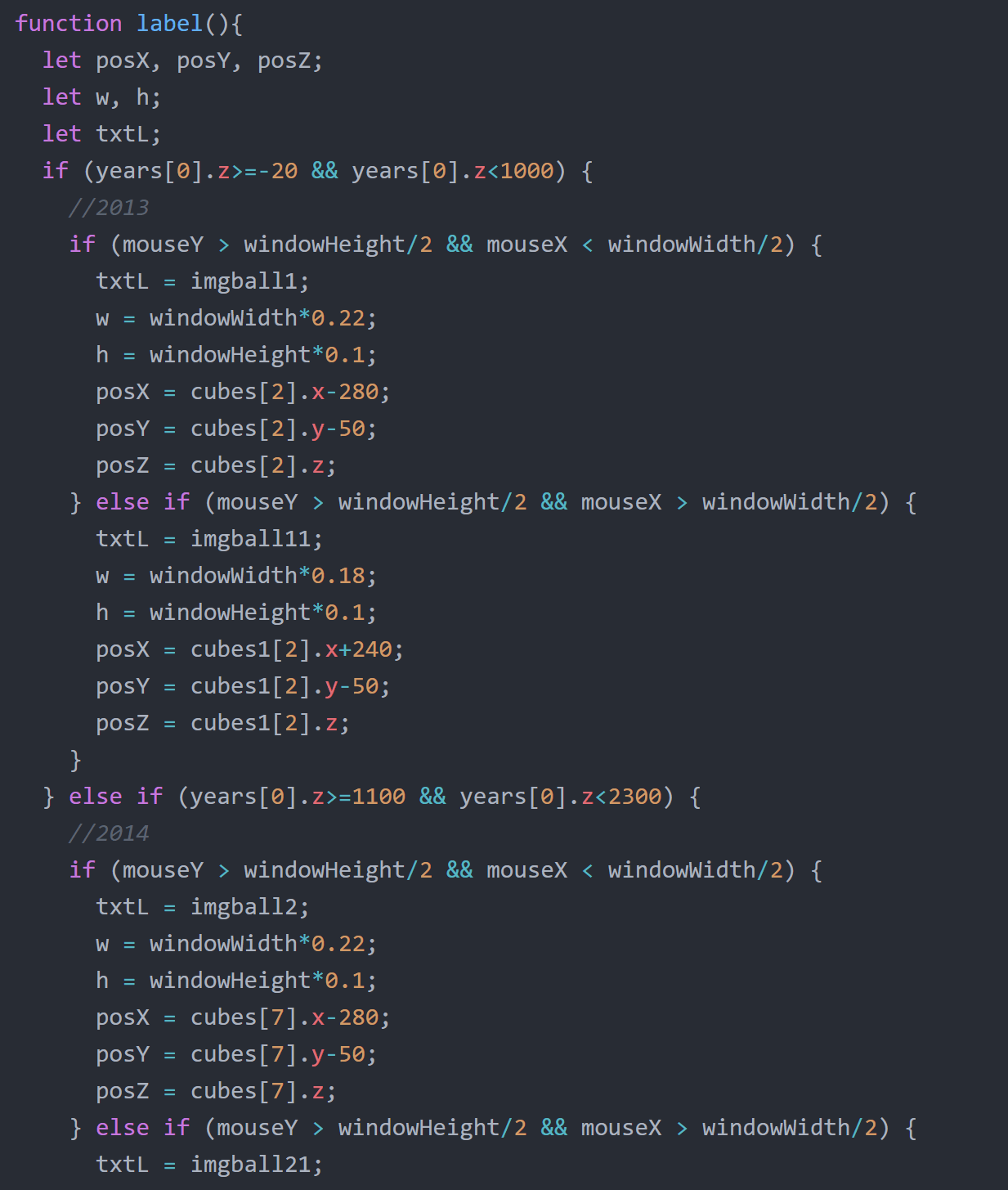
In terms of coding, we write it collaboratively and also debug for each other. And also for the intro page, I wrote the part with floating cubes and Milly made the hex part and then we put them together in one js file. We decided to build the visual in 3D after discussing with Moon, which is the point where our struggle started. In this project, we learned basics of 3d in p5 using webGL.
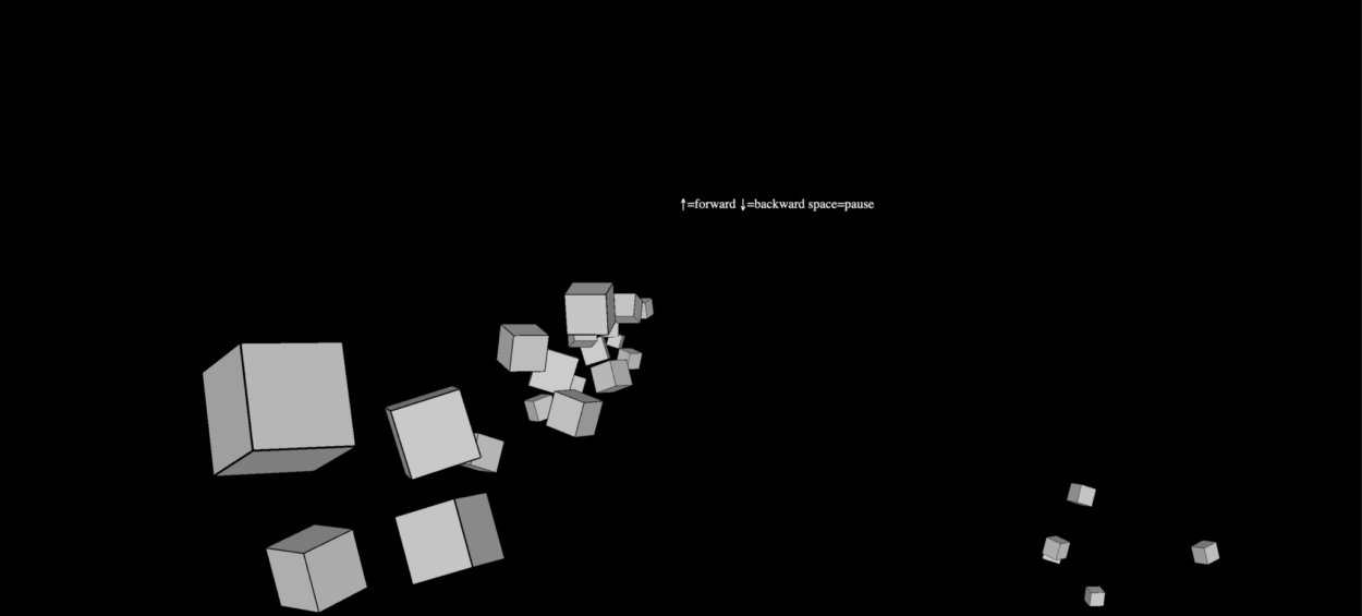
At first, we learned to create an array of objects using “class” and also learned the concept of OOP. We first made the boxes generate automatically and used the mouse position to change the camera view.
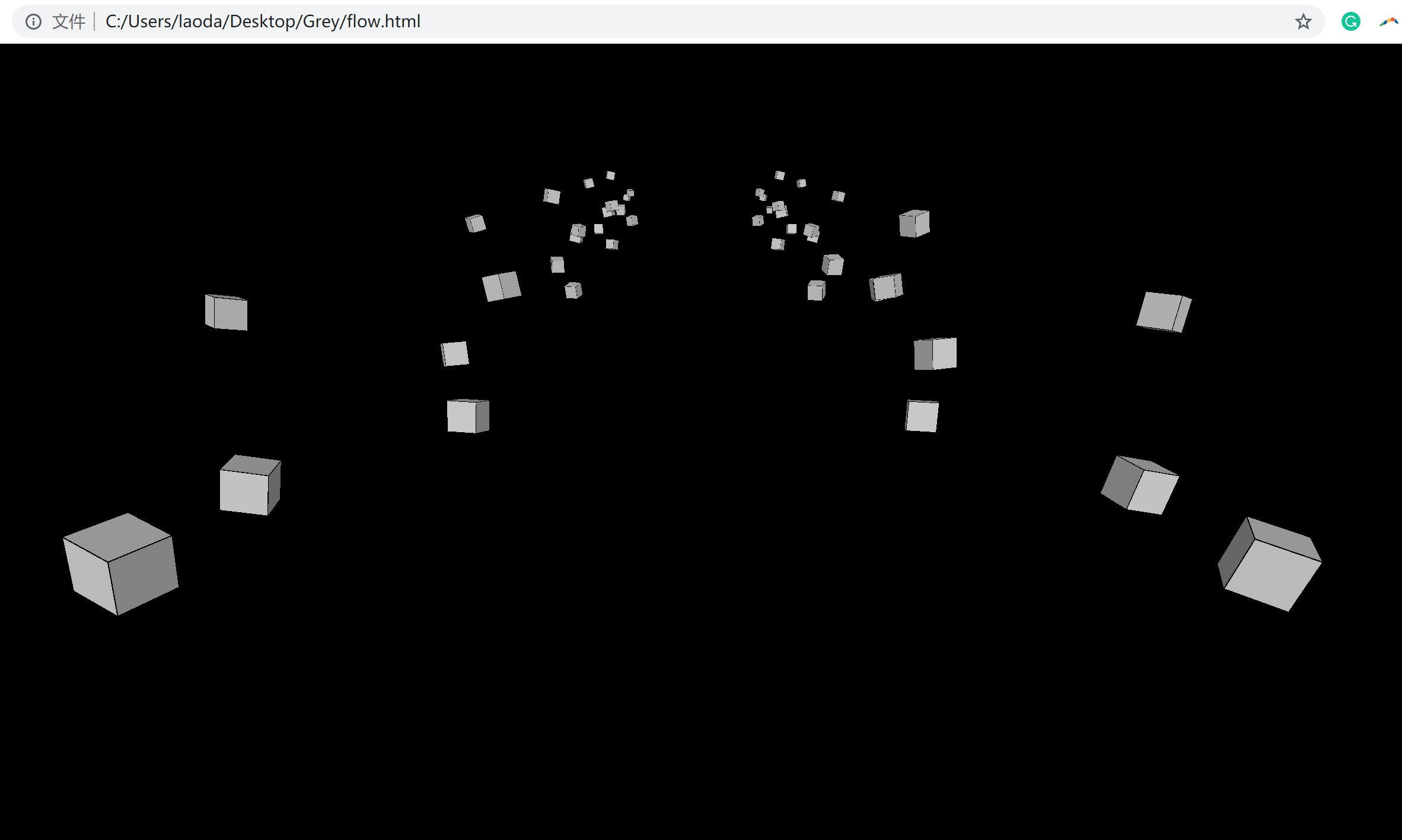
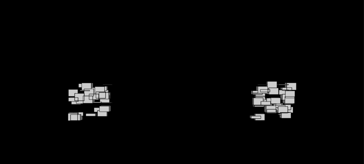
Later we modified the arrangement of cubes and also add different cube arrays as well as the “screen” where we will present the information.
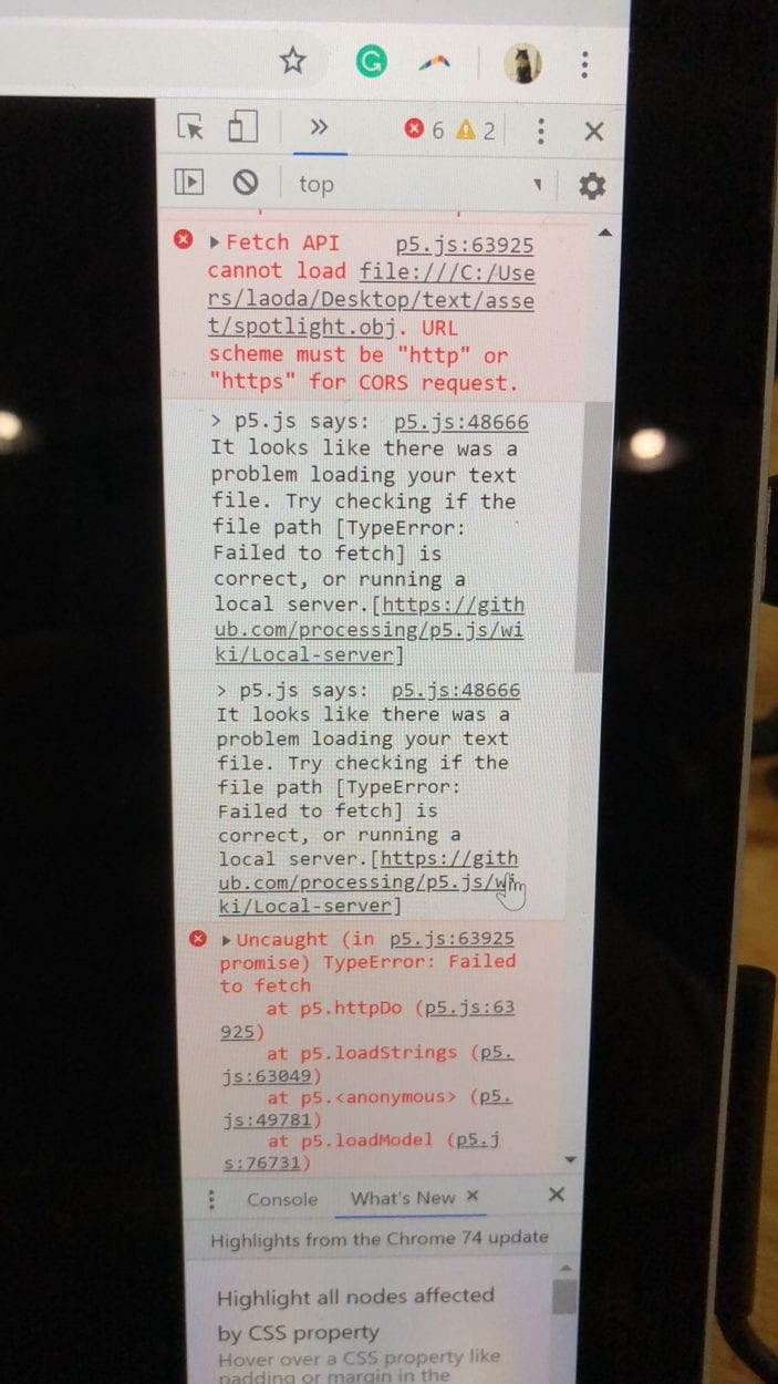
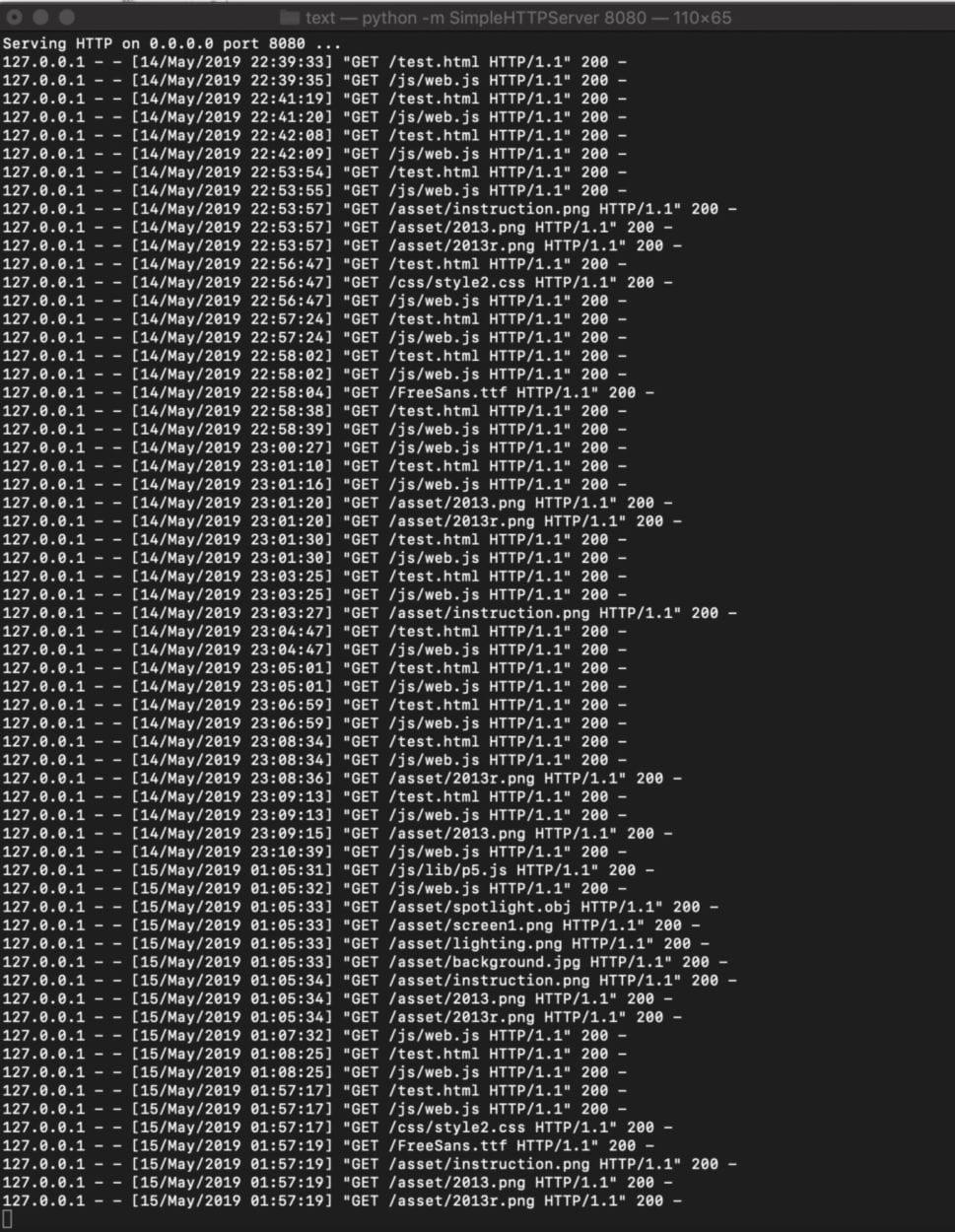
When it comes to loading images, a problem we met is that we can’t load the file when testing the website and we learned to create the local server to solve the problem.
For the rest of time we spent a lot of effort adjusting the layout design and interaction. We explored with the texture, loading object and also string array, etc. We also adjust the keyboard and mouse control for several times in order to make user-friendly and more intuitive interaction. Instead of just writing the text in p5, I edit the glowing effect in ps and save it as png so that we can have better visual experience for the users.
Reflection
Many things can be improved if we have more time.
Firstly the content we show on the page can be categorized so that the user can be clearer about the idea we want to convey which is the topic of negative things happening on the internet. The information can also be more organized. Our initial intention is to build an archive which includes information and links for people to look at (like Wikipedia), but ended up picking two events of each year due to the time limit. If we have time we can try to find out how to show enough information in a more effective way.
In terms of design, we can also improve that by adding more features highlighting the current position. For example, adding different colors to the sphere the user is hovering on so that they can clearly see where they are.
Taking into account the feedback we get from the class presentation, we also added some adjustment to our project including adding the source of information, adjust the instruction position and also removing the 3d model.
Before:
After:
Source Credit
Songs:
Fading Sun & After you
Cases:
https://www.identityforce.com/blog/2018-data-breaches
https://en.wikipedia.org/wiki/Computer_virus
https://zh.wikipedia.org/wiki/%E7%94%B5%E8%84%91%E7%8A%AF%E7%BD%AA