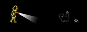
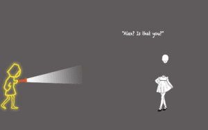
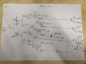
For our comic project, we wanted to do something very interactive and suspenseful by incorporating ways that the player could make their own decisions and navigate throughout the websites (comic) based on these decisions. First, we created the characters in our story through sketchpad and photoshop. We drew pretty much everything that appears in the comic (buttons, objects, and characters). Then made a detailed outline of the storyline of the comic and numbered the html pages so that we had an idea of what to do for the coding. This allowed us to code along with the outline so that we didn’t get confused with the pathways of each html page and correctly followed the story (as it gets more complicated as the story goes along).
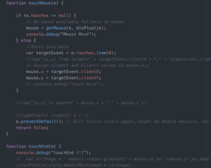
We ran into a lot of problems at the beginning of the project because our project required some coding we had never learned before. We wanted a flashlight affect with the cursor to read the text for our first page, so we needed to research this code (it involved functions with “getmouse” or “touch move”).
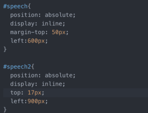
Another aspect of coding the I learned was in CSS the position aspect of images. I kept having problems with it being “relative” and it messing with the animation of the image. I fixed this by changing it to “absolute” so the animation and position worked better with the entire page.
We also had a problem adding the music because it would play on loop instead of for a specific time. In order to fix this we had to change the javascript aspect of it by using “var x” and using a function to define the time. I learned a lot more about animation and CSS aspects of coding during the project, as our comic required a lot of it. I specifically learned more about how much the sizing and position of elements in CSS can affect the rest of the code a lot. Using the inspect tool really helped for this and helped me easily identify what to fix.
