Link: http://www.oasisinet.com/#!/home
This is the official website for a British rock band Oasis. I found it very inspirational.
First because the layout of the page is great and consistent. Black background and white words, the same font throughout the whole web.

(Music Main Page)
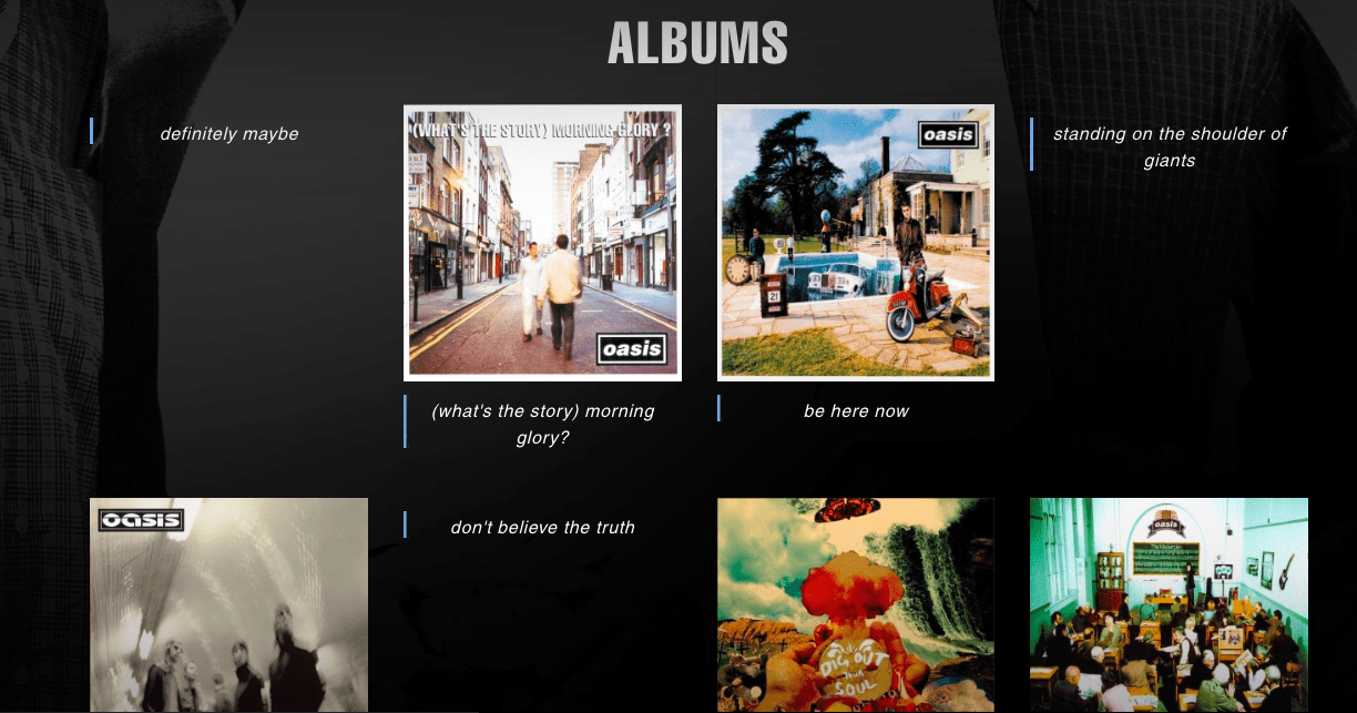
Also the display of the album pictures and videos are aligned perfectly. Some of them are pictures and some of them are words.
(Album Display)
The navigation bar also follows the same style.
![]()
(navigation Bar)
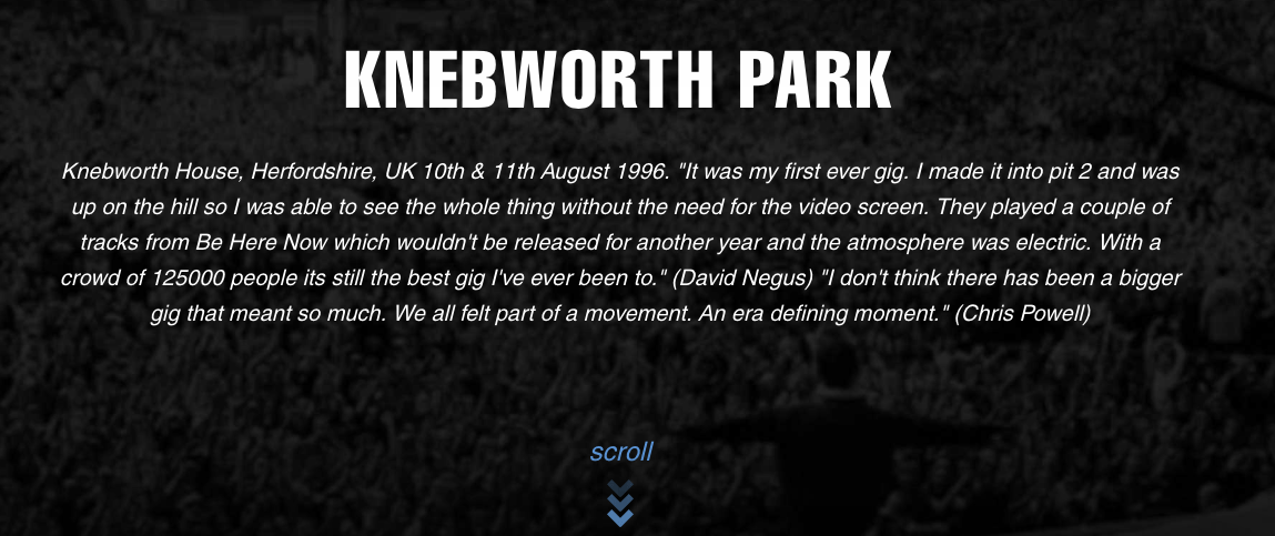
Secondly is the interaction of the website. It has clear instructions(all in blue color).

(Interaction)
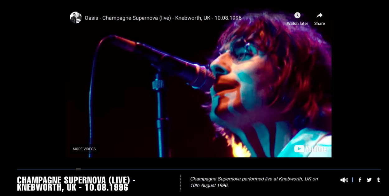
And when you open a page there will always be some animation. Also, they way they play the video is not simply direct it to the YouTube page, but they play it on their own page and has name of the song and the information of the concert at the bottom.

(Video Play Page)
So I think this is a very sophisticated webpage and it inspired me a lot.