Design
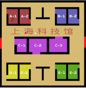
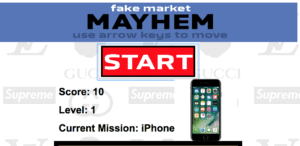
Fake Market Mayhem is a game based off of Pacman where you run around the Shanghai fake market collection items all the while running from desperate shop owners trying to scam you. Inspired by old-school game websites like Miniclip or Nitrome, the interface of the website is simple and is centered around the small box in the middle. The game is very difficult, as with each level a new enemy appears. The enemies, unlike the player, have the ability to teleport through walls while chasing the player. The player is always in search of one item at a time, which is showed not only on the game screen, but also above the game in a larger, more visible format. The background of the game is a collage of different designer brand logos whose fake counterparts are often available for purchase at the fake market. This project was inspired by a recent trip to the fake market where we were chased around by a couple of shop owners desperate for our business for about ten minutes. They knew all the shortcuts and secret passages which was the inspiration for the game design choice where the shop owners can pass through walls. When the player is caught by the shop owner, a real recording of a shop owner yelling about their products plays.


Process
This project was the hardest thing I’ve ever coded. It took so long to make and required me to learn some new kinds of coding. Primarily, I had to learn Object Oriented Programming in order to make the enemies work. Object Oriented Programming is something was something I had wanted to learn for a long time but never actually got around to sitting down and learning it. This project required me to use it and I feel like I really learned a lot through that. One of the most difficult things with it in this case was getting the tracking to work for the enemies towards the player and also changing the amount of enemies based on the level. I also struggled greatly with making the enemies reset when the game reset. Another thing I had to struggle with on this project was wall detecting. I had to figure out how to get the pixels in from of where the player was going and determine exactly what color they were in order to read where the walls were. Another obstacle I faced when making this project was the randomization of the items and making them appear in predetermined locations as well as determining when the player grabbed an item. Another huge thing I had to learn was CSS. Going into this project, I had somehow managed to have just about no knowledge of CSS and had to learn a bunch in order to make this page look good at different sizings.
Future
If I had more time, my project would be very different. I would have had walking animations and sprites for the players and the enemies and would have added a bunch of sound effects to it. One issue that I was unable to fix was the fact that when someone resizes the page after it loads, the game works at a different speed and needs to be reloaded at the new size. Also, as the critics said, the audio was very strange, unintelligible and inconsistent. If given more time, I would either make a theme song for it or just have a loop of ambient noise playing at all times. Another thing which the critics suggested was to add a goal — to give an ending to the game. In its current state, the game has no ending and becomes incredibly difficult very quickly. While I had hoped that this game would have a high skill level, I think the game is just too difficult and doesn’t reward the player enough. I do not think I would want to add an ending, but I might want to add some kind of global scoreboard for people to compete against each other.