Communications lab final reflection
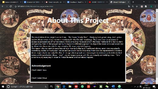
Our project’s idea was generated from the Seven Deadly Sins. However, we weren’t trying to depict the seven sins as they originall y were, instead, we tried to find them in the daily life of human, and depict them as a sinful joy that people may be addicted to, or the small problems that everyone would encounter. The whole project consists of one home page, seven pages for seven sins, and an about page which describes the idea of the project.

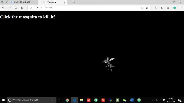
On each page of a sin, there is a small “incident” that the user needs to trigger using simple interactive moves like clicking or hovering or pressing keys. And through these incidents, we depict the seven sins in a comic, entertaining way but without losing the facticity of them happening in our life. For example, in the page of wrath, we have a picture of a mosquito that changes position to a random place whenever you hover on it, while playing the annoying buzzing sound that it makes; basically it’s a mosquito that keeps buzzing around your ears and that you could never kill. This can really be very annoying in real life so I interpret is as the sin of wrath in modern people’s lives. The rest of the pages are similar.

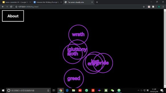
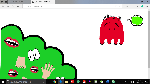
To be honest many things that we initially brainstormed was too ambitious for us. Like too many elements or ‘interactive’s on one page or like making each sin a individual game or so. And there is quite a few things that I want to change if I were to do it again. For example, in the page of envy, I don’t think I interpreted the concept of “a person envies the fun of the others because he was excluded from them” so well and I might think this over and make other interpretations or simply make the page easier to understand; by probably using cartoon figures of people rather than the red, ghosty figure and the mouths and eyes on the other side. And same for the page of lust. I feel like the interactive, which is simply scrolling, is a little bit too simple on this page, however, simply by photoshopping a really long picture to active the interactive on the page and thus reduced out workload, worked pretty well. Another thing that I think worked well is the p5 animations of the home page. I think making the seven shaky little circles clickable and have a name each was really cool and funny. I really liked my homepage.

If I had more time, I would definitely at least add a description of each sin which you can access on each page; and give more instruction of how to navigate through the websites somewhere on the pages. And also I would consider making the style (like the coloring, the backgrounds and the drawing styles) of each page more coherent, as what was mentioned in the critics. But furthermore, I would think of making the seven sins actually games that motives the player to commit those sins—which is to convey our point that the sins are in everyone’s lives more clearly.

For example, we can make the Pac-Man game of gluttony harder and add some conditions under which you could either eat all junk food and become happy, or stress out because you don’t do stress eating. And also, of course, add more navigation buttons in those pages. So that the project feels like a whole rather than several different pages. And that may help on the coherency of the styles as well.