Concept:
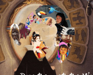
Our internet art project is meant to simulate a children’s web game. I drew inspiration for this from an interactive collage, that represented its meanings through various popup windows. Our conceptual goal is to represent the differences between conventional beauty standards from different parts of the world. It seemed fitting to approach this topic through the lens of the popular children’s movie, Snow White and The Seven Dwarves. The website begins using the famous quote ‘who is the fairest one of all?’ that subsequently proceeds to a world map that requires the user to view images from several places to continue. The images are each a collage of the various characteristics that that that location believes (or have believed at one point in time) as conventionally beautiful. After the user views each pinpointed location, they are then directed to sort out a college that includes a beauty standard from each country. Our central message is meant to bring attention to the
The Process
We originally planned to create this project in the form of an interactive timeline outlining the change in beauty standards over periods of time as well as between different regions. However, as we gathered more research and began to structure our website, we felt it was also important to convey the message of how conventional beauty standards are entirely dependent on preconceived notions of desired physical traits (mainly with women) within a given culture. People’s subscription to these beauty standards appears to be a product of their socialization, as in, where you were raised and the commonly held opinions in that region will affect how you compare yourself to others. This is why we saw it fit to create this project as a children’s web game, as an effort to expose them to the subjectivity of these norms at an early age.
Designing the website and photoshopping the images was a long and meticulous process. As this is a sensitive topic, we wanted to be sure it was executed in a suitable way. Selena and I first created a shared google doc to outline information on trends of beauty within each country, with which we chose the pictures for the collages. Moving forward, Selena started the coding while I worked on the visuals and joined her to work on the coding when I was finished. The main issue we had was coding the collage drag at the end. For this part, we used CSS and Javascript to position the images, but finding a solution that would hold the image in place properly was extremely difficult. Initially, each time we tried dragging the image, it would go to a weird place on the page. With help from Dave, we were able to find a solution by putting a div where we wanted to place the images.
(here’s what the collage looked like in the beginning)

Reflection
After presenting in class, I realized how we could have improved our message. I think it would have been helpful to provide a textbox or description beside the images. Even though we had done the research and were aware of how the images we selected impacted the beauty standards of that country, from the feedback we received, I can see how this may be perceived as otherwise. I also think it would have been better if we chose a specific area or city, not just a country, to focus on. With such a broad yet sensitive issue, there is always the risk of trivializing certain features that many would consider important, which was obviously not the intention. However, I do think these problems are a simple fix and something that could be easily changed if I were to tackle an issue like this again in a project.
Overall, I am pleased with how the final project turned out. This was a subject that both Selena and I felt passionate about and we spent numerous hours working on. In this class, I feel like I have gained extensive knowledge on the importance of communication and I think this was a nice way to apply all the content we’ve learned into a single project.