For our final project, I had the idea of creating an interactive catcalling website because I felt that, with the JavaScript features we learned, catcalling would translate well into a web-based medium. Catcalling is a widespread form of street harassment that plagues metropolitan areas, though it is not uncommon in less urban areas as well. Catcalling is mostly done toward women by men, though there are cases of the reverse.
- Design
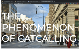
The project only features one page and contains information about catcalling, such as a definition, the prevalence among different countries, why it is important to bring attention to it, the effects it has on the individual and society, and resources for further reading. There is also an embedded Twitter feed of curated tweets concerning catcalling, including firsthand accounts by victims. The page is meant to be informative and the aim is to educate the reader on catcalling and street harassment.
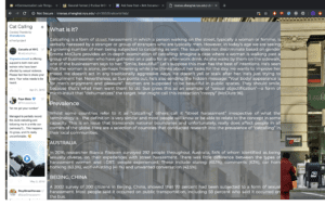
Another feature of the page is the interruptions, or the ways in which the webpage catcalls the user. Upon opening the webpage, the website wolf-whistles at you. This is what makes the website more effective:
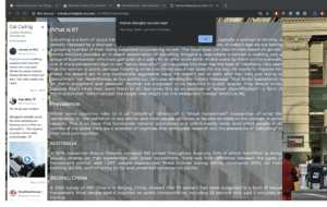
The reader is meant to be interrupted by this alert every five seconds, which is both annoying and persistent, reflecting the nature of catcalling in real life. Not only this, but we also placed misleading links that are meant to enhance the interactive catcalling aspect:
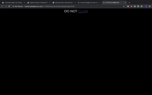
The link contained herein leads to a video about catcalling.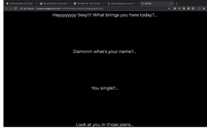
Once the viewer reaches the bottom of the page, a popup shows up containing a video featuring women telling their experiences of being catcalled.
- Process
We began by compiling the information we would feature on the website. This process was simple enough due to the plethora of information and accounts on catcalling on the Internet. We wanted to make the layout simple and streamlined, but also aesthetically pleasing. We split the work between the two of us such that I would handle CSS and styling while Taylah handled the JavaScript interactions.
I believe the components of the project all worked well together, namely design and user interaction, though due to time constraints I feel that the page is rather simplistic and could use more interactions or visuals rather than just text on a page. While doing this project, I learned how to implement Twitter feeds using Twitter’s TweetDeck functions, which allow a user to compile tweets into collections that could then be translated into source code to feature on websites. I was also able to strengthen my CSS skills through this project.
- Future
Taking into account criticism from the class and critics, if we had more time I would’ve liked to create visuals on my own rather than sourcing them from the Internet. More visuals, such as a map infographic, would’ve improved the page since many people felt the page looked too Wikipedia-esque. More interruptions on the webpage would be more interesting and conducive to the user experience, and if given more time, we would have liked to include more varied interruptions, such as audio and different types of popups.