Link here.
Laura and I decided to create a comic showing a girl (named Alex) going through her daily life, constantly distracted by her electronic devices, who pays a price for this towards the end. User interactivity is centered around these devices – when you hover over a phone (for example), the phone enlarges for emphasis. If you click on it, you see what Alex is seeing. You can then go back to the main scene, and then go ahead to the next scene. We considered making an “Inception” type story with multiple layers, but eventually realized it would be too difficult. Instead, we decided on this story, which still uses the same idea, but on a smaller scale.
For visuals, we used photographs as the background images. The characters and speech bubbles were drawn in Adobe Illustrator. The effect of zooming in on a part of the image was achieved by duplicating the image and cropping out everything except the part to be zoomed in on (such as a computer). This part would then scale larger when hovered over, and serve as a button leading to a separate, close-up shot of the device’s content when clicked. This effect of zooming in and out actually took a while to solve, as I wasn’t sure how to do it at first, but eventually figured it out.
While we originally had each scene as its own webpage, we later decided to put everything on one page. All the characters and buttons are made invisible by using “display:none”, and are added/taken back out for the appropriate scenes; the background image also changes for each page. Every scene has its own set of functions for loading the scene, as well as for when buttons and items in that scene are pressed.
In terms of division of labor, Laura created the visuals and the html index page, while I wrote the script for zooming in/out. We both made contributions to the CSS styling, as well as the JS scripts for transitioning between different views and scenes.
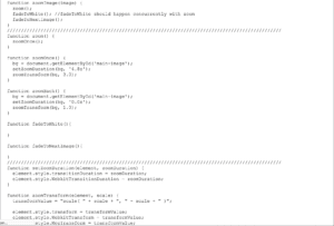
The main issue I ran into was with zooming in and out. I wanted to make the entire page zoom and then fade into another scene (the closeup of the phone/computer) when the phone/computer is clicked. I did get the full-page zoom to work, however I didn’t have enough time to fully implement it the way I wanted, so it didn’t get used in the final product. It looks quite simple, but actually took quite a long time to get it to work properly. We didn’t end up using it because I also would have needed to implement a fade in/out of the previous and next images, which I didn’t get a chance to complete. A screenshot of the unused code is shown below.

Another problem we encountered was, we couldn’t find a way to reliably line up the zoom-in item (i.e. phone), which would be placed over a larger image, with the larger image. While the larger image is positioned relative to the browser window (i.e. it changes position and/or size when the window is resized), the zoom-in item is much smaller, and since it’s a completely different size from the larger image, it requires a different approach. It’s placed in a hard-coded position, which works on my laptop or Laura’s but not necessarily for everyone’s.
Overall, I’m happy with the comic we created. Aside from the problem with aligning different-sized items, our webpage works as desired, with effective transitions and a healthy amount of user interactivity. Anyway, it’s out there now for everyone to see and interact with. Enjoy!