Link to Comic:
http://imanas.shanghai.nyu.edu/~hrm305/comic_finalDraft/about.html
Project Description:
For our comic project, we decided to have an interactive story where the user navigates as the main character through a new, unfamiliar environment. The story is a metaphor for feeling misunderstood, and this misunderstanding plays out in the main character’s interactions with others where other people do not understand the main character. The concept is that although it may be difficult, the more the character interacts with people and the world around him, the more understanding is gained. Throughout the comic, the user will make decisions about whether or not to interact with others. Depending on the decisions, there will be a couple of different outcomes. The more the user interacts with others, the more colorful and realistic the world becomes, while the less they interact, the more black and white and comic-y the world stays.
Process:
Our process started by conceptualizing our comic idea and how we would convey the metaphor in a doable way. We then worked with photoshop to manipulate some images until we found a “filter” that we liked to stylize the comic photos. Once this was decided, we began coding our general page layout, which consists of a scroll function with the page split into 5 sections with a full-screen image identifying each section. We then proceeded to work on using js to add other interactive elements to our comic, html to input content, and css to style it all.
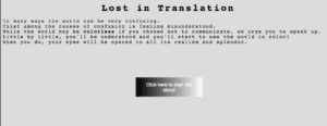
The project works by starting off on an “about” page, which gives a context for the metaphor of the comic. It then uses js to have a button link to the index.html page, which is our main story start page. This page is black and white and in our “cartoon” style. As you scroll through the first 4 sections of the index.html page, you read changing narration text at the top of the screen. This narration text contextualizes the new environment, and leads up to the 5th section of the html page, which involves your first possible interaction with another character. On this last section, the narration prompts you to either ask for directional help from a man, or continue trying to find the way on your own. If you click “start a conversation” button, a conversation div appears which starts off with a greeting from the stranger when you click a button, and then allows you (the user/main character) to respond by typing into a text box and clicking continue. To signify mis-understanding, we coded the “result” text from the user-typed input to show “gibberish” text. After a 1 second delay, the response from the other character comes back exclaiming their inability to understand. You try to say something again, but get the same confused response to your gibberish. After the second response, the user is prompted to click the button again to move on to work and end the interaction, taking you to the “page3” html page. Alternatively, if you click “continue wandering,” the button links to a new html page, “page2,” which continues the story at the character’s first day of work.
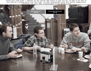
On the “page3” html page after your first interaction on the index.html page, the user starts the main character’s first day at work. The user will notice that the comic images are now more realistic and slightly less black and white than before, due to the decision on the index page to interact with the man. At the second section of the “page3,” the user is again given a choice whether or not to interact with their coworkers. choosing to interact by clicking “Ask for Advice” makes the next section more colorful, and allows you to interact by chatting in a similar way to before, however this time after two confused interactions of gibberish, the character’s coworker understand them at the third interaction. In our code, we achieved this by using if, else if statements and only calling on our gibberish function for the first 2 interactions, before having the ‘result’ variable spit out “userInput” instead of gibberish to indicate that there was an understanding achieved. Alternatively, clicking on “Try to solve on your own” on this page makes the next section more black and white and cartoon-y, indicating that you have decided not to interact. In the third section, the main character is invited to karaoke with his coworkers and can decide (again through the click of a button), whether or not to go. Clicking “Go home after work and end your day” button takes you to html page4 which tells the user that you didn’t interact enough and so are ending the day and can restart the comic. Clicking “Spend time with your coworkers” on the other hand, leads to the next section which is outside a karaoke bar, with the image being in nearly full color to indicate the user’s willingness to interact with others. On the fourth section, you can click “enter karaoke bar,” which changes the picture of that section to people signing inside a karaoke bar in full color. You are then prompted to scroll down to the 5th section, which is in full color and links you back to the about page to restart the comic.
Alternatively, if you choose not to interact on the index.html page, you are taken to page 2, which has the exact same storyline as page3, except you begin the page in black and white with the cartoon-y effect and the color and realism change is less drastic since you didn’t interact on the first page. The “ending” to this page is either the same “page4” if you click “go home…” on page 3, or it is the same karaoke scene if you decide to go to karaoke, however the world is in less color for this reality, since you didn’t interact as much as you could. have. In the same way, the fifth section (in less color than on page3) links you back to the about page to restart.
Difficulties:
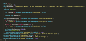
The most difficult part of our project, in my opinion, was the code to create our interactive chat div. Aside from it just being challenging code with many concepts we haven’t learned in much detail, we also struggled to figure out how to integrate both gibberish and the actual userInput results into one conversation. Thanks to Harry’s and Konrad’s hard work (Thanks so much Konrad for your help!), we were able to get the basis of the chat code figured out. And with Cici’s suggestion, figured out that it would be best to in general call the spitOut function (the function that spit out gibberish) for our index.html page, since that was the page with all gibberish responses, and then we could just call “userInput” at the point where we wanted the other characters to understand the user. We used conditional if/else statements to specify this by saying that if a counter for the number of responses was less than a certain value, we called the gibberish spitOut function, and if it was greater than that number, we called the “userInput” value. This code ended up looking like this:

Post-mortem/Takeaways:
Our final project differs drastically from our initial concept of having a Pokemon comic. That being said, our goal was to make our comic fairly interaction-heavy, which I think we achieved. Not only do we have scrolling elements and button elements, but we also used javascript to create and interactive conversation div where the user can type in their responses to the other characters. We also used js to have buttons link to other pages, as well as have button clicks change img src and the visibility of divs. All of these aspects make our comic very interactive, and I think keep it engaging.
Conclusion:
Overall, I am very happy with how our comic turned out. We made it very interactive, and I think conveyed fairly well the metaphor of our comic. I learned a lot through this comic project, including many new javascript functions such how to set up a scrolling function, how to employ button functions have alter multiple things on a button click, how to use conditional statements with a counter for our chat div, and much more. I like the concept of an interactive comics, because it allowed us to create multiple endings to our story, as well as show throughout the story (through changes to realism of the photos and the colorfulness of them) the importance of mutual understanding through continued interactions, even if this is the difficult decision. If I was to continue working on this project, I would perhaps explore a different/continuing narrative tract to explore other, more interesting avenues of the story besides just a single day in the character’s life.
Photo-examples of comic:


Three alternative endings depending on choices made throughout the comic:


