http://imanas.shanghai.nyu.edu/~hkg245/week01/Final%20Project/
In making my project my original plan stayed largely intact. The main difference is that, while I initially planned on making each data-point clickable, I chose to make the key clickable instead.
Concept: As someone passionate about public health, Internet Art with elements of data visualization presents an exciting opportunity to make global health issues better understood by a casual audience. Our attention to a disease is often not proportional to the danger it actually poses. In response to this I want to represent the loss of life by specific illnesses by the appearance of differently colored polka dots. Based on the number of people killed by a disease each year, a dot will appear in a color representing that disease. For example, every ~1.5 seconds someone dies of heart disease, so every 1.5 seconds a dot appears on the screen.
Process: My biggest concern in making my project was making the timing accurate. Initially I wasn’t sure how to accomplish this at all, but it ended up being a much simpler calculation and line of code than I expected. I used p5 to draw ellipses in particular colors and used if statements to dictate when to draw the ellipse.

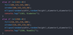
I used data from a 2016 WHO report that stated number of deaths caused by each disease that year. I then divided number of deaths per year by 525600 (minutes) to get number of deaths per minute. I then divided 3600 (the number of frames in one minute) by the deaths per minutes to get frames/death. Using the code above, I was able to make a dot appear after the correct number of frames. I’m very glad to have learned if(x%1350==0) because I otherwise would have struggled to convey the idea of “every 1350 frames” to the program. I also feel that this simple line of code is applicable in numerous other situations as well.
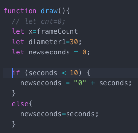
My biggest challenge ended up being the clock in the corner, which I had previously assumed would be easy to fix. My main issue was making seconds reset when they reached 60 instead of counting into the hundreds and making the time something like 03:135.
![]()
The two lines of code directly above displayed the time elapsed. Below is the code that eventually worked, after I sought help. My problem was that I was initially using one variable ‘seconds’ however in order to make econds “start over” and count again from zero after reaching one minute, I needed another variable “new seconds” to set it equal to. This seemingly simple exercise helped me to understand the iterative nature of the draw() function and how if-statements work when values are being manipulated.

For creating the key and making the information popups, I created a class key-values in which I created a separate div for each disease. I used onmouseenter and onmouseleave to queue functions that opened and closed the corresponding pop-up. This was also something that I initially didn’t know how to approach because I was initially only familiar with onmouseclick and oncmouseover, which both didn’t allow me to make the pop up disappear easily.
Overall I am pretty happy with the result because data visualization is something I find both very interesting and very important. However, I still think the project could be improved if I had more time by having multiple screen for different world regions, etc. Right now the project provides insight and comparisons between diseases, but not between different areas. While I feel I accomplished my initial goal, I think the project requires itself to be expanded upon in the future so as to encompass more data, which I am eager to do now that I understand how to approach the task.