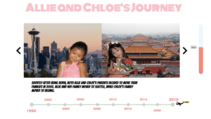
http://imanas.shanghai.nyu.edu/~cc5581/week04/interactive-comic/
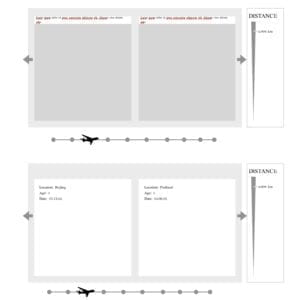
My partner and I began our Comic Project by first brainstorming and outlining our ideas. Once we both agreed we wanted to create a project which described our lives from when we were born (1999) until the moment we first met in class (2019), we started thinking about the layout of our website and how we could implement things such as a timeline, split screen with pictures, and stories about our lives. Once we finished sharing our ideas, my partner drafted an outline of our plans. In the image below, you can see a distance meter on the right side of the screen which tracks how far apart Chloe and I were each year of our lives that we decided to display with pictures. There is also an airplane which follows along a timeline. And lastly, in the center of the layout, you can see how the two images of my partner and I will be laid out.
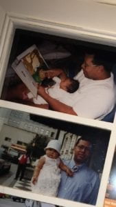
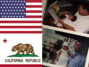
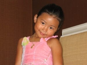
The next steps I took in my project was photoshopping my nine images for the panels. Some of my pictures such as my baby pictures in the first panel were too long for the size my partner and I had agreed on as the set size of the boxes which would hold the space for our images. So, rather than resizing my pictures, I combined them with another couple of images so that the size would not look distorted. I also think that these edits gave an additional positive visual for the audience as it helps them decipher my location just from looking at the images.
Towards the beginning of the project, I was incredibly sick with the flu. I’m thankful that my partner was able to begin the coding process and also seek help from friends who had prior experience coding for the more challenging pieces of code such as formatting and creating the base for the arrow navigation, panels for pictures, and timeline. After my partner and set up the foundations of the code, I was able to step in and add the panels for the timeline, insert images, write and insert the text, as well as work on the design, style, and layout of the page overall.
The most challenging part of the project for me occurred when I was working on the panels. The result of having 10 different panels was incredibly chaotic and repetitive.
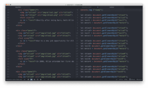
After writing the code for the first 2-3 panels, I decided it would be easier to copy and paste the code rather than retyping everything. But, this resulted in me making little mistakes by forgetting to change one number or one name and then having to take additional time to go back and look through my code until I found my error. Something I also struggled with while coding the website was figuring out why my ninth and tenth page wouldn’t show up. After meeting with Professor Moon and having his fresh eyes look through my code, he found that I had pasted the code for the 9th page after I had consoled out of the code. So it was luckily an easy fix, I think I learned that it is beneficial to have a fresh pair of eyes take a look at your code, especially if you’ve been staring at it for a long time—like me.
I would definingly say we reached most of our goals as a group. The layout of the page looks almost exact to what we had brainstormed a few weeks ago. I think if we had more time, I would have liked to figure out how to rotate the images; so if you clicked on them, they would give the audience a more detailed explanation of what was happening in each photo. Also, it would have been great to have the timeline below the split screens move with the arrows and adjust according to the panel the audience was clicking on/looking at.
Overall, I’m really proud of how this project turned out. My favorite page is definitely the second panel because, in my opinion, the image split screen of my partner and I is super cute and adorable. I also think it’s incredible how similar the pictures of us are. Lastly, while creating this project I feel that we both learned a lot about each other and honestly despite so far away from each other, we moved around about the same amount and also had similar upbringings.
