http://imanas.shanghai.nyu.edu/~asd526/week03/basic_website/index.html
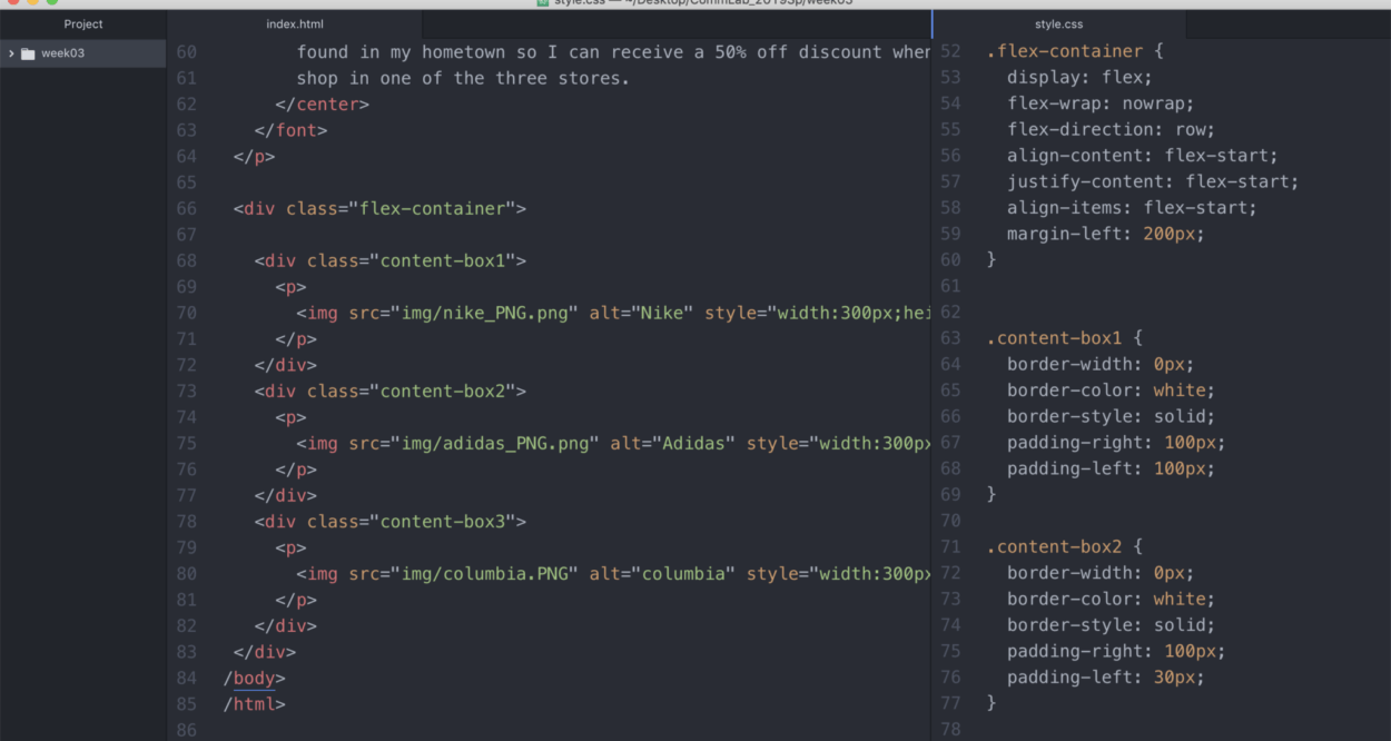
For this project, I wanted to build off of my first “about me” page that only used HTML and add style to it. I decided that I wanted to implement what I learned from the CSS exercise about utilizing flex-containers to arrange images. In my first project where we were only allowed to use HTML, I really wanted to incorporate three photos of the brands Nike, Adidas, and Columbia sportswear into my code and arrange them into a row, but I hadn’t learned how to do that yet. So, after learning how to use the flex-container feature in the second week of class I was finally able to arrange the photos of how I wanted.
I didn’t really run into problems using the flex and wrap feature, although I did have some troubles with the arrangement of each photo. Because the Columbia sportswear logo was a different size from the Adidas and Nike, the spacing looked uneven between the PNGs. I tried altering the margins and padding, but nothing seemed to be of much help. That is when I decided to separate the code for each box and try naming each context-box a different name (context-box1, context-box2, context-box3). Creating a specific style code for each content-box gave me much more flexibility, and I was able to adjust the margins and padding to my liking.
Another element I wanted to incorporate into my project was applying texts from Google Fonts and colors from Color-Hex. I found that this was a straightforward process and I plan on continuing to use both of these websites again in my future projects.
One issue I ran into during the beginning of the process was linking my style page to my HTML page. I tried rearranging the folder/style sheet name order, but I couldn’t figure it out. Finally, after asking one of my classmates to look over my code, she pointed out to me that I had a spelling error and actually had an extra “s” at the end of the document’s name. Something I learned from this experience is that it is beneficial to have an extra set of eyes look over your code because they might see something you were not looking for or were not aware of after spending so much time searching for an error.
Overall, I learned a lot from this first project. I think my most significant accomplishment was utilizing containers to arrange images. Not only did I use the container to create one row of pictures, but I wanted to make sure I mastered the code, so I did it with a second set of three images as well. Some other minor, but essential things I also learned along the way was how to adjust font size, center text, and use margins. Despite this being a pretty simple website, I feel that it is much more advanced compared to my first HTML page that did not utilize style.

