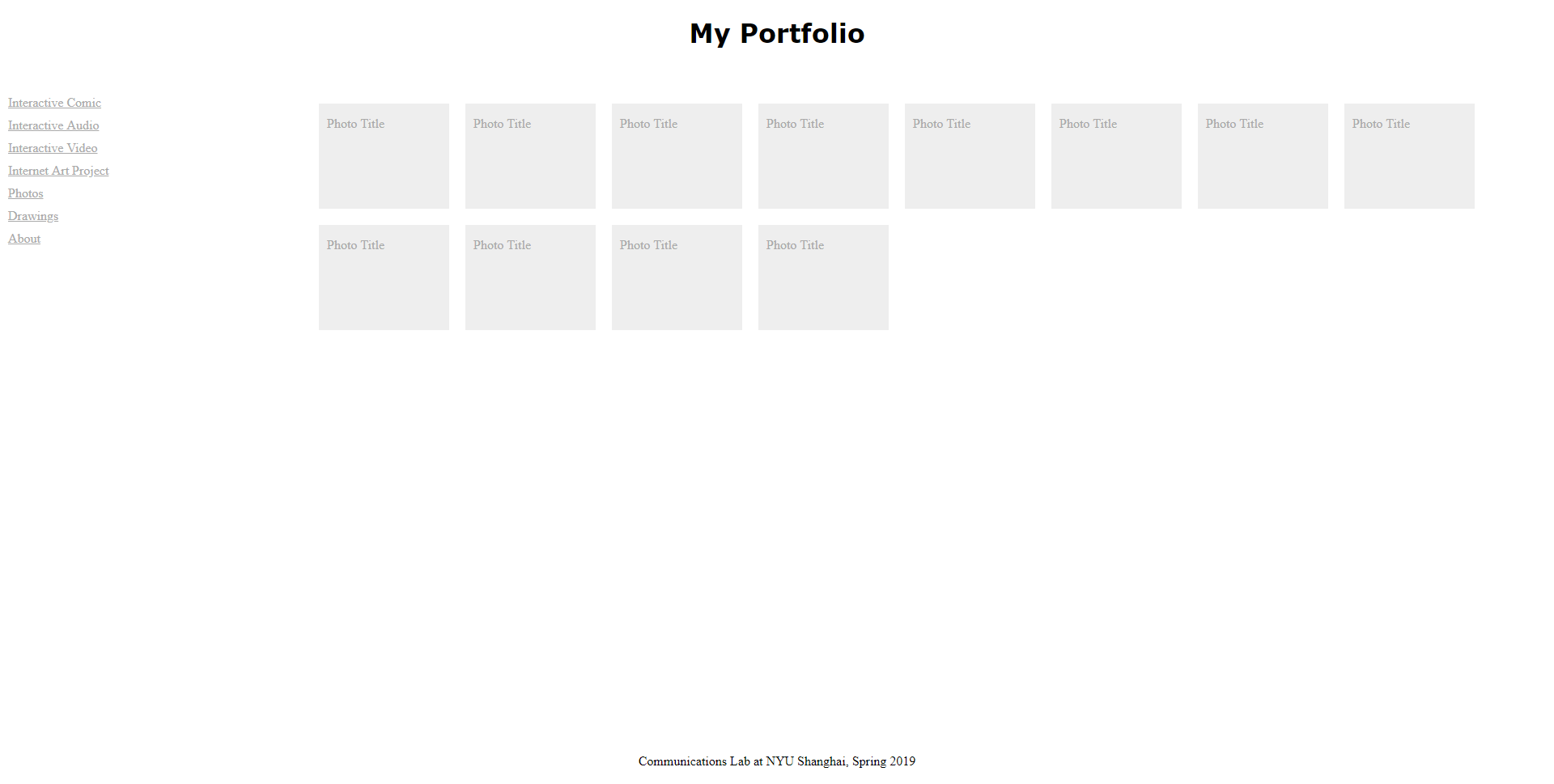
Click here for the link to the CSS design exercise.
In order to design everything correctly, I used multiple flex boxes in order to align everything. This was accomplished by using a single flex box for the header, navigation bar on the side, the “main content,” and the footer.


I specifically used the vw unit (view width; this measures the width of the viewing window) to make sure that no element moves vertically. I accomplished this by making sure that each “row” I wanted to make added up to 100vw. Therefore, both the header and footer are 100vw. The navigation bar and “main content” sections add up to 100vw. This allowed me to make sure all of the sections are organised and remain positioned where I want them to be.
However, the footer didn’t ground itself to the bottom of the page. I had trouble with this, and looked up a solution online. The CSS code I found made sure the footer would have its position set to the bottom of the page.