In this blog post, I will be documenting and comparing both of my physical color studies and digital studies.
Assignment 1
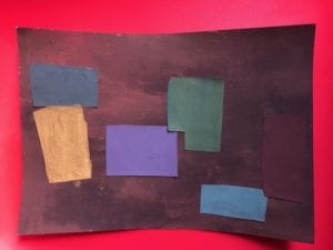
To be honest, I had no idea about my color choice and it was totally random. I choose brownish-red as my background. I created this color by mixing red and grey. For the rest of the color, I just mix them with the primary color along with grey or any darker color except black. Also, I used a lot of purples as well because it worked quite well with brighter colors. There is absolutely no meaning and symbolism behind this painting.
Assignment 2
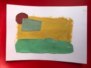
In this painting, I was trying to make a landscape. As you can see the green represents the grassland. The yellow represents the landscape and the mountains. The cyan color is the cloud. Lastly, the red represents the sun. I tried to mix them with white to make it brighter but it didn’t turn out as I would expect. I remain the border as white to give the overall painting a contrast element to the whole.
Assignment 3

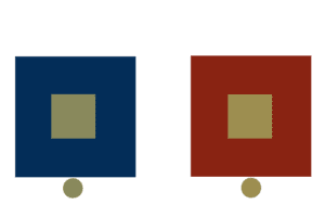
The first exercise is changing the brightness and I picked black for the center. The red in the first example will make black more stand out and make it seem more bright. While the second example, I picked brown which is a darker color to make it seem dull and dark.
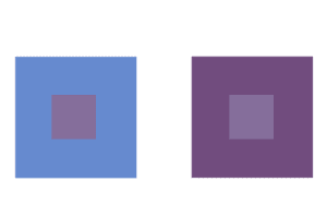
In exercise two, I will be changing the hue while maintaining saturation and brightness. I choose a light purple for both. In the first example, I picked light blue to maintain its neutral look. While the second example, I picked the purple which darker and more saturation. This will make the second example a slightly different color.
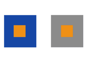
In the third exercise, I will be changing the saturation of the color. For the center, I picked orange. In the first example, I picked a dark blue to make the orange more intensive. While the second example, I picked grey to make as little change as possible to the orange.
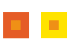
In the fourth exercise, I will be changing all of the elements that I’ve done before. In this exercise, I picked orange again. The first example, I picked a reddish-orange to make the orange more intensive in darkness and more saturation. The second example, I picked yellow to make the orange more intensive in brightness and less saturation. Since both appear to be a slightly different color, the hue appears different.
The last exercise can be challenging because it required the different colors in the middle but changing the border to make the same color. For the center, I tried not to pick colors that are different drastically. The first color in the left is slightly more greenish and the right is a more orange look. At first, I had no idea what color to pick for the surroundings. I can only figure it out by testing different colors on the color grid. I don’t think this is the best option that I can do because the center color can appear the same without looking at it closely. I guess in the second example the orange-red color will make the yellow-green darker and so closer to the first example.
Assignment 4

In the first sequence, I used colors from green to blue. When the color approach the middle it turned cyan.
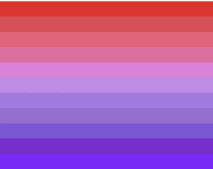
In the second sequence, I used colors from red to purple. The color turned slightly pink in the middle.

These two color sequences are complementary but instead of combining them as complementary colors, I match red with green and blue with purple. I think it will make the final sequence more standout and more contrasting look. The red and green reminded me of Christmas color which I really liked.
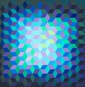
Assignment 5
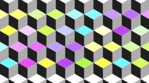
For the final assignment, I made a three-dimensional platform with duplicated squares. These individual squares are created with three panels and they are in the sequence of yellow, green, blue, purple and pink. Also, they are from lighter to a darker scheme. I purposely left the top and bottom corner white so there is this illusion that the cube is facing both up and down depending where you start. This is inspired by Victor Vasarely’s artwork called “Ion-11”. In his artwork, he makes the square in many different directions which confuses the audience of its direction. Also, it used brighter colors such as green, yellow, and cyan in the center. The outer corner, he used darker colors to make the center the focal point of the artwork.