Title: Eyeball
Collaborators: Phyllis Fei, Yutong Lin, Hoiyan Guo
Performance Video
Abstract
Eyeball is a Lumia artwork that provides a synesthetic stimulus of the audience’s auditory and visual experience. It is an abstract, immersing, real-time audio-visual performance in which a self-built optical installation and digital technologies are well combined and embodied.
Description
Eyeball is an emotional exploration as well as a materialization of our visual and auditory sensations. It uses water, paint, and light as main materials for visual production, corresponding to the audio in real-time. The performance starts with one single “creature” (we name it “eyeball”) tentatively wandering around in the space. The motion of the creature gradually transits from moderate to drastic, with the number of creatures increasing (from 1 to 2 to 4), and visual effects changing from light to dense and dark. The performance ends with the eyeball returning to its original appearance, moving slowly and calmly in the space again.
Eyeball ends at where it begins: purity and simplicity as a raw organic individual. It explores the interconvertibility between simplicity and complexity, meanwhile indicates how drastically external forces may impact on the subject. Through our eyeballs, we see the external, thus we sense.
Perspective and Context
I recall that Thomas Wilfred seeks for the “primitive visual experience” in light art. Wilfred believes in humans’ ability to perceive luminous forms and movements under natural circumstances. This project is developed from organic materials (water, paint, paintbrush, plastic drop, and flashlight), interesting and unexpected movements were developed by finding relationships among them. Unlike Wilfred’s work that reminds people of the aurora, I think Eyeball allows the audience to perceive in a microworld — it seems to be like a microscopical reveal of the cell division process. Nonetheless, it provides enough room for audience’s imagination and interpretation. The visual complexity (including the speed/range/style of movements, color scheme, and the number of creatures) is closely linked to the audio piece, while the music is also enhancing the visual experience.
Development & Technical Implementation
During the experimenting stage, neither leaves nor phone-microscopes worked out well with water since they together did not form visual consistency (I forgot to document them but from what I remember, I directly projected the water-in-sink with objects, without using any light source.). I feel that it should not be how “fancy,” “unique” or “abundant” the materials are that matters in this project, but how we make the best out of the limited normal elements — the flexible and tolerant feature of water gives itself much potential to work with! So instead of adding water/paint and other objects altogether to the large sink, I took the plastic bowl (which was originally used as a paint container) as the main material in which I can mix liquid inside (water + paint). This time I added light to create the shadow of the liquid, and got really satisfying feedback (see Figure 1)!
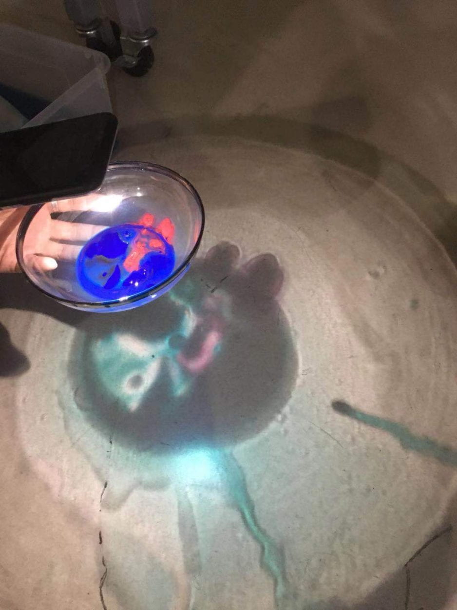
Then, by adjusting different portions of water and paint in the bowl, as well as the distance and angle between the bowl and the flashlight, I discovered more interesting and colorful shadows (see Figure 2), and our group agreed on using only liquid for the performance.

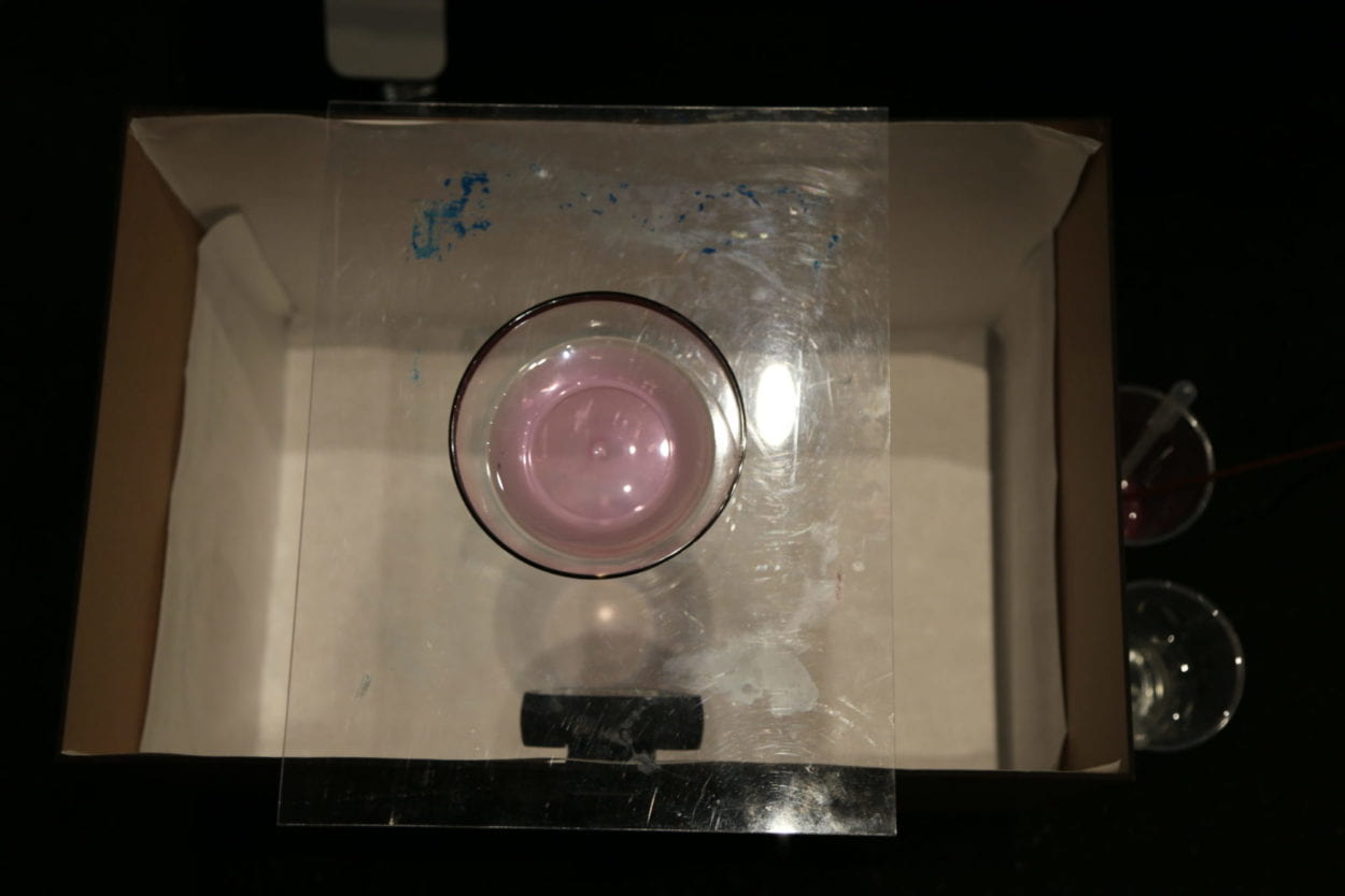
I built a simple (sketchy) setup with a carton, covered the inside with white paper, and made a hole to stabilize the webcam. To minimize noise from any other elements other than the bowl and liquid, I put acrylic beneath as a support for the bowl (see Figure 3).

Yutong and I laser cut a better box for the final performance setup (see Figure 4).
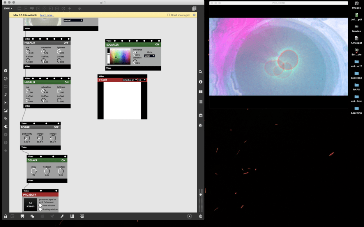
Yutong and I basically ran through every visual effect provided in Max and found some exciting results (see Figure 5&6):

On top of what we’ve got for the visual (lighter & darker style) and my experiments on what patterns I can get from different movements of the water, I realized that it is crucial to develop a storyline for the entire performance. The storyline design ensures the piece gradually builds up with more consistency in visual and sound, meanwhile, everyone is clear about what is happening next. So I spent quite an amount of time designing each scene, building connections among them, making clear what tool I should use and how the materials (bowl/water/brush/flashlight) should interact with one another, clarifying what Vizzie from Max may potentially support the visual, as well as what style of the music may better correspond to the movement and the visual effect (see Figure 7 for more details).
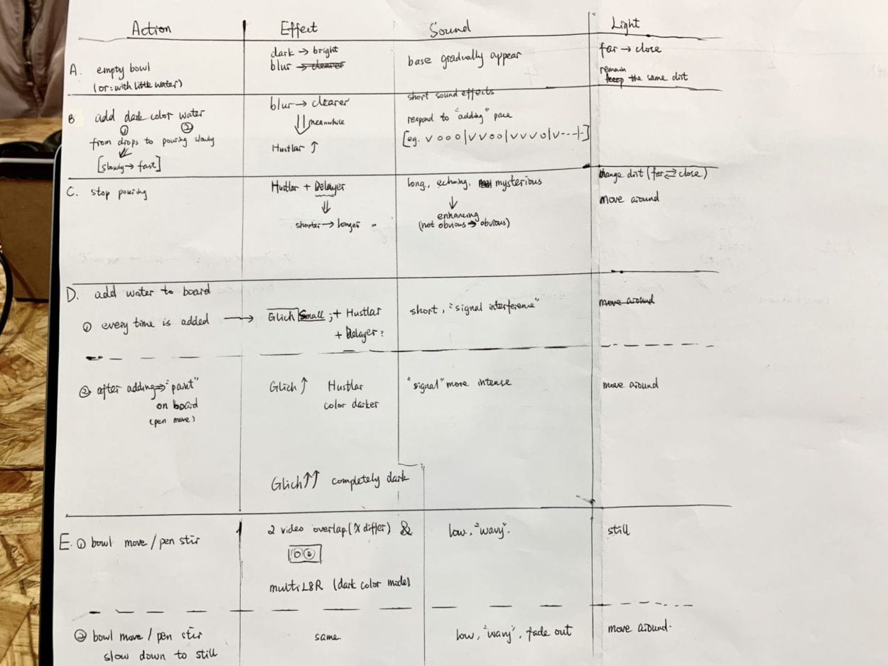
Then we discussed the storyline together so that Hoiyan has a better sense of how to design the music. Hoiyan and I discussed a lot about some key audio elements in detail: for instance, I expect echoing sound when delayer effect occurs; I expect waterdrop sounds when I use the plastic drop to add water; when I use the paintbrush to stir, I expect flexible short melodies, etc. Hoiyan designed the entire audio based on how she understands each scene, and we did some final small adjustments to the audio file during rehearsals.
Having the audio ready, we worked on how to put everything together smoothly. Yutong and I actively revised each parameter for our visual effects in Max: the color scheme, the delaying effect (at what time duration does it look best), X/Y offset for the climax part (which makes the four “eyeballs” centered and symmetrical, see Figure 8, 9&10), etc. I also did small adjustments to how I should move the liquid and light (rotating the bowl/adding waterdrops/stirring/flashlight movements and angles), to correlate with the music better.


Figure 11 is the final patch we used for the performance.
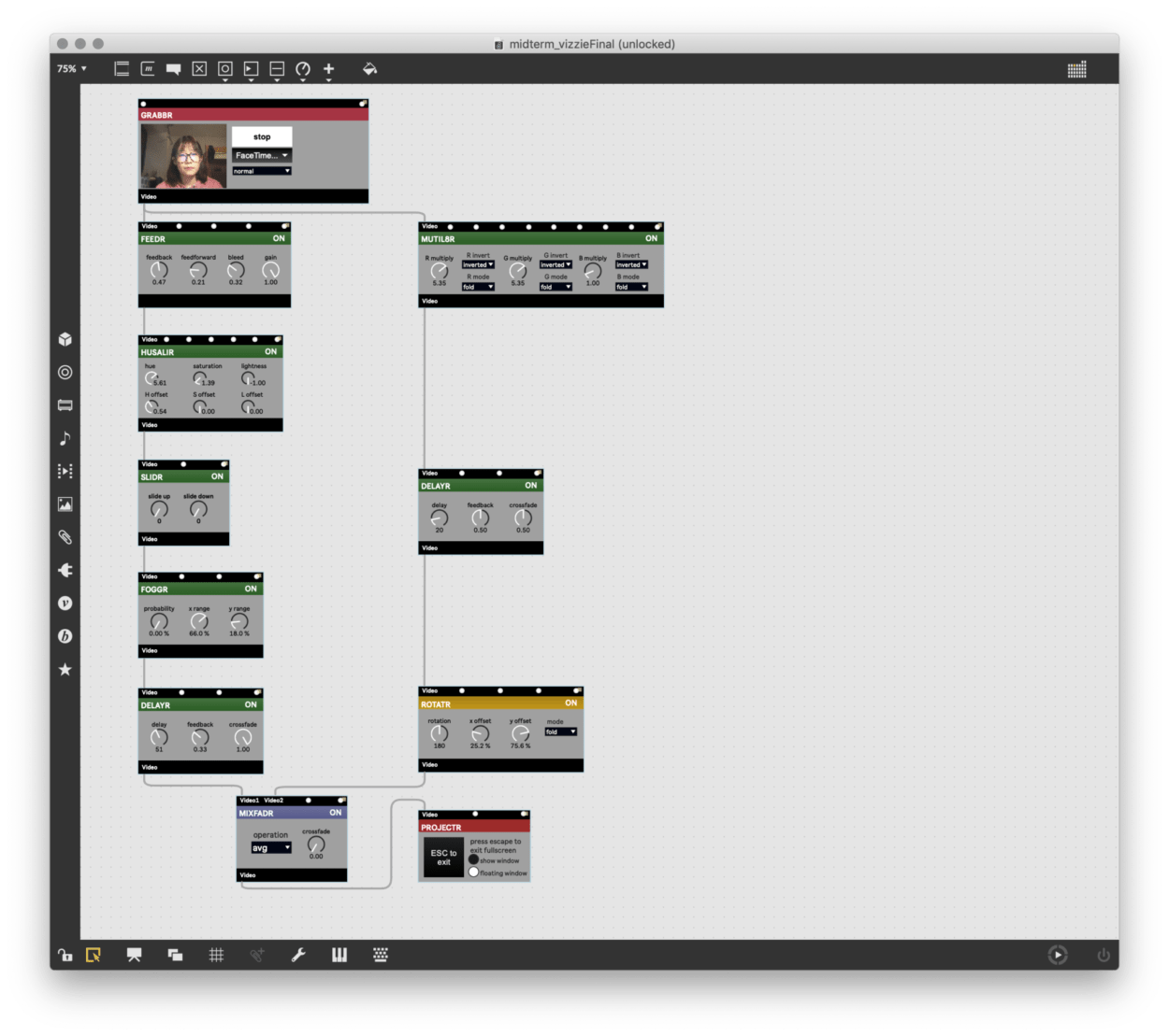
Link to the gist for Vizzie patch.
Link to the gist for Beap patch.
Performance
The performance went quite well overall. I really appreciate it that we performed in the completely-dark auditorium with a huge screen and nice speakers — it maximized the audience’s audio-visual experience. I also really enjoyed us performing as a group more formally, in front of some actual audience who are able to understand our work. The entire setting just made me feel more professional and confident in what I’m doing and what I want my audience to see and feel. I also really appreciate all the feedback from the class 🙂
Things that are unexpected… Although we’ve rehearsed many times, I feel like the final performance wasn’t at our best level. First, I guess it was because Max had been running for so long that it started to be stupid — being really slow and even made glitch on the projection screen at the beginning. Second, we forgot to reset the screen sleep mode, which resulted in getting black screens multiple times during the performance. Third, we made small mistakes in controlling light/water movements, midi visual and audio controls (we might all be a bit nervous…) In short, we could’ve done better!!
[I’m glad that it’s a group project — letting one person be a dj/vj/performer at the same time is just impossible!!]What We Failed to Achieve during the Performance
Conclusion
I absolutely have had a better understanding of the creation process of Lumia art through working on this project. I remembered how confused I felt sometimes when watching abstract films and earlier synesthesia/Lumia artworks, trying to figure out what the artists were thinking and why they embodied the music/visual in specific ways. Now I realize that it is more of a personal interpretation of feelings/sensations that may not even have any intuitive reasons behind it. The outcome (the actual artwork) might be really abstract for the audience to understand, but it is concrete to the artist. At least for me, this is how I feel about Eyeball.
Speaking of the performance again, I think it has a more solid introduction but a relatively rough ending. Eyeball has a quite long introduction compared to the proportions of the other parts. When the performance reaches its ending, the audience were still immersed in the transition/climax part. I think either deleting part of the music’s introduction or composing more for the ending will work. In this context, Eyeball will then be able to have a more detailed transition from the climax to the ending, so that the audience will be given more time to digest the scene. Eyeball will have a more thorough transformation from “crazy and extreme” to “calm and relax,” echoing the idea of “one ends at where it starts.”