Overview
Our project MUSE is an app gathering information about museums and exhibitions. It aims at providing accurate and comprehensive information. We provide users with a personalized tag-based classification system to help them find exhibitions instantly. For example, we have a tag called kid-friendly so parents who want to take their children to visit museums could select this tag and find educational exhibitions easily. We place the focus on the visual information of exhibitions such as pictures from the official website to increase the credibility of the source. In order to avoid being cheated by the over beautified pictures, all the photos on the introduction page are from official resources, and there will be the area of the museum in square feet and probably the amount of the collections to make up the limit of the picture.
Inspiration
The project idea actually originated from a personal experience. One day my friends and I were talking about going to exhibitions during the weekends, and they came up with several interesting exhibitions, but I had no idea what these exhibitions were and how they got the information. So I just nodded and agreed on the exhibition they finally chose. After several discussions with my group members, we found that it could be a universal problem for people finding an exhibition.

Market Research
According to the 2020 China Art Museum Industry Analysis Report, the number of visitors in 2019 was 41.36 million. The report also predicts that the number of visitors will continue to increase in the coming years as China recovers from COVID-19. On the one hand, this tells us we have a large potential user group as well as the exhibition-related app has a promising future. Then we conduct further market research, through our investigation, although the potential user group is huge, there are few apps providing users with a good channel to the exhibition. Compared to the total 41.36 million visitors, in 2019, the museum-related app with the largest user base: iMuseum has only been downloaded 586,123 times, counting for only 1.417% segmentation of the potential users’ group. This means the competitors’ rivalry is weak and is relatively easy for us to enter this market. Thus, we decide to create an app targeting museum visitors.
Competitor Analysis
To know more about our competitor iMuseum, we analyze its download time in 2019. At first, we thought the decrease in download times was because of the virus. Surprisingly, we found that in 2019.2, iMuseum suffered a sharp decrease in download times. This is before the COVID-19 so the loss of users is caused by other factors.
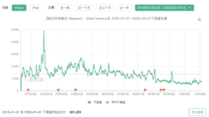
To study why it fails to engage a large user group, we go through the user review in-app store during that period. We notice two issues. First is users sometimes lost in the wide range of information. iMuseum provides users with information, but they lack a good filter for the user to select. To improve their shortage, we design the tag function providing a user-friendly experience. If you are a mom, we provide a kid-friendly tag. If you are an office worker, we provide weekend-open and open-at-night options. Our slogan is “whenever you use our app, you can find the exhibition we like”. The second weakness is its pictures and text are separated. Users mentioned although there are a lot of photos, there is no text introducing the exhibits in these photos. To improve this, we integrate text with pictures helping users know more about the artifact. Our tag function and visual design are where we stand out.
Survey
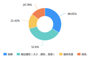
Next comes the survey. We did a two-round survey. In the first-round result, the pinpoint was revealed again. First, visitors want to see the exhibition but cannot find the exhibition they want to see, because the exhibition information is too scattered. And again, we confirm the user’s need that 83% of them wish there can be a channel where they could find a summary of exhibition information. Second, they also hope the app can provide a credible but also easy-understanding guidance of the artifacts.
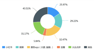
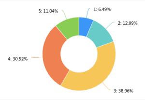
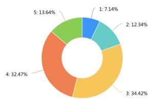
In the second-round survey, we collected 138 results. After information Integration, we found three problems. The first problem is the fragmentation of exhibition information. Official public IDs, self-published tweets, and friends’ recommendations all account for a large proportion of available information channels for users. This leads to the fact that users can only see part of the exhibition information in each platform, but cannot see the comprehensive information. Only 10.22% of users are quite satisfied with the existing platform. 60% of users feel that the content of the platform is not sufficient and some exhibitions cannot be searched on the platform.
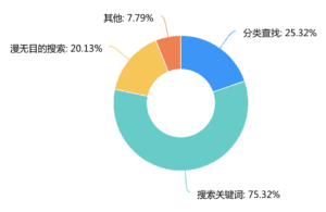
To solve this problem, we decide to build a single platform to provide users with all the exhibition information. The second problem is users feel that the existing exhibition information is not that comprehensive enough. Because the existing profiles are mostly provided by a single channel, users respond that they need professional, objective, reference-oriented exhibition evaluation and introduction. Only 9.49% of users felt that the actual exhibition they saw was comparable to what they knew beforehand. Based on this, we intend to introduce the post function written by other users who have been to the exhibition before. This can provide more objective and comprehensive information about the exhibition for those who have not yet visited. The third issue is the classification and timely pushing of information. Only 14.49% felt that the existing search method could find the right exhibition quickly. We received feedback that information categorization is needed. We also received feedback indicating that information about exhibitions of individual interest needs to be pushed more actively. Based on this we decided to add a tag function and also alert users of upcoming exhibition information.
Interview
After the survey, we also conducted 17 interviews. 13 of them have a demand for/already using an integrated informative museum app, 9 of them have a demand for a more personalized/filterable museum app. Below are some representative comments from our interviewees.
Person one: “就其实我主要信息来源也就只有小红书啊点评上关注的博主或其他去过的人的贴文,但关于展本身的信息比较少(或者没有)”
Person two and three: “查找信息费时费力,没有时间。会希望有更多资讯,可以推出人流量数据,避免人太多” “希望更私人定制一些,不要虚假宣传,照片能更有全面性”
Person four: “平常应该一个月去一次吧,公众号我不会常看,但有时间去搜寻信息的时候,常常找不到合适的。至于app的话,希望推送能及时,也能推荐附近的展。”
Again this echoes the three problems: fragmentation, incompleteness, and lack of classification of exhibition information. Based on these findings, we start our further development.
Iterations:
I–an application that integrates and categorize exhibition information
Based on our first round survey result and interviews, we came up with the conclusion that the pain point of our user lies in the fact that all the information about the exhibition is too scattered and sometimes not authentic enough. Building on our defined pain point, we came up with our first round solution– an application that integrates exhibitions from all sources (both the official channel and visitors reviews). In addition, since our target users don’t want to spend so much time on searching for exhibitions, we want to categorize the exhibitions properly so that they can find an exhibition that caters to their needs within several clicks.
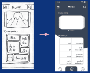
II–in addition to integrating information, having precise tags to be more personalized.
After doing several rounds of user testing, we realized that the categories we originally defined were not user-friendly enough. Originally we were using conventional categorizing methods (solo/collective/retrospective exhibitions). Unfortunately, the users had no idea how to continue with them. After conducting and reviewing our second-round survey result, we found that what users think of when searching for an exhibition to go is actually the theme of it rather than the type. To categorize the exhibition that fit their needs, we searched for all the exhibitions on display and categorized them by themes( such as art/sci-tech/kid-friendly). In addition, to also shorten the time searching, we added a filter function that can filter by tags we defined that fits the need of our target users (open at night/on weekend). We also worked on the description page so as to make it simple enough for the users to make decisions quickly.
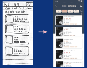
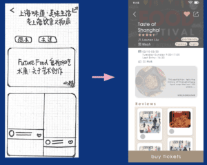
Nonetheless, since we skipped the low-fidelity digital version and turned to relatively high-fidelity one right away, it seems that we have been focusing too much on the detail of interaction rather than the general user flow itself. For the next iteration, we will conduct a new round of user testing so as to identify frictions within our current design.
Further Development
- Modifying home page (simple and clear)
- Posts and Review section (to create a sense of community)
- Confirm and enrich the tags of exhibition
- Highlight terms that will help strengthen the understanding of the exhibition, and make the highlighted text clickable.
Citation:
2020年中国美术馆行业分析报告-行业运营现状与发展趋势预测. baogao.chinabaogao.com/qikantushu/398090398090.html.
