Project: Room
Date: 04.07.2019
Processor: Moon
Description: Room is an P5-based interactive project, featuring a 3d dark room which could be light up by three dots of light. The user interaction is as simple as moving their mouse to control the light so that they could see what is in the room. The scale of space being lighted up is directly proportioned to the distance between the three lights(as how it would be in real life). By moving the mouse, user can change the sight of how they perceive the 3d room to imitate the feeling of turning around in the space. Additionally, users can adjust the brightness of the “light” to interact. Room is expected to create an immersive user experience.
Process:
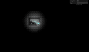
My idea for this project is to create an immersive 3d space where user could control something to light up the room with really simple interaction. To build up the project, there are three parts involved: SOURCE OF LIGHT(object), LIGHT(glow) and SPACE TO BE LIGHTED UP.
Lights:
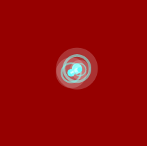
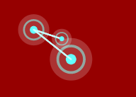
Considering the source of light, I chose a traditional way of lighting things: light bulbs, yet a unconventional way of design. The light bulb is designed to be blue and consists of three circles sticking together. To make the lights more organic, I created the effect of three dots of lights rotating around one another at the position of mouse, by using the “attraction effect”.
Glow:
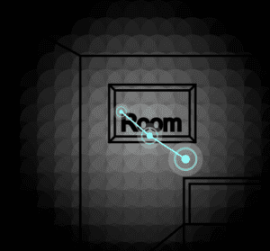
After I finished the part of light, I moved the part of “glow” for actually lighting up the room. I created another class called “rect” to push all over the canvas. Then by checking the distance of each rect and the middle bulb and map the color of the rects with distance being checked by, I faked the effect of light glow. The visual was later changed to ellipses according to feedbacks I got during presentation.
3d Room:
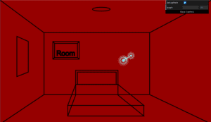
This part was the most frustrating, for I have to do all the calculations by myself to fake the effect of 3d room in the 2d canvas. At first I thought maybe a png could help, yet later found out to create an immersive experience, I have to draw it myself so that the space could also be interactive. It took quite long time to do the perspective changing effect which later result in quite simple room with little furniture. Yet the overall effect is really realistic and I am quite satisfied.
Debug mode:
For my own convenience, I add the debug mode of changing the background of my canvas red so that I could directly see how my room looks without lighting it up with bulbs while writing code. I also add the part where user could adjust the brightness of light to control the scale of the space being lighted up.
Difficulties:
I met some difficulties with faking a 3d space. Originally, I am thinking about mapping those rects as being rotated as below to achieve such effect.
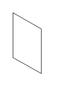
Yet the webGL turns out really slow. Later suggested by my friend, I decided to drew the 3d space myself.
I also try to make the rects really small so that the glow could be more natural, which also slows down my computer and I gave up on this trial. Later during the presentation part, I changed the rects to ellipse so that the edge of the glow would not be so pixeled.
Feedback and future development:
During the presentation, I got some really helpful feedbacks and suggestions. As mentioned before, I improved the glow effect. Some other suggestions are making it more clear that the room is also interactive and adding a background story to this project, for example the three dots of light are actually my friend without which I would get lost completely.
Overall, I am satisfied with both the interaction part and the visual part. Yet I do want to make the project more playful. For development, I am thinking of adding more space(more furniture and multiple rooms if capable). Additionally, according to one feedback I got, I may add some pop up scenes to make the user experience more interesting.