Assignment 1
I chose grayish blue as the background and mixed a little green somewhere. As for the collaged color shapes, I mix bright colors like red and yellow with gay to make it dimmer. I also used purple to make broad hue representation.

Assignment 2
I chose blue which is my favorite color as the background. Then I used bright red and yellow to represent the sun and sunshine in the blue sky, and the muted color green is a tree. However, what I did not do well was that the value range was not broad to present the contrast between chromatic and muted colors.

Assignment 3
This is the assignment I found very interesting and difficult to experiment on the change of colors. I tried several times on the interaction of colors and failed a lot.
(1) This beginning was not too hard. I put a medium gray in the middle and selected lighter and darker backgrounds, to emphasize and reduce the darkness of the central gray respectively so that they appear different brightness.

(2)At first I was confused about how to only alter the hue without changing the brightness and saturation. Then after some failed experiments where either the brightness change or the saturation change was more obvious, I started to ponder. If the central colors only have hue variation as they appear, does it mean the backgrounds should also change the hue only? Then I finally got a satisfying result. Although not very obvious, the purple on the left seems bluer than the right one, but they stay the same brightness and saturation.

(3) I used two opposite colors blue and yellow as the backgrounds. On the left, the blue reduces the saturation of the purple center, whereas the yellow on the right gives more stress on the purple, making its saturation bigger.

(4) I also failed a lot of times on this exercise. The deep green background makes the central light green a bit yellow, as appears on the first screenshot of its similar color. The yellow background makes it greener, appearing similar to the second screenshot. So the central color varies in all the three factors successfully.


(5) I selected scarlet with a little gray as one background. So I thought the central color should be dimmer than usual. Because dim red, as a contrast, would upgrade the brightness of its central color if it’s brighter than itself. So I used camel which is neither too bright nor too dark. And put a brighter camel within the sky blue surrounding.

Assignment 4


I first made a cold-color styled sequence gradually mixed with warmer colors. I adjusted the colors in the middle with less saturation and value, but added more when the sequence gets to the end. Also, the reason why I added warm colors is that I want to mix it with my another warm color sequence while the start will have a more contrasting effect with the other sequence.
I also experimented with less change in hue, value and saturation on the right. They are all highly muted colors.

I created the second sequence with all warm colors: red to yellow. And the saturation and value are also gradually decreasing. This is a sunset effect sequence that I really like.

When I mix the two sequences together, it seems to give me the view of sunset on the sea. On the top the sunlight is harmoniously mixed with purple, red and pink. When looking down, you can see darker blue. The yellow at the bottom is stressed by the sea colors. Generally, it presents two kinds of interaction among colors: mixing and contrasting.
Assignment 5
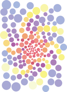
I painted spirals of two kinds of color sequences. One is formed by colors from pink to yellow, and another is formed by colors from pink to purple. When the colored circles accumulate in the center, the colors of two sequence would merge, while on the outside, the colors are distinct. The first sequence of warm color looks like a flower blooming. The colors interact and mix, creating a harmonious picture.