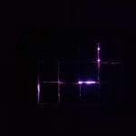
Title: Rip
Project Description:
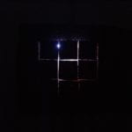
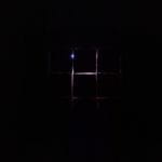
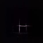
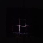
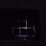
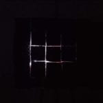
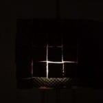
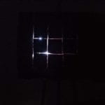
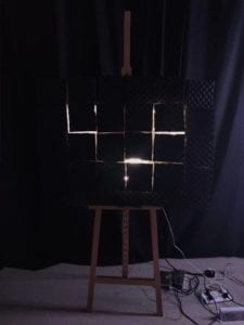 Rip is a kinetic light project, built and developed upon the idea of “abstration art” and “time and speed”. Audience should experience Rip in a room of total darkness so that people can get a more direct idea of space rip as the light appearing and disappearing. The project is intended to be self-explaining and intriguing with its movement and basic shape of rects.
Rip is of a easel scale. It is two-layered with the bottom layer of light source and the top layer of lots of rectangles forming a puzzle plane to prevent the light. Light source are digital light stripe. Lights are coded according to different rectangles. They are intended to form different light patterns with the movement of the rectangles. Kinetic part of the project is conducted by 12 solenoids which are coded to push back and force to control how many lights are shining out round the shape of the rect being pushed out (how thick the light strings are). The time and speed of pushing out the rects are somewhat random. Which rects are pushed out is also unexpected by the audience. There would not be any music except for the sound of soldnoids.
Perspective and Context:
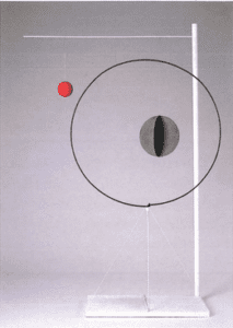
In the article of Century of Kinesthesia, the author discuss the “field of abstraction” in which he refers to several conceptual artwork that do not try to explain something beyong what it is. “Object with red ball “, for example, plays around with things in the universe, which is “obviously models of universe”. How artworks are valued is based on the feelings conveyed rather than over interpretation.
Alexander Calder
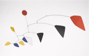
In the section of “Lineal and cyclical(or speed and stability)”, GuyBrett talks about the instability revealed through time and speed, which he refers to as “one of the achievements of kinetic light”.
Esther Stocker
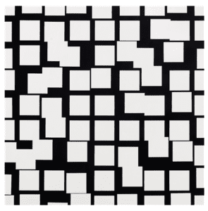
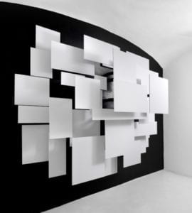
Esther Stocker is an Italian Artist who is really good at visualizing the concept of space through basic shapd like rects and lines.The way he simply place several rects on the black board and gives space to imagination and feelings of real time. The different layer of the rects gives an intention of moving while being static.
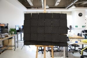
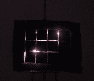
Rip, as inspired by the two artists, follows the design of rectangles which despite the simplicity, has tons of possibilities. Similarly, Rip is exploring the concept of “abstration art” and “time and speed” in its experiment of light. “Kinetic” and “sculpture” seems to have a charm when are are combined together. Rip is intened to create an unique experience of movement and light for the audience. The randomness of the movement and speed adds to the unexpectation of the project, which is also part of its charm.
Development & Technical Implementation
Problems & Solutions:
Nearly every part of the project have went through the process of meeting a problem and finding a solution. During the process, I improved my soldering skills and became more comfortable with digital fabrication.
solenoid:
Problem: The first time I saw solenoids, I knew I would develop a project with them. They have direct movement of pushing back and forth and the sound they make is really interesting. The first challenge I met is to install them on a board. My original idea is to dig a hole in the board which is exactly the size of the solenoid. Yet it turns out really unstable.
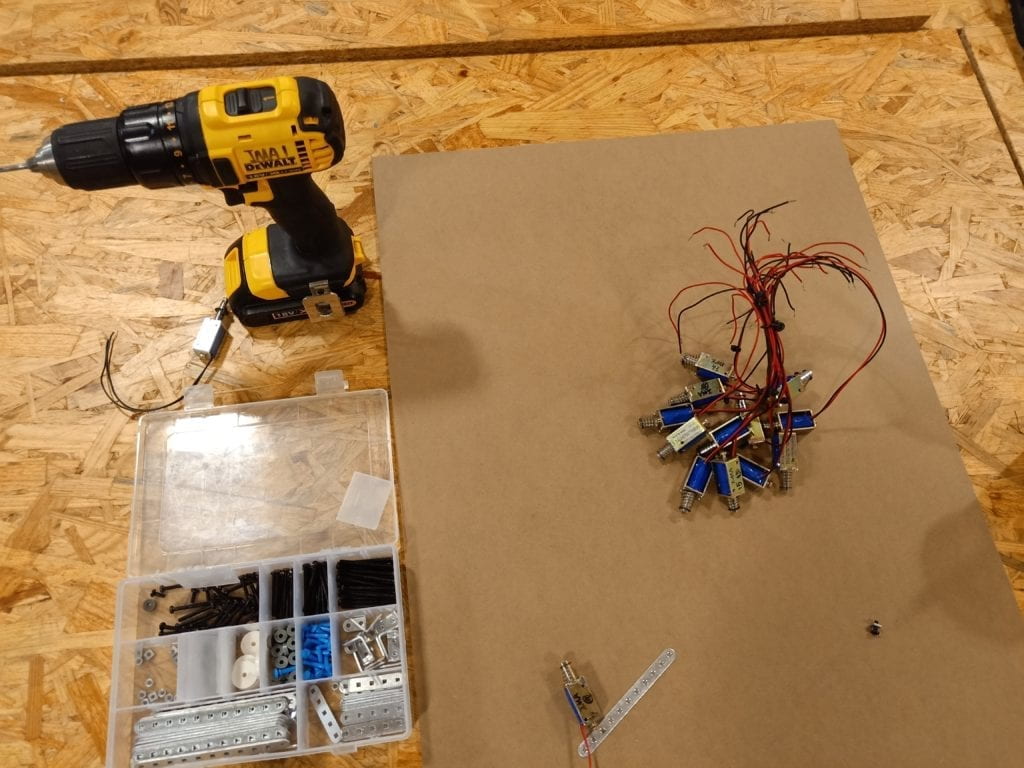
Solution: Eric suggested a more mechanical way of doing it. I then design a holder using screws. Which however leads to the second problem.
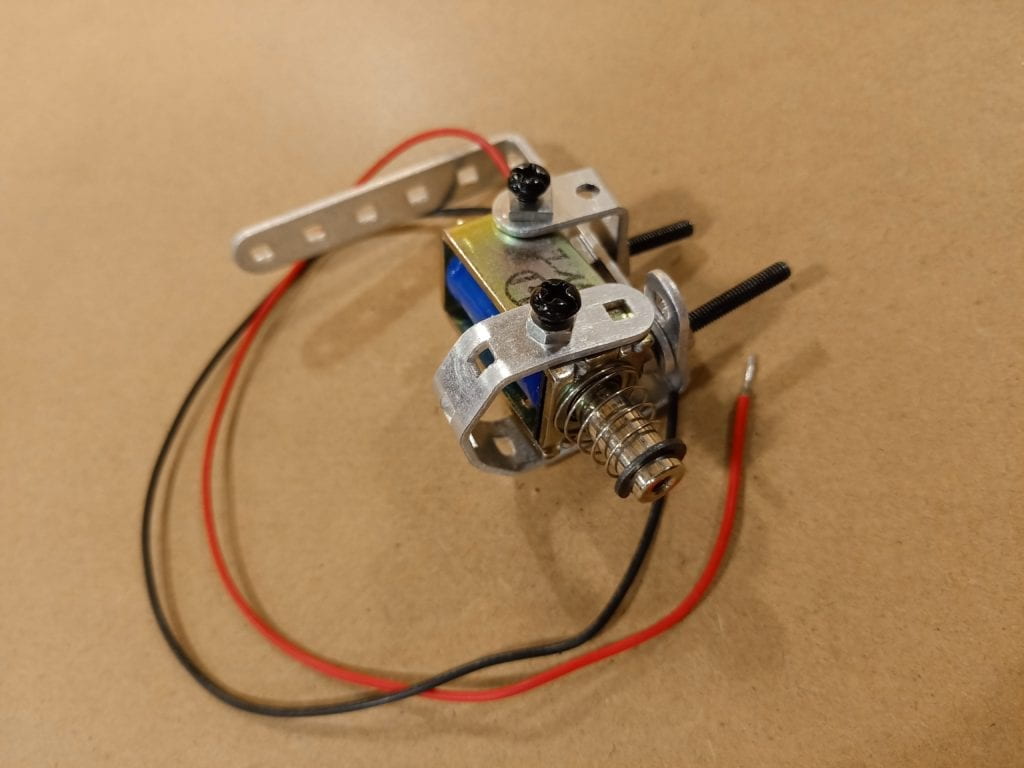
Problem: I accidentally screwed too hard and made a hole in the solenoid which completely broke half of my solenoids.
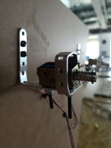
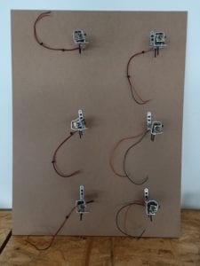
Solution: I then used the solenoid borrowed from Eric and rebuilt the holder. This time I was very careful so that I would not broke them again. After testing each of the solenoid, I screw them on to the board.
wire connections:
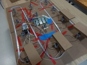
Problem: The second thing is to connect the wire and make them work together. The problem is I have 12 solenoids and to make them work together, I need a lot of wires which would definitely be a mess if I use the bread board.
Solution: I decided to use a perfboard and solder all the connections.
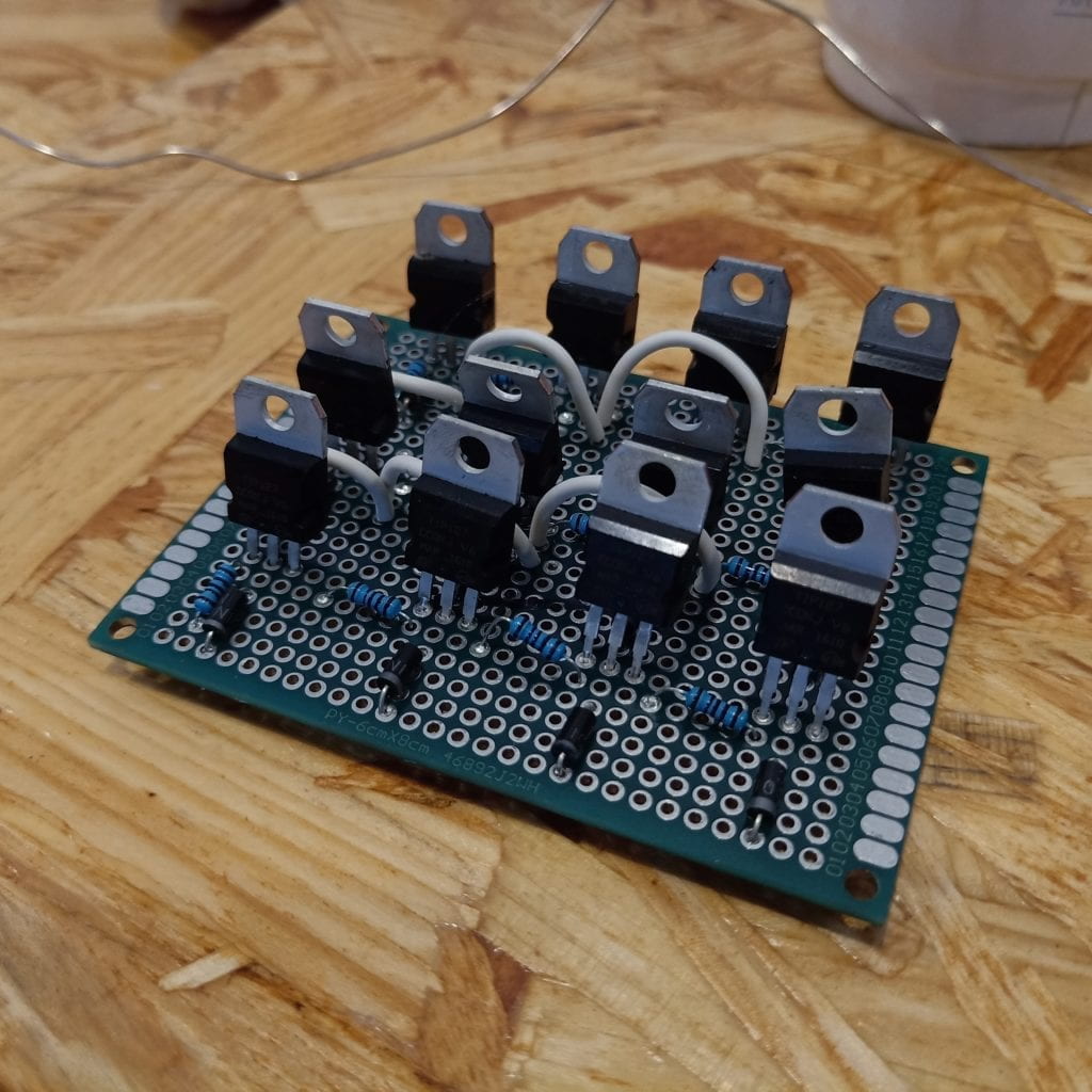
Problem: This however doesn’t work out because I was not using the right conponents for the solenoid and the power supply I was using could not handle enough “A” of the circuit.
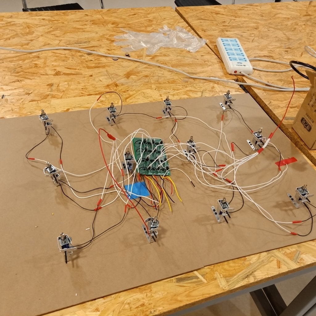
Solution: I have no choice but to solder all the connections again, this time I chose a bigger perfboard and make the arrangement more clear. I connect them to the 12 solenoids. Also, I change the power supply and it works as I expected.
rectangle plain & board:
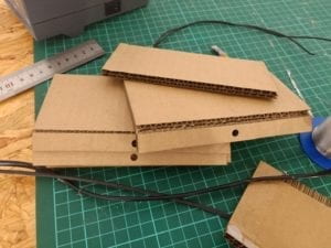
Problem: I finally got to the part of adding rectangles to solenoid. I bought a special material for this on Taobao yet found it is thicker than the length solenoid can push, which could not work with the idea of when rectangles are pushed in, there would be room for lights to come out.
Solution: I then brought a thinner version.
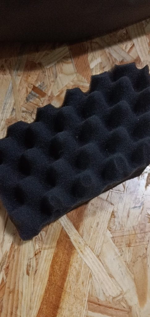
Problem: However, I didn’t realize that the thinner version is not strong enough to keep in the shape of a plain.
Solution: By adding a layer of cupboard behind it, I solve the problem.
Problem: Now that I got the material be in the shape of a plain, due to the connection I designed. Rectangles would lean to one side for the thickness of cupboard does not fit into the solenoid.
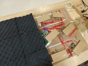
Solution: Eric helped with 3d modeling and printing a connection to fit into the solenoid which I could also screw in.
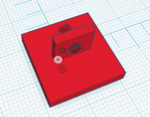
Problem: Finally, I got all the rectangles connected to the solenoids. However, while testing, I found that when I make the board vertical in the way I wanted to present. Due the gravity and the fact that I did not measure well on the board(the distance between solenoid is bigger than the length of the rectangles I cutted, which means if I want to make sure all the rectangles touch one another to cover the lights, the connection point between the rectangles and solenoids are not in the middle of rectangles), the rectangles rotate when they are pushed and there are no support on side.
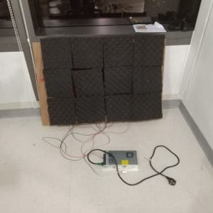
Solution: Given the difficulty of measuring the key point of the rectangles, I thought it would be easier to redesign the board. I lazer cutted two holes for each of the solenoid so that there could be multiple connection between rectangles and the board. I rescrew the holes on board and reconnect the solenoid to this second board. I could not get the little 3d printed connections off the cupboard behind each rectangle which I conneted using hot glue, so I redo the 3d printing agin and recut the cupboard support and restick them to the rectangles.
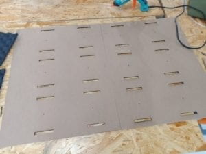
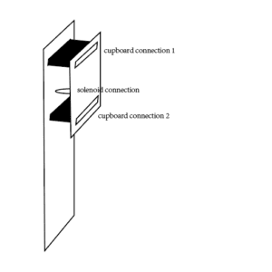
The redesigned connection model is illustrated below.
lights:
Problem: After I hang the board onto a easel so that I could present, I tested with the lights I added before. I found that due to the material, the friction is too big for the solenoid to get back to the original place after it pulled in.
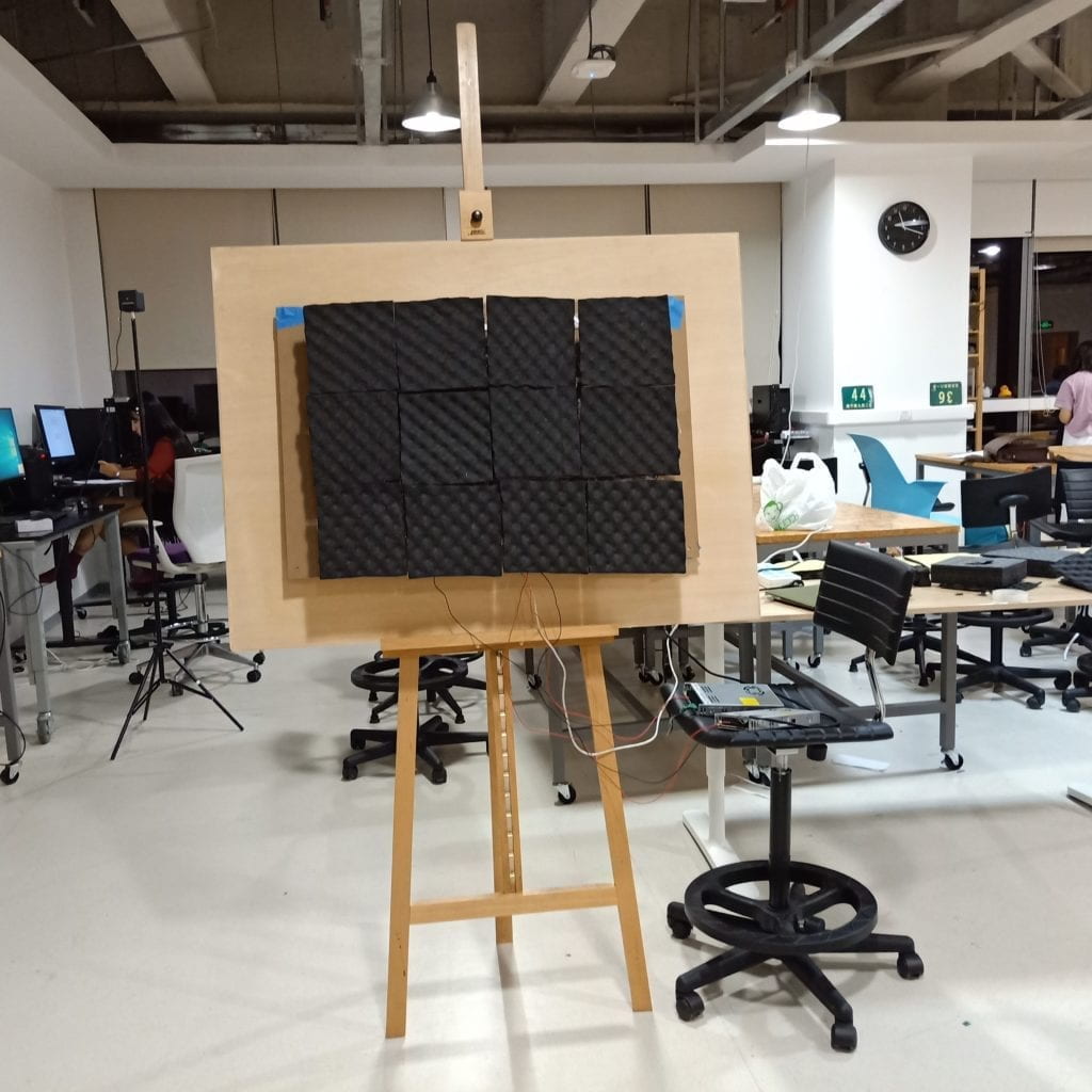
Solution: I cutted the edges of those rectangles to decrease the friction.
Problem: Another problem occered: though the rectangles seem to connect with one another slightly, there would always be a gap between even they are not pulled in.
Solution: Eric told me to code the light according to rectangles to fake it. I also add another ring of rectangles to cover the whole easel to make it look better.
Function:
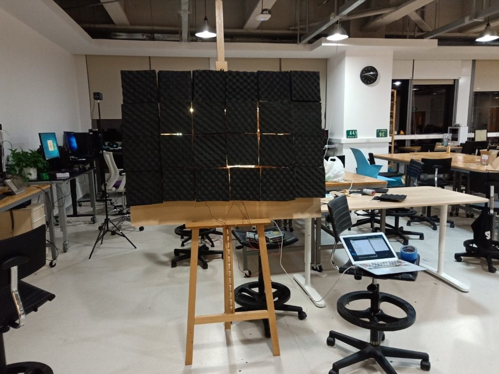
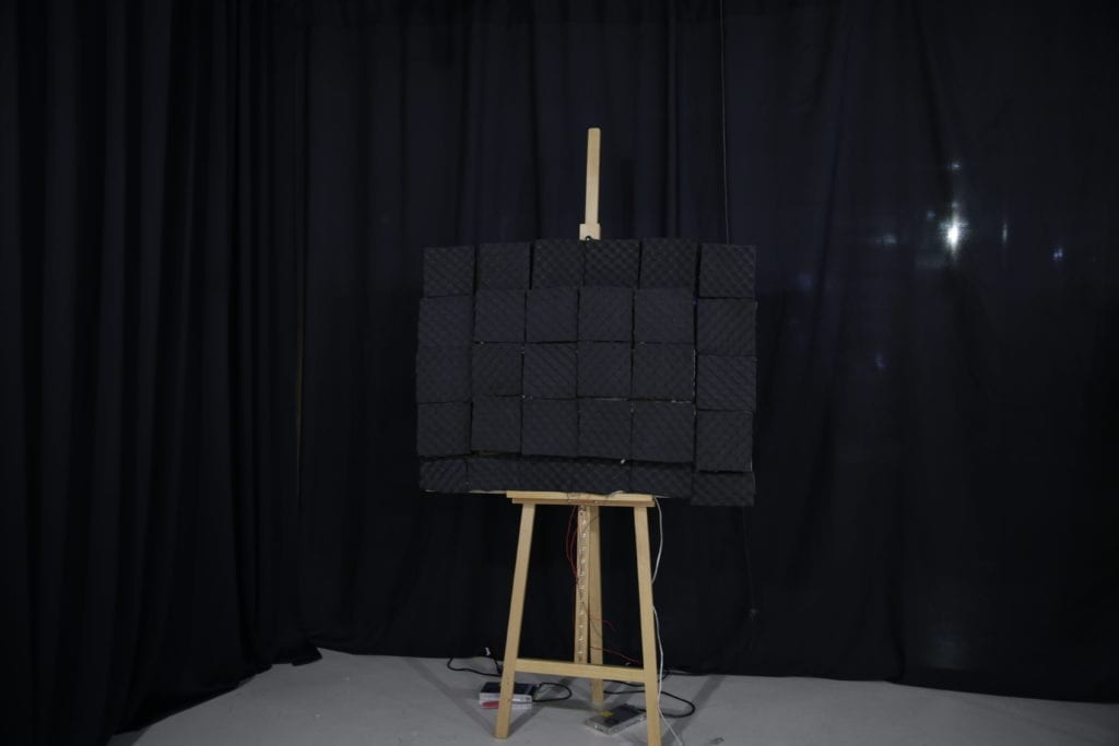
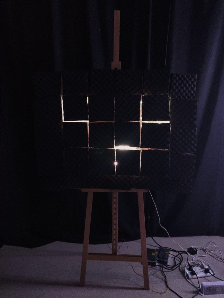
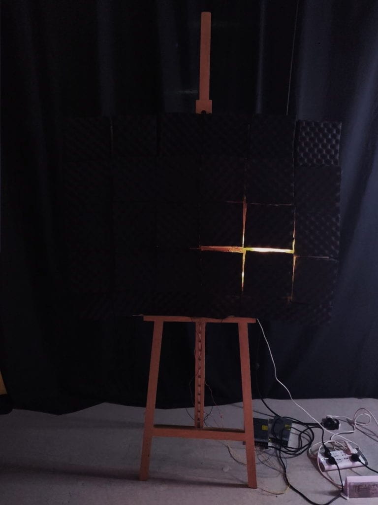
The basic structure of Rip is a board of 12 solenoids, each conneted to a black rectangle that can be pushed in and out. Four as a group, the 12 rectangles are connected to three pins that are coded to move. Lights are shine in groups of rectangles with different colors. Together they form the performance of Rip. Audience would experience the project in a complete dark room with only sounds of the solenoids.
https://youtu.be/7L4LML5mbTY
Presentation
The presentation in class happened in the 826 studio during which I present with only 3 patterns of light(according to the 3 pins). I got some feedbacks expecting more patterns of light from the class.
The night after inclass presentation, I wrote each rectangle a function of light so that I could use. I also added some effect of fading in and out the day after. The IMA show went well with darker environment than in 826. Though not ideal with so many light projects around. The stand beside for a while to see how people react to the project. Most of the time, they would not notice the project at first for it is not bright enough to attract people immediately. However, when they were watching some other project and suddenly heard the sound of the solenoids, they turned to Rip and watch. Some people would walked closer to make sure whether it is the source of the sound and got shocked when another sudden sound was made. Some children try to hit the ones that are pulled in as an interactive game which is something I did not expect.
Conclusion
Overall, I was pretty satisfied with how it looks for now. Thanks Eric, JingYi and all the other fellows for helping with all those weird problems I met during the whole process. Thanks Shalia, Xiangxi Chen and Lijun Xiao for helping. The development of Rip includes hours of soldering and rebuilding and redesigning, during which I really learned a lot with soldering with perfboard and digital fabrication. It is my first time build a project of such scale and the process felt really tough but rewarding. It took a lot of effort to work with all those conponents and put them together. Yet it took even more effort to “hide” all of them and make the project as concise as possible. Also the nights spending in the lab with other classmates are truly a precious memory for me.
However, there do exist room for improvement. As for now, the physical part is not strong enough. the outer ring of rectangles sometimes fall off the board and connections between the board and the rectangles are not strong enough. Also the movement is not clear enough. For future improvement, these are the first I would try to solve. Some other improvements may be to decrease the thickness of the project. A better structure should be designed to get rid of the gap between my board and the easel. Also, I would like to have all the rects at the same level but not the outer ring stays closer to the easel as they do now. If possible, I may stick to my original idea of having Rip be the scale of a wall to have better visual performance.