Name Haoyu Gao (Rosie)
Instructor Eric Parren
Assignment 1 & Assignment 2
Reflection
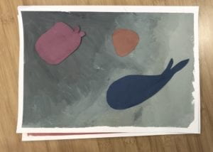
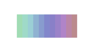
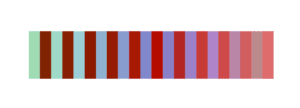
As a first touch of the concept of saturation, hue, and value of colors in the form of real-life painting, I have to admit that the joy of working with paints the first time took my concentration away from the requirement and the purpose of the assignment, that I spent too much time on the assignment 1 and failed to use the same design for assignment 2. It was also challenging to make the colors in my plan on actual paper, and after pasting colors to the background, the way they interacted with each other also went out of my expectation. It seems like colors in similar saturation range are more likely to form a great harmony with each other, though I failed to keep it in assignment 2.
Assignment 3
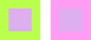
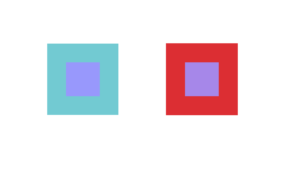
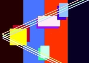
Try to make a single color appear as two different colors by altering its surroundings. These experiments require close observation, repetition with small adjustments, and a conscious engagement with what you encounter. As you observe color effects, try to reason out the cause. This work demands full submersion into the visual experience of color. Use two adjacent rectangles of varying colors with two smaller rectangles of the same color inside them for each of the following:


Reflection
Assignment 3 is an interesting experiment for us to experience the illusion caused by color collaborations. It is also a personal lesson for someone who did it twice for misunderstanding the instructions like me: when you have questions in class, ask immediately.
Assignment 4

Assignment 5

Reflection
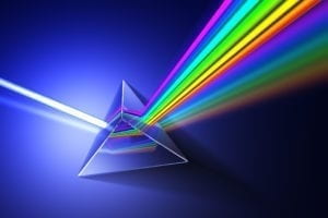
The three main inspirations I have for assignment 5 is prism and François Morellet ‘s work, Random Distribution of 40,000 Squares using the Odd and Even Numbers of a Telephone Directory 1960. Prism reminds me of how a shoot of sunshine can be distributed into different colors, like magic, embracing the most mysterious and dazzling beauty in something we are used to by changing our perception. I drew three pairs of lines with similar hues and mix them with different background colors to call out different effects. I used red and blue specifically, as I was really impressed by how François Morellet used these two colors to create a powerful impact with simple components. I am not satisfied with the printed version, as I did not have a print test in advance, and the interactions between background colors weren’t really harmonious. Still, I consider such a first try as a great experience of understanding kinetic art better, which used to be something I considered as simple and abstract, but actually has much more behind it.