Title Concrete Jungle
Presentation Date 04/14/2019
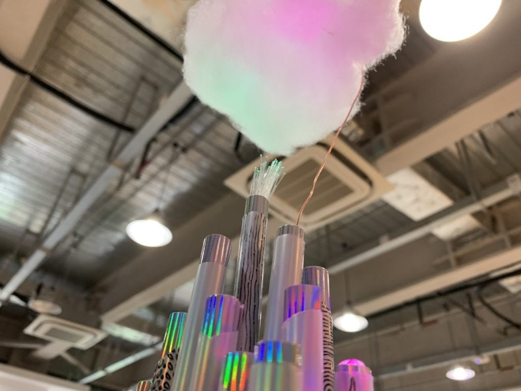
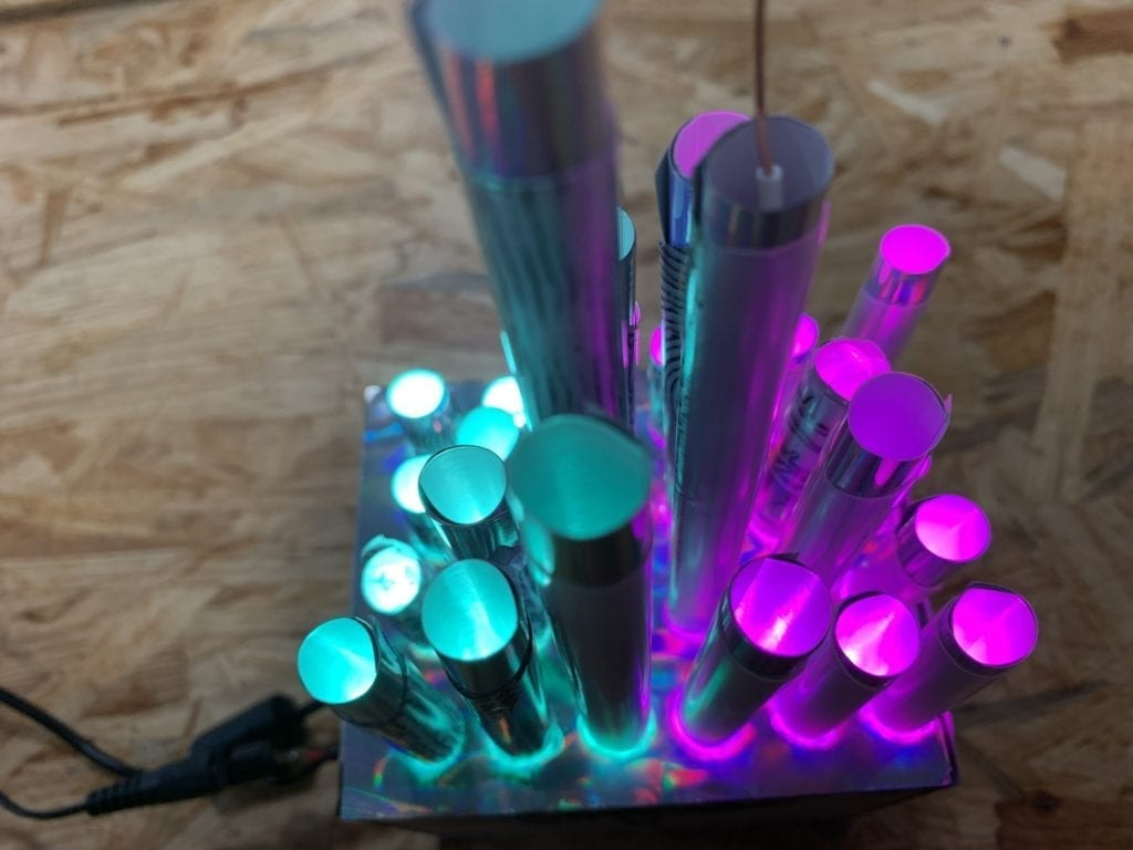
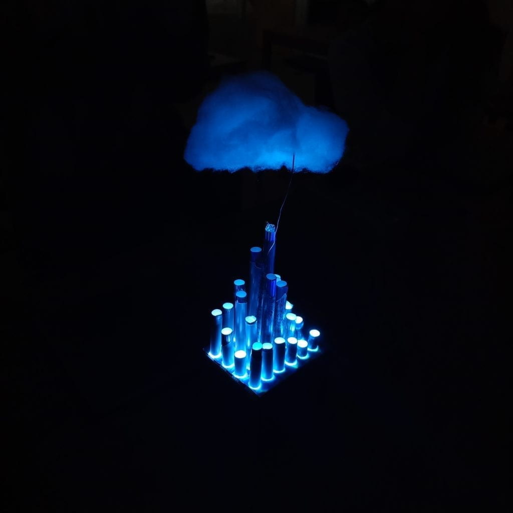
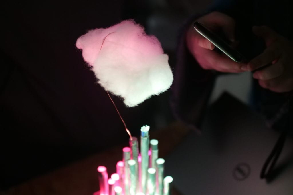
Project Description As the title suggests, I drew my inspiration for “Concrete Jungle” from the image of a modern city: groups of skyscrapers with reflective surfaces made of glass, steel and concrete. I laser cut an 8 cm * 8 cm * 10 cm box as its pedestal, and simulated skyscrapers with straws. Under each straw was a LED light – in total I used four digital LED strips, and a FadeCandy to control them. I hid the circuit inside the box, only the strips coming out through a pre-designed hole on the box. A large proportion of the surface is covered with silver-colored reflective materials – I picked silver because to me it is the color of modern cities. To create contrast and reinforce the cold and stiff feeling brought by the silver color, a piece of cloud made of cotton is hung above the straw city.
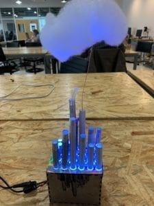
Growing up in Shenzhen, I was never afraid to identify myself as a city kid. I love how during the daytime in the city, all buildings look the same with similar glassy surfaces but when the evening comes, they all light up with distinct patterns and dynamic colors. That’s when it occurs to me that the buildings are not lifeless, and that actually in this jungle of concrete, the constantly changing lighting is a way in which we can feel the life of a city. With this project, I wanted to express my love for big cities and remind people of how beautiful and lively they are.
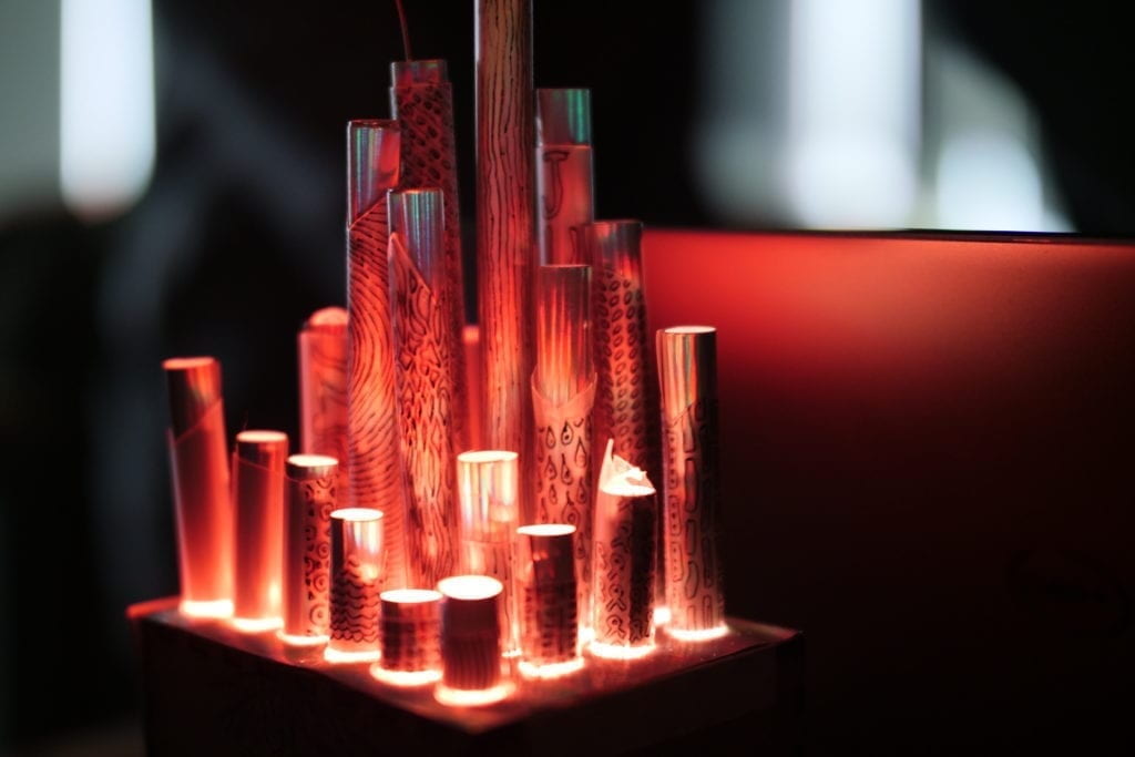
Perspective and Context More than just an abstract model of city buildings, “Concrete Jungle” is intended to help its audience recreate, reimagine, and for them to appreciate the beauty of the city lights. An extra takeaway that I wanted the audience to get from the project (putting aside the actual result :D) was the inclusiveness of the city. A kinetic light art project, “Concrete Jungle” is open up to all kinds of interpretations, and I would not want my explanation to interfere with them. But to be honest about what happened during the creation process, all the elements – the colors, the different heights of the straws, and the patterns on the straws, are my ways of embodying diversity. One significant reason why I love big cities is that, the bigger it is, the more inclusive it tends to be. When creating the project, I was thinking about how urban people can seem so similar in terms of their daily routine – nine-to-five jobs, working five days a week – but each of them has a different story underneath. Different opinions collide and blend, different values converge and diverge, and the variety of them blows my mind. I wanted to symbolize that in this project, hence all the different elements I utilized. Specifically, the patterns on the straws are a product of me inspired by the famous pop artist Keith Haring. He was famous for the repetitive patterns and bright colors in his works, and a major object that he drew was man. I drew repetitive but distinct patterns on the straws wanting to symbolize city people – all alike, yet completely different.
The constant changing of the lights is a key factor of the project, because without them it would be a completely different thing. You may think that the physical setting already looks complete and self-explanatory, but as I said before, a city is not complete without the lights. The lights are the colors of the city, bringing life to it and symbolizing its “ever-changing-ness”. They are the humanity of the city. Each May when NYU seniors are graduating, the Empire State Building lights up in purple to celebrate that. Ever since NYU Shanghai, the Oriental Pearl Tower has been doing the same. I was lucky enough to see it last year, and I felt instantly connected to the city that I’d lived in for one year.

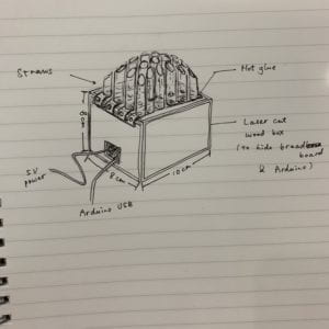
Development & Technical Implementation Before finalizing the idea, I drew this draft to generally determine what materials to use and how big the scale would be. You can see on the draft that the straws were not how they turned out to be, but other than that, the draft basically reflected what the physical setting of the project would be like.
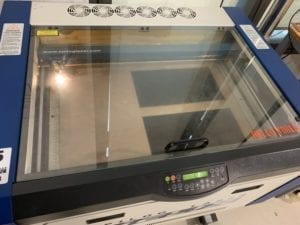
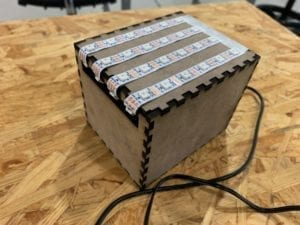
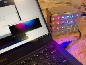
After I had the box cut out using laser cut, I assembled the circuit and hid it all within the box, only letting out the four strips. I got a piece of reflective paper and cut holes on it, putting it over the top surface of the box. I bought the straws online, only to find that they were a little too transparent for my project. I was expecting that they would reflect more than letting the light go right through, so that each straw would just be a column filled with light of one color only. I cut some straws into different sizes and hot glued one over each LED. Before gluing them, I drew different shapes and patterns on some of the straws, for decoration and also to kind of make the straws a little more opaque.
Still, it was not so ideal, because the straws let too much light out. Thus, I cut out a piece of reflective paper for each straw, rolled it and plugged it in. This made it look so much better not only because the brightness was toned down, but also because of the dynamic colors that the paper reflected. The straws looked more like skyscrapers, thanks to the silver color.
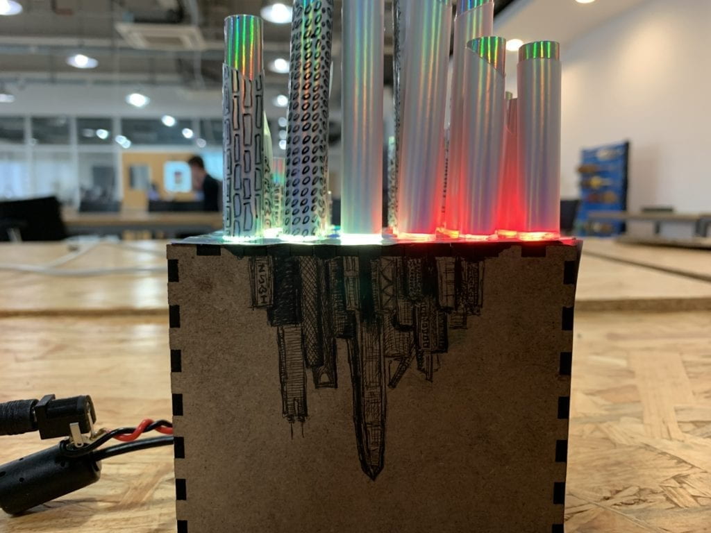
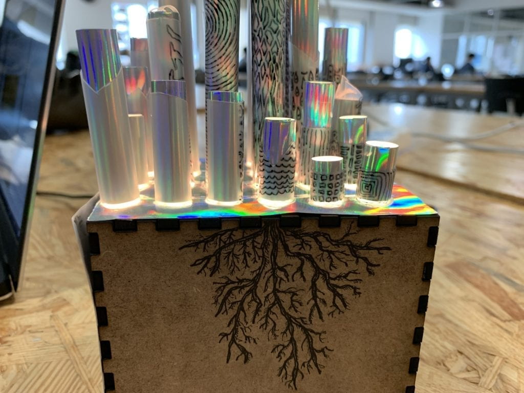
On one side of the box I drew a city skyline, and the root of a tree on another, to echo the name of the project. The city skyline was based on an image I found online of my hometown Shenzhen, and in the middle is the fourth tallest building in the world – Ping An Finance Center. The light of the LEDs is cast through the straws onto the cotton cloud above the city, while also shining through the gaps between the straws and the box.
The coding part was not so much effort as the physical part. Because FadeCandy had an example code that enables an LED strip to show the colors in an image while it scrolls up, I only needed to come up with an image to implement the generative composition. Since this method does not require high resolution at all, I decided to use the most “primal” software ever – Microsoft Paint, also to make it more natural by drawing the whole thing manually with the spray paint tool.
Initially, I thought about giving it a theme color, but not before long, I changed my mind and decided to go through all hues in the image. Starting from the white color, I manually adjusted the HSB values each time I finished with a new color, to give it a subtle and intentional transition. In the middle part, I divided the image into two parts, making them start to differ at the purple section and converge again at orange. During the separation, the two parts go to opposite directions on the hue spectrum, and they meet again because the hue spectrum is actually a closed circle. The colors mostly hover around high/mid-saturation, but to connect the bottom of the image to its top, (in the example code it scrolls up forever in a loop) I gradually toned down the saturation towards the end so that it went back to white.
![]()
Presentation The presentation in class was generally successful and went as I had expected. The project was set up on a table, while the audience all stood around it. I wanted them to be able to look at it from any direction, so I asked them to kind of move in a circle to watch from different angles. When I first ran the program, the color remained white, because I closed my laptop, and the program could not run with the laptop closed. I restarted it with the laptop slightly open, since I did not want the light from the screen to interfere with the experience as well. Most of the audience complimented the project for the atmosphere it produced. Some suggested me remaking it into a larger scale, which I think would enable a better visual experience. Some suggested I use more diverse colors and make them vary more. Another thing to mention was that in the dark, the audience could not see what I drew on the sides of the box at all, and only after I noted did they realize there was something there, so that is definitely something that I could improve.
Conclusion I think the good thing about this project is, as soon as everybody saw it, they knew that I was trying to make a model of a city. Though it’s called “Concrete Jungle,” it was a somewhat abstract simulation of city, and I intended to make it abstract. The problem is, how do I take the audience one step further than just knowing that it’s a city? What do skyscrapers mean to them? How can I convey to them what a city means to me? In this sense, the project is not yet complete, and there is a lot to consider. I never expected to take the audience where I came from making the project, but at least I had to take them somewhere outside of that classroom.