Date: 02-24-2019
Assignment 1
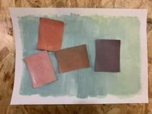
For this grey scale exercise, now I do realize I could have made the rectangles into more interesting shapes, and if I knew then I would… Anyway, what I learnt from this exercise is that grey can refer to a pretty wide range of colors, all of which may have different hues but what they share is comparatively low saturation, which required a lot of white paint in the process of creating this.
Assignment 2
If only I had more time… I think I would have made the colors differ more in terms of brightness and saturation, now that it seems that the only difference between them is the hues. The shapes are more diverse than those in the first assignment, though. Also, since we used water based paint, it was kind of hard to keep the colors pure, as they kept mingling.
Assignment 3
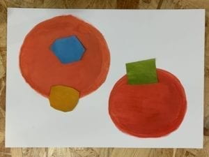
For this assignment, the requirement is for us to modify the background colors so that the one in the middle could look like two.
The first one features three different shades of grey. With the lightest and darkest ones as background, the two squares with the neutral grey get contrasted differently, which makes them look different.

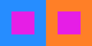
The goal for the one below is to make the two squares look like they have different hues but the same saturation and brightness, which is very tricky. I tried many colors, and this combination is what I decide ultimately to be the best one that matches the requirement. Because purple is the combination of blue and red, the purple on the left kind of contrasts its blue background and “resonates” with the orange (which also contains red) on the right, so I think it looks warmer than the one on the right.
This one is the hardest one for me, for which the requirement was for one color to display two shades of saturation. Different combinations have been tried, and even though I’m still not sure if this is good enough, I do think that the yellow on the left is a little more saturated with the pink background.
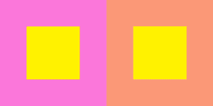
Then, make all three values (HSB) look different.With the knowledge involved in the previous three exercises combined, I used pink, purple and orange in this exercise. The pink on the right seems lighter, more toned-down, and less purplish.
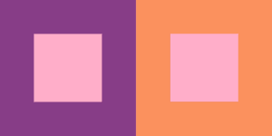
Finally, this one below is kind of the easiest one to do – to make two different colors look like one. I used two different yellows with the same hue and similar saturation but different brightness, and gave the light one a lighter background, the dark one a darker background.

Assignment 4
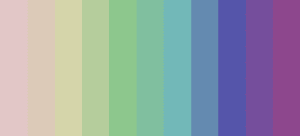
For the first color sequence, I chose a bluish hue and adjusted the saturation and brightness so that it shades from dark to light; for the second one, I adjusted the hue and lightness so the colors share the same saturation value but display a kind of toned-down rainbow effect. Then I combined the two sequences.


Assignment 5
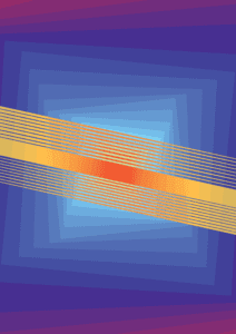
It is the first time I have ever used Illustrator to create something, thanks to the help from IMA fellow Cindy! I drew my inspiration from the subway train – just imagine standing in the middle of a subway train carriage and looking towards one end of the train, and when the train turns and trembles, the carriages form a tunnel like this that twists and turns. The yellowish stripes symbolize the speed and the parallelism between subway trains in two directions. The colors actually did not turn out the way I expected because they seem far away from subway colors. I was also inspired by Antonio Asis’ works, where he uses a lot of shapes that cross each other, which produces a lot of little spaces, and Asis fills them with different colors.
