In our team’s quick and dirty design cycle, we analyzed Rudi’s day to day phone use habits to design a tool to improve his user experience. From the video, we learned that Rudi is a IMA professor and father of two young daughters. He wakes early and spends a good amount of time on the metro to get to campus. He has a personal connection to his phone case, which has a thoroughly used card holder. He confesses that he uses his phone very much everyday, with an average of 4 hours per day mostly on Wechat. He also has many apps that he doesn’t often use. When asked, he said he didn’t have a clear idea of how he would improve his phone.
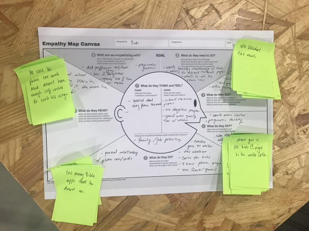
After watching the video, our group filled out an empathy map, in which we analyzed Rudi’s habits, thoughts, and problems. With these ideas, we proceeded to come up with many potential problems and opportunities for Rudi. Many of them dealt with his excessively long phone usage, so we decided to focus on this in our design challenge.
We decided to create a mobile app to restrict the amount of time Rudi would spend on his phone per day. The app has four levels which increase in intensity the more he uses his phone. Each level works to remind Rudi of the amount of time he’s spent on his phone so far, since most people are unaware of how long they spend facing a screen. We created a prototype out of paper materials, using two layers of cardboard for the phone and scrap paper for interchangeable screens to put in between the cardboard.
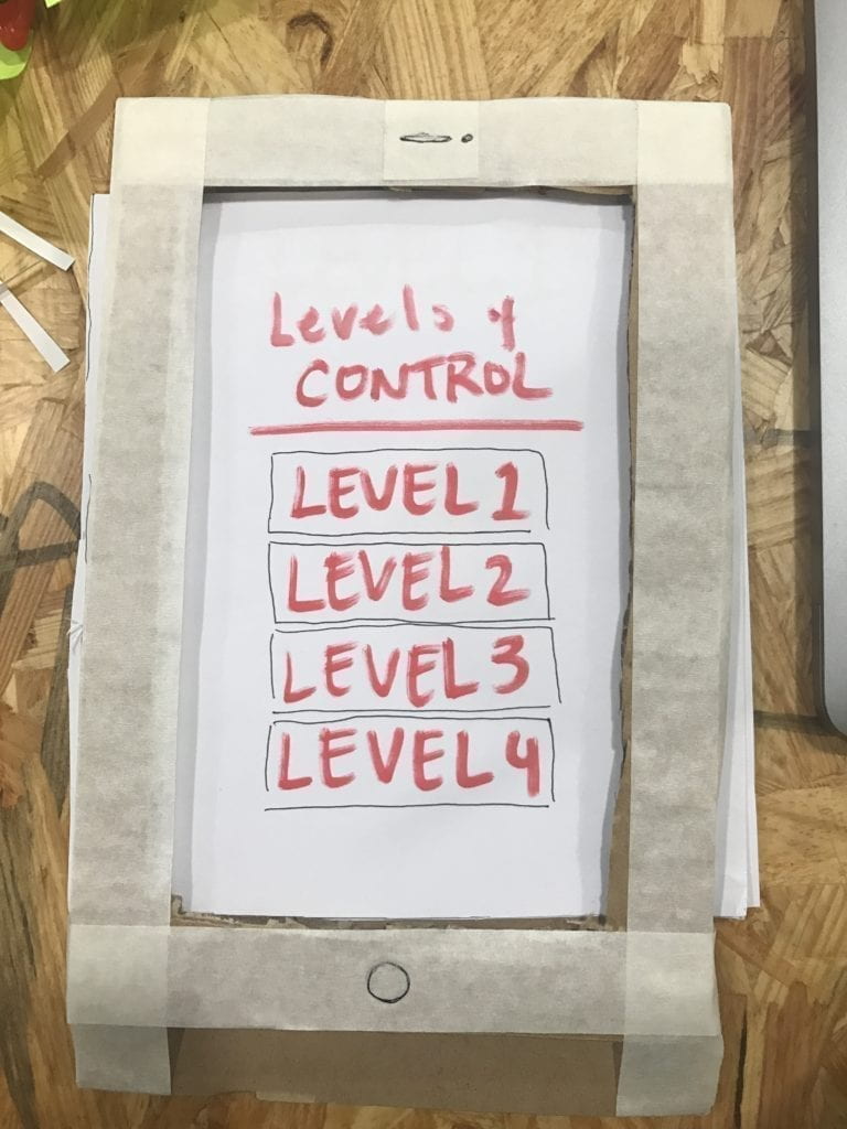
The home screen contains four levels that can be adjusted for Rudi’s liking. He can choose to go chronologically, or personalize the restrictions to his liking. In this prototype example, we illustrated the chronological example.
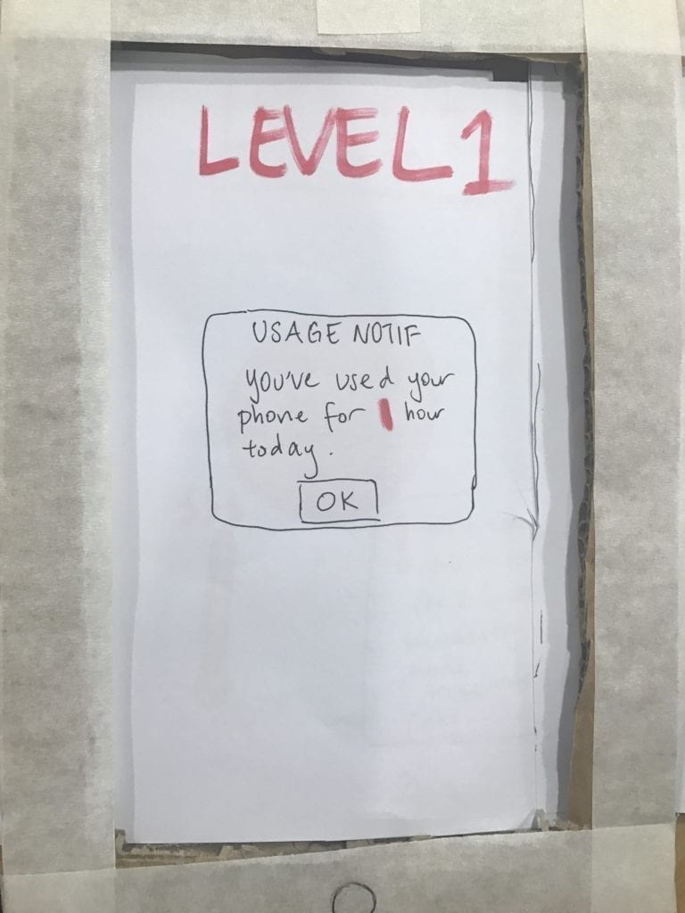
The first level is a simple notification that pops up after 1 hour of phone use. This serves as a gentle reminder of how much Rudi has used his phone.
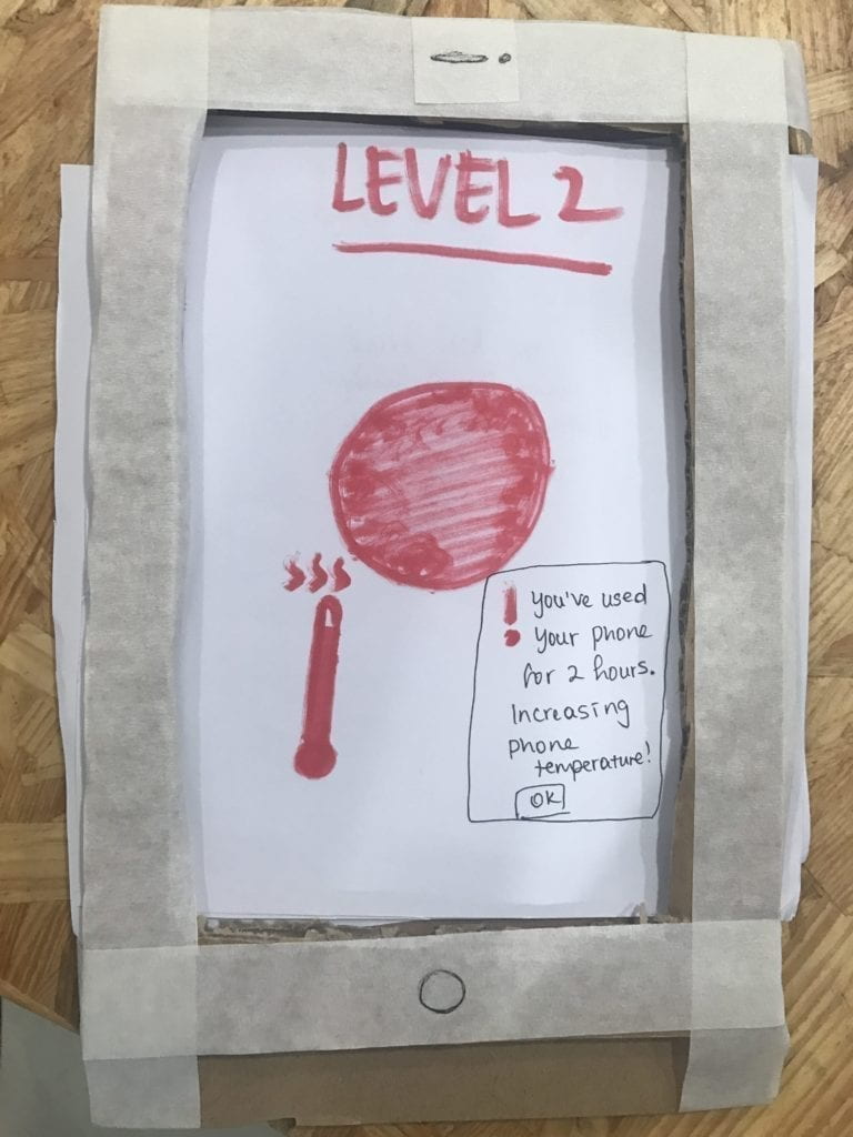
The next level is reached once Rudi uses his phone for two hours. At this time, his phone begins to slowly heat up, so that it becomes physically uncomfortable to use.
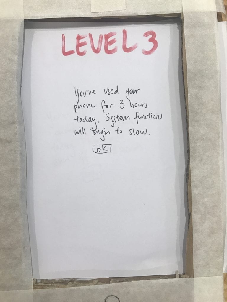
The third level slows all the phone functions after the third hour of usage so that is becomes aggravating and inconvenient to do anything on his phone. With lagging functions, it will become increasingly annoying to be able to do anything, which will hopefully deter him from using it further.
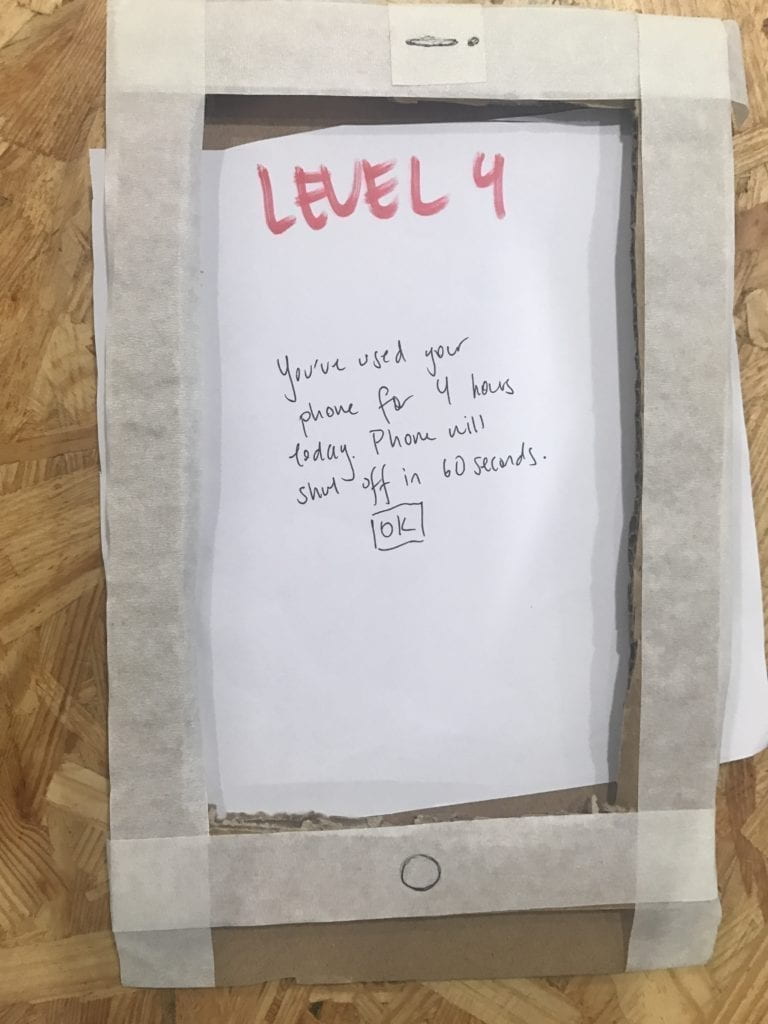
At the last level, the phone will shut off at four hours of use, so that Rudi does not surpass his usage average. This will completely prevent him from using his phone further.
After presenting in class, we learned of some things that we could work on. First, since Rudi usually uses his phone on the metro, it wouldn’t be great to have his phone heat up at the second stage, since he wouldn’t have anywhere to put his phone to cool his hands down. Instead of this, we could put this level later in the day, or modify the settings so that it will not be painful to hold. Additionally, completely shutting the phone off makes emergency functions unavailable, which would defeat the purpose of having a phone. A solution would be to only shut off access to certain apps that aren’t a necessity, so that Rudi still has access to things that are of utmost importance.