Documented by: Candy Bi
Project name: Color visualization of flight
Professor: Ann
Link: https://editor.p5js.org/candy/full/JDRj8RNQh
Video: video


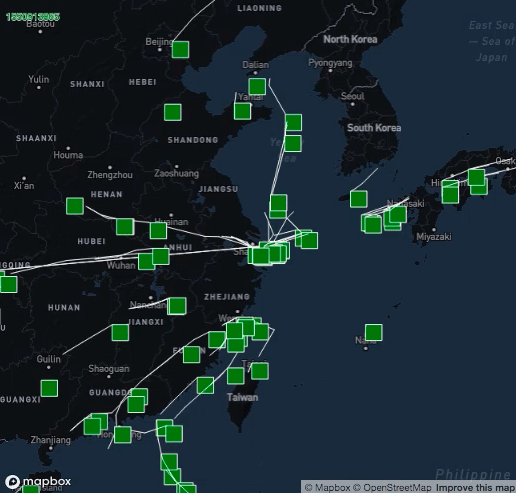
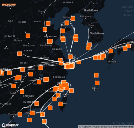
Description: I find it hard to change the data I download from WCS into nested json data set. Thus I choose to develop on the data of the flight we use in the workshop. What we already have is those planes flying to Shanghai as “clock” goes. To better visualize the data, I made each plane a rectangle and make them bigger. The time is visualized by different colors rather than just displayed on the top-left of the canvas: all planes(rects) are originally green, as time goes, they became redder and redder. “Clock” on the top-left corner are made the same color of those planes. This way, by looking at image itself, audience could get a direct idea of what is going on. Lines are drawn to display the trial of flying.