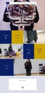
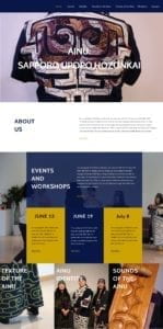
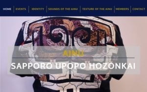
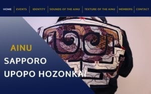
So far, we created four different mockups of the website homepage using Inviison Studio. We chose a navy blue (#081748) as the primary color and a darker yellow color (#CCA300) as the secondary. The navy blue reflects most of the Ainu’s apparel. The layout of the website are based on actual Wix themes that we were considering.


From the feedback we received in class, most preferred the second layout where an events section is shown on the homepage. This way, the events and workshops section is emphasized as a bigger part of the Ainu group’s focus. Some people were unsure about the color combination, mainly the yellow color. There was also suggestions for more image transition so there would be more interaction.
Next, we would like to focus on actually making the website on Wix and add transitions to the images. We are also planning to start going through the content and start the editing process.