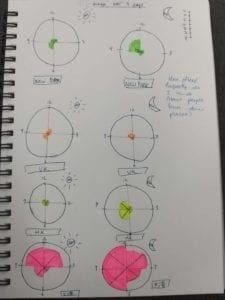
My map charts how frequently I think of people who are currently in certain places. The places I picked were New York, Hong Kong, the UK and Shanghai. I picked Hong Kong because that’s where my family and some of my friends are. I also have family and friends in New York. I know some people in the UK and Shanghai since I’m currently here.
Originally I wanted to use a world map and have bigger circles to represent how often I thought of people from different places. However, I thought it would be difficult to represent the times that I was thinking of people on the map so I decided to go with those world clocks that are quite common. I split it into AM and PM as normal clocks on show 12 hours on them. I think I could have been a bit more creative, perhaps using different colors to show different emotions perhaps when I thought of people from different places?
Overall the map was quite simple and I think to improve it next time I could try seeing how much information I can really fit into these clocks without overcrowding it.