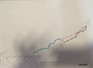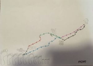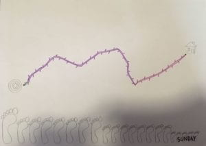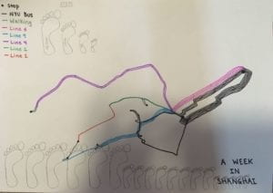
For my week of data project I decided to map out everywhere I went by mode of transportation. I color coded the lines based on the color of the subway lines and used black and grey for bus and walking repectively. The full week is compiled above and below are individual days. The number of lines represents how many times I followed the same path, for example throughout the week I took the NYU bus to school six times and took it home from school four times. On the individual day maps I used arrows to show which direction I was going and included icons to represent what I was doing at each place, but I thought including these on the week map would make it too crowded. I also included a count of footsteps, which often correlate with where I went, for example monday, wednesday, and thursday I only went to and from the AB and my footstep count was much less than other days.