Professor Ann Chen
Carlo G
Feb, 25th 2019
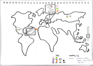
For the week-2 assignment, I created a data visualization of my weekly drink units. In making the data presentation more attractive, I decided to hand draw a world map that shows the origins of drinks I had this week. For a head up, this world map was hand drawn poorly, so I’m sorry if some regions aren’t on this map.
Furthermore, I use different colors to show which day I had which drinks. For example, pink represents Monday, green represents Tuesday, yellow is Wednesday, purple is Thursday, Friday is orange, gold represents Saturday and black represents Sunday. To show the number of drinks I had, I incorporate a geometrical shape that is square. One square represents one drink.
What I wish I could have done better for this assignment is the accuracy of my world map. I am aware that a lot of details are missing on this map and that many places may appear smaller/bigger than it actually is.