Is it possible to teach an AI design? This is a problem at the forefront of Machine Learning exploration and a fascinating topic that could change how designers work and how companies operate. For my midterm project, I wanted to examine ways to create an algorithm that could design posters based on a specific style and user inputs. In the end, I believe that my proposed idea is likely possible, but would require time, extensive data and skills beyond my range.
Background:
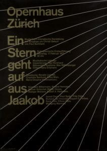
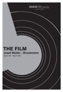
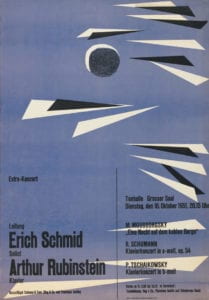
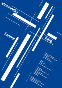
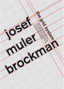
I wanted to do this project because of my interest in design, as well as the Swiss Minimalist style, which I chose to focus on. Swiss minimalism, particularly the poster style I chose to focus on, was developed in Switzerland during WWII and made famous by designer and author Josef Muller-Brockmann, editor of magazine Neue Grafik. Brockmann’s posters used bold colors, a grid layout and simple, clean typography to create aesthetic posters. Brockmann’s style changed graphic design, ushering in an appreciation for layout and typography. His style is time-tested and still favored today by artists and institutions.
Posters designed by Josef Muller-Brockman that show the fundamentals of Swiss Minimalist Design. Note the use of color, shapes and different headings.


Another source of inspiration is the class Programming Design Systems, which I’m taking this semester with Cici Liu. Before this class, I mostly used Adobe Illustrator, Photoshop and InDesign to create designs, which often involves a lot of manual work, i.e. physically moving things around the canvas and placing them myself to see what looks good. I love making posters, whether it’s for a party I’m throwing, part of my freelance work or just for fun, but I often find myself saving countless versions of the same poster with slightly different positioning and elements. Through the class, particularly the poster-designing assignment, I found it fascinating to see how code could be used to simplify the design process, and how an aesthetic poster could be broken down into coding data. We work in P5, which can also be used to randomize posters by setting limits and creating arrays with sets of data to allow the code itself to generate many different versions of posters within set ranges.
I used P5 to recreate a few Brockmann posters and realized the Swiss Minimalist style poster could be entirely recreated with P5, as the posters usually involve a few headings of text (sometimes rotated or overlapping), use of simple shapes, curves and lines and a grid layout, all elements that can be translated into code to reproduce the posters.
Here’s an example minimalist poster coded in P5:

Inspiration:
As mentioned in my project proposal, I was inspired by Alibaba’s LuBan AI software, which is used to generate banners and ads for products on Taobao and Tmall. Most of the pop-up ads in the app are now generated by the software, which can generate 8,000 banners per second. This AI was trained with a more complex process involving teaching it design elements separately, and then having teams of designers use reinforcement training to steer the AI towards “good” designs. The AI was trained on copy, product shot, background, logo and decorating artifacts, all the elements needed in a simple ad, from a huge dataset of these individual features. This project took years and likely thousands of programmers and designers, but it shows that a Machine Learning algorithm can be taught design elements and produce designs indistinguishable with those from a designer.
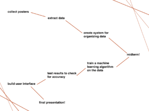
Process:
After bringing Aven my idea of teaching a Machine Learning algorithm poster design, we brainstormed possible ways of doing the project. Inspired by the Programming Design Systems class, I was interested in using P5 as the way the algorithm could “design” the posters as that way the posters would be represented as data. This means that I could use P5 “data” to teach the program, and it could create an algorithm based on the data to design original posters with Swiss Minimalist design principles. My goal by then for the midterm was to find an effective way of creating and gathering this data.
My original plan for the project from midterm to final:
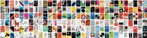
Aven said I would need at least 1,000 posters, so I started my research, saving posters that could be turned into data (eliminating those with images and design elements that couldn’t easily be recreated with code) and saved several hundred minimalist posters.
Some of the posters I saved to gather data from:
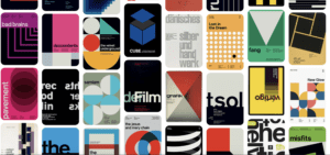
I began to notice that many of the posters had 3 main types of text, which I began to call Heading1, Heading2 and Heading3. Heading1 was usually bold and almost decorative, often very large and distinctive on the poster. Heading2 and 3 usually had smaller font and creative placement, containing the actual information for the poster. The posters often used one or two types of shapes, repeated and in various colors. After observing these posters, I created an Excel spreadsheet for the data I wanted to gather and broke it down into a few different categories that I thought could represent most of the posters:

Heading1 text placement (location on the canvas, text size, text color, text rotation, and the same data points for Heading2 and Heading3, then Shape1 placement, size, fill, rotation and stroke, continued for the rest of the shapes present on the poster, and background fill. I was planning to input the data as P5 code.
A clear example of the 3 headings style I wanted to teach the algorithm:
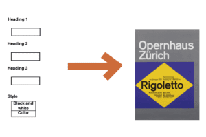
I then brainstormed the user interface, which I wanted to be simple but allow users to create their own personalized posters. While my original idea involved different “styles,” I decided to simplify that to “black and white” or “color.” I wanted to allow users to input the three headings themselves, perhaps with a guideline indicating that Heading1 should involve little text and Heading3 should contain the main data for the poster.
User interface layout:
Potential solutions and challenges:
The first major challenge I encountered was gathering the data. While I knew what data I wanted to pull from the posters and I had the posters to use for this, I quickly realized that placement, rotation and fill weren’t that intuitive. In order to get this data, I would have to “redesign” each poster in P5. Some of the posters didn’t share the same dimensions, so I would have to reformat the posters to one dimension to create consistent data. I would also have to use color pickers online to find the colors inside the posters, and then pick a consistent color system, such as HSB in P5, to represent the colors. Rotation also presented a challenge as it would take time to find the rotation and placement, which I would have to do by essentially “eyeballing” the poster and trying to match the coded version to the real one. Also, recreating curved lines with Bezier curves would prove a major challenge, as well as any irregular shapes that would involve more coded data than I could easily input. I quickly realized that turning 1,000 posters into P5 data was a huge task that would take many hours and could produce imperfect results.
The second major challenge was how to input this data into the Machine Learning algorithm. I met with Aven again to discuss this challenge, and he suggested JSON, as I would be able to upload my Excel spreadsheet of data into the platform and then import JSON into the model to train it.
Also, since I wouldn’t be using a simple pre-trained model, I would need to find a program that could read and learn Swiss Minimalist principles from the data, and then be able to generate new P5 data and create a sketch for a new poster. This seemed very challenging as we discussed how we didn’t know whether such a program already existed, so I may get through all the steps of data gathering to realize that I wouldn’t be able to train it at all.
In order to create the user interface, I would also have to find a way to input the user’s headings into the P5 sketch while allowing the algorithm to generate the rest of the design based on the data, and then display that sketch. This also posed a challenge as while I have experience in P5, linking all the systems together to create the project I wanted would involve many steps I wasn’t familiar with.
After reaching the conclusion that turning thousands of posters into data would be beyond my ability this semester, I started looking into other ways of finishing the project, such as human in the loop. I knew from my experience with P5 that I could use several different sketches to produce infinite posters in the Swiss Minimalist style by randomizing certain elements within ranges. With this in mind, I was curious whether I could have feed an algorithm these sketches and have it produce its own random designs, which I could then evaluate in order to essentially teach it to produce more of the “good” designs. This is very similar to LuBan’s reinforcement process, where teams of designers evaluated the AI’s designs in order to teach it the finer points of design. While Swiss Minimalism famously uses grid systems, which generally follow “rules,” many of the posters also “break” these grid system rules in order to create interesting and unexpected designs. This would be one aspect I could teach the algorithm through human in the loop: when to “break” these rules and when to follow them in a design to create aesthetic results. One challenge however is that most of the resources on human in the loop that I came across start with a high quality training dataset, and I couldn’t find references on whether I could have the algorithm randomize posters from different ranges of data and elements to create its own dataset. I briefly considered somehow gathering the data from different iterations of P5 sketches to create a database, but if all the sketches use the same code to create different posters, this would also prove to be a huge challenge.
With this is mind, I conclude that while this project may be possible if a team can turn thousands of Swiss Minimalist posters into P5 data and then teach an algorithm to use that data to generate its own posters in P5, it would take time, resources and knowledge out of my reach in order to do so. Also, at any step of the way if something went wrong or if the actual algorithm needed doesn’t exist, this could easily fail to produce the results I was looking for. This project was a fascinating exploration for me into the world of building databases and training models, and while in the end I’m not able to create the project I wanted to, I have a much better grasp on the realistic challenges of data, training and algorithms, which I can take with me for my next, more achievable, project.
Sources:
https://www.figure-eight.com/resources/human-in-the-loop/