Floating keys – Fay Li – Eric

CONCEPTION 

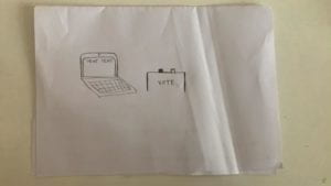
Our project was like a physical version of Piano Tiles and Guitar Hero. There were four boxes as four keys of the piano, each with a sensor inside. The player should follow the moving tiles on the screen and put his hand into the right boxes accordingly to reach a high score and complete the jingle bells melody. Compared to simply tapping the screen, we wanted players to have feel more engaged with the game through the physical process of interaction.

DESIGN,   FABRICATION, AND PRODUCTION:

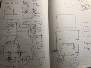
Our original design for the physical part was to put four small boxes in one big box, to make all the circuits and keys an integral part. But it was thus rejected by the TA the first time we went to fab lab, because it would use more than ten boards of wood, which was a lot. Later we decided only to make four small boxes with a big platform (built by two boards), which altogether would take six boards. And the idea was rejected again as six was still too much. Therefore, we had to give up the idea of using the wood board as the platform. We found a box in the cardboard room and cut it to the proper size and glued the boxes onto the board, which turned out working well though looked kind of weird.

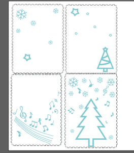
We left a small hole at the back of each box so the wires could come out more organized. I also added some decorations onto the top of the boxes to show the theme of music, and add some Christmas vibe to the project.

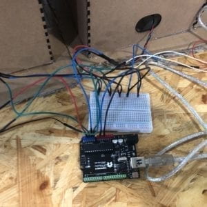
We also met some problems with the Arduino when building the circuit, though it was supposed to be the easiest part. We found that when connecting the Arduino to the computer, it didn’t show up in the port list, and the green light turned off, and Arduino became extremely hot. Later we found out that it was because we misconnected some of the wires. And the same mistake occurred several times throughout our production and even right before the presentation, and each time it took us long enough to figure out.

The coding was the hardest part of the project. We were able to complete the code with help from professors, TAs and many friends. Especially thanks to my partner James, who put a lot of effort into this. The project wasn’t fully functioning during the user test due to the same mistake I mentioned above and we didn’t figure it out before the user test, so we used four keys on the keyboard to replace the sensor to only test the code. We didn’t get many useful suggestions during the session, but Eric helped changed the code to make it work better.

Later we added more details to the game interface, such as the title screen, time bar, highest score record. And the game could be restarted as well.

CONCLUSIONS:

Though we still ran into some problems the day our presentation, the project overall interacted with the player well. They interacted with it by placing their hands into the right box and complete the melody, which aligned with my definition of interaction as being a reciprocal and cyclical process between the user and the machine. It also reached the goal that making the users feel more engaged with the game through physical interaction. The problem was that once the melody was completely played, the array reached its end and the game would crash (Eric helped fixed it after the presentation). If given more time, we could improve it by adapting the suggestions we received during the presentation, such as making it a two-player game, or making a vertical version so that the keys can really “flow”, or adding more songs to it… The project experience was very interesting and meaningful, as a team we overcame many difficulties and finally had a good outcome. And hopefully, the attempt of adding more interaction and making a physical version of a game can bring more fun and engagement to the players.

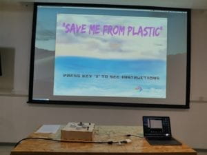
“Save Me From Plastic-Lifan Yu-Inmi Lee

 Brief introduction:

This game focuses on the environmental problem of ocean plastic pollution. We designed an interactive game that encourages people to use less plastic product and find ways to treat plastic wastes that do less harm to our environment (and ourselves)–stop dumping them into natural environment! 

 CONCEPTION AND DESIGN:

In general, when I think of how my users are to interact with my project, I would like them to move around, be actively engaged and achieve the winning result with combined effort.

First, to move around. When we thought of how users can interact with images of falling plastic trash pieces on the screen, we first thought about pushing buttons. But this can’t get users to move around. So, we decided that half of the screen should have a camera-captured real-time image as a background. This way users’ image actually appears on the screen along with images of plastic trash. Users thus can move around, changing their places in the image and interact with image of falling pieces of plastic that’s laid on top of the camera image. To determine whether, in users’ image, they successfully touched the plastic pieces, a threshold is set. When falling images move pass a place whose colors are darker than the color this threshold represents, these images disappear. Thus the results looks like when users wear dark-colored gloves and their images on the screen “touches” the falling trash with those gloves, it counts as they have “successfully blocked the plastic pieces from falling into the sea”. (Dark-colored clothes can also work) This is effective to encourage users to move around.

Second, to be actively engaged. This game is a continuous, quick-paced game. Plastic trash pieces fall from the sky continuously and the already existing pieces of plastic in the ocean move around all the time. Users have to be focused on the game in order no to let the fish die. At first, we did not add the already existing plastic pieces images in the ocean. However, this is problematic because if one player is very good at “catching” all the falling plastic pieces, the other player don’t need to control the fish at all. Then we added extra plastic pieces in the sea to encourage two users to actively play this game from the beginning.

Third, to win this game with combined effort. We once thought of making a one-player game. If more plastic pieces fall into the sea, the color of sea water will change and there will appear dead fish in the water. When the dead fish reaches a certain amount, game over. However, we thought of offering players another experience in the fish’s viewpoint. Thus we added the fish part.

We wish to raise environmental awareness by providing our users with information about plastic pollution in ocean. There was an option that we rejected was a candy box that automatically opens when players win. We once thought of putting on the candy wrappers some sentences of call to actions and scientific facts about current environmental conditions. Therefore, users are more willing to take in all those information. However, our motor didn’t work well in our device and we just didn’t add it to our project.
FABRICATION AND PRODUCTION:

In user testing, we received suggestions to add a video of ocean in the background of the “fish” part. We also received suggestions that we should provide users with some gloves with colors that rarely appear on clothes. In our code, we can write some lines that detect the color of these gloves so that as soon as they appear on at the same place with falling plastic pieces,  the plastic pieces will disappear. Back then, we didn’t add the already-existing plastic pieces in the ocean, so all players just focused on “blocking” plastic pieces. Nobody went to control the fish’s movements.

We later added a video of ocean in the background. However, this didn’t work very well because our video showed fish swimming. During presentation, some users reported that they get confused about which fish they are controlling—fish in the background video or the hand-drawn fish.

We bought bright pink gloves and black gloves, but we ultimately chose black gloves to provide to users. However, this turned out to be a wrong choice because one of our users wore black clothes and can very easily “catch” the falling plastic pieces images by stretching out her hands.
CONCLUSIONS:

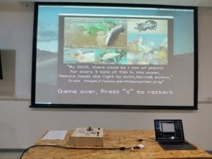
We tried to use a fun and interactive game to raise environmental awareness among our users. My definition of interaction is that people and device can receive information from and provide feedback to each other. This process is better if this communication can go on and on if both sides keep interacting. My project allows users to receive information by seeing the falling plastic pieces and try to block them from falling into the sea. When one piece of plastic is blocked, other plastic pieces will still keep falling down. People can keep interacting until the game ends. Referring to the game itself, a camera is used to detect users’ movement information and decide whether their images on the screen actually “touched” the plastic pieces or not. According to different actions the users make–successfully caught the trash pieces or accidentally let them fall into the ocean—the game itself also gives different feedbacks. When a plastic piece fall into the sea, it will start moving randomly in the “sea area” and threaten the fish. If users don’t control the fish and hide away from plastic pieces, it will die. Different actions done by users can lead to the game’s winning or game ending. The whole process is an active, interactive process.

If we had more time, we would change our “keypress” into pushbuttons. We can place several neat little buttons on laser-cut boards in front of users with captions like “start” “restart” etc.

We can also use a camera that connects to the computer and hide the computer away. This way, we can change the distance of the camera and the user instead of placing a computer in front of users (which made their image appear to be very large and they can too easily “catch” the plastic pieces.) After this, our whole project can look more simple and neat.

We can also add some sound effects so that as soon as users “catch” a piece of plastic trash, a sound can be played.

Finally, the page that contain scientific data and call to action can be shown to users before the game starts instead of after the game ends, because users are usually too busy restarting the game instead of stopping and taking a look at those words.

I’ve learned that if I want to raise awareness, I should focus more on how to make everyone feel like “I really should care”. Our project simply stated the current disastrous situation of ocean animals, but our game didn’t show how this affects us and wasn’t touching enough to encourage people to care. Moreover, it would be better if we made the whole thing look more pretty that people will be very interested in interacting with it as soon as they see it.

I was glad that some people really liked the “blocking the falling plastic pieces” part. They thought it was interesting. One person even did research into plastic pollution after user testing and decided to buy less drinks contained in plastic bottles and use less plastic products. I wish if I have another chance in the future, I can refine the whole game and make it look more attractive, so that we can let more people know about this serious environmental issue in a fun way. Taking actions to slow down our environment worsening can’t wait another day. However, if I directly call for everyone to take actions, no one will be willing. This project we made can be of some help to interest people in this often-ignored environmental problem that actually decide whether we and ocean animals live or die.
PART OF OUR CODE

(the part when fish is alive.

code that decide the winning and losing of this game)  

//PART OF OUR CODE
//(the part when fish is alive & code that decide the winning and losing of this game)   

 if (ok==true) {


      for (int k=0; k<plasticList.size(); k++) {
        Plastic temp=plasticList.get(k);
        temp.display();
        temp.move();
      }


      if (fishY<=height/2+10) {
        fishY=height/2+10;
      }

      if (fishY>=height-40) {
        fishY=height-40;
      }

      if (fishX<=30) {
        fishX=30;
      }

      if (fishX>=width-30) {
        fishX=width-30;
      }

      if(sensorValues[0]==1){
      fishY-=fishSpeed;
      }

      if(sensorValues[1]==1){
      fishY+= fishSpeed;
      }

      if(sensorValues[2]==1){
      fishX-= fishSpeed;
      }

       if(sensorValues[3]==1){
      fishX+= fishSpeed;
      }


      image (img1, fishX, fishY, 100, 100);
    }

    for (int j=0; j<plasticList.size(); j++)//When fish touches plastic, it dies
    {
      Plastic nmsl=plasticList.get(j);
      float dis = sqrt((fishX-nmsl.x)*(fishX-nmsl.x)+(fishY-nmsl.y)*(fishY-nmsl.y))-nmsl.size*0.4;
      if (dis<=0) {
        ok = false;
      }
    }


    if (ok==false ) {//if a fish dies, game over, users lose the game
      image(img6, width/2, height/2, width, height);
   //   println("show game over");
    }


    if (key == 'c' && ok == false ) {//see the facts page
      image(img8, width/2, height/2, width, height);
     //  println("show facts");
    }


    if ( key=='s' && ok==false ) {//restart after losing the game
      ok=true;
      win = 0;
      start = 0;
      int l = plasticList.size();
      for (int i = l-1; i>=0; i--) {
        plasticList.remove(i);
      }

      int r = fallingplastics.size();
      for (int s = r-1; s>=0; s--) {
        fallingplastics.remove(s);
      }
    
    }

    if (win == 1 ) {//this means when users win, the fish is alive whatsoever
      //myPort.write('1');
      ok = true;
      fill(255, 34, 899);
      rect(0, 0, width, height);
      textSize(40);
      fill(376, 678, 222);
      text("You Won!!Press 's' to restart", width/3, height*2/3);
      textSize(45);
      fill(255);
      text("You won the game.", width/2,height/5);
      textSize(30);
      text("But there are countless fish that survive by chance like this", width/2, height/4);
      text("We play a crucial role in deciding their lives and deaths",width/2,height/3);
      text("Less Plastic, less disaster", width/2, height/2);
    }

    if (fallingplastics.size()>=fallingplasticsWinning && ok==true) {//After a certain amount of time, users win
      win = 1;
      fill(255, 34, 899);
      rect(0, 0, width, height);
      textSize(40);
      fill(376, 678, 222);
      text("You Won!!Press 's' to restart", width/3, height/2);
      fill(255);
      text("Save our ocean!", width/2, height/4);
      text("Less Plastic, less disaster", width/2, height/3);
    }

    if (keyPressed && key=='s' && win==1) {//restart the game after winning
      ok = true;
      win = 0;
      start = 0;
      int l = plasticList.size();
      for (int i = l-1; i>=0; i--) {
        plasticList.remove(i);
      }

      int r = raindrops.size();
      for (int s = r-1; s>=0; s--) {
        raindrops.remove(s);
      }
    }
  }
}


class Plastic {
 
 
  float x,y;
  float size;
  float speedX;
  float speedY;
  Plastic(float startingX, float startingY){
    x=startingX;
    y=startingY;
    size=random(50,150);

    speedX=random(-10,10);
    speedY=random(1,15);
  }

    void display(){
      image(img2,x,y,size,size);
  }
 

  void move(){
    x+=speedX;
    y+=speedY;
    if(x<=0||x>=width){
      speedX=-speedX;
    }
   
    if(y<=height/2||y>=height){
      speedY=-speedY;
    }
   
  }
 
}
Final Project–The epic of us–Ketong Chen–Inmi

  For this final project, I teamed with Tya to build our project”The epic of us”. I learned a lot during the process of making the project and I want to thank my professor and my best partner Tya and all assistants who give me a lot of help.

CONCEPTION AND DESIGN:

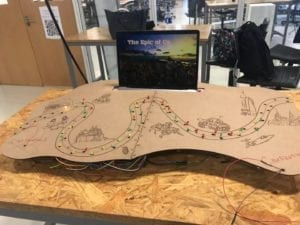
  Since our project is a board game that involves two players to role-play the leader of two civilizations, we want them to try to attack each other for their development of the country. We first thought about using the fsr sensor to create a device to let the user to hit and the force the user put on will determine the damage of the other civilization. To use the fsr sensor, we need to figure out how to store the maximum value that the fsr senses during a certain period of time. But later we find it hard to control the sensor(the same problem we have met during the midterm project). And we also had two buttons for the players to begin the game, so we decide to use the button to do all interactions, the times the button be pressed would decide the damage degree. And to make the game more engaging, we put 48 LEDs on our board which nearly drove us crazy. We first try to use a chip called 74HC595 to control 8 LEDs with 3 pins from the Arduino(since we need 48LEDs and there are not enough pins), but after several days of struggling, it did not work. Though really discouraged, we still want LEDs on our board to show the steps of the players. Finally, we use Arduino Mega which has 54 pins in total to connect LEDs and Adruino. When connecting the LEDs, the Mega did not work for some reason, after asking the fellow, I learned that I should not connect the pin 0 and pin 1 to LEDs since they are used for Mega to talk with the computer. Also, the LEDs are not stable and the wires always fall off so we need to frequently check them and fix them. And about the materials of the board, we first used cupboard but we were not satisfied with it because it was a little bit soft and did not delicate enough. We used wood at last and to make the board larger, we used two wood boards and stuck them together.

FABRICATION AND PRODUCTION:

  We laser cut many pictures on our board to decorate and show the process of the development of human societies. It is a very annoying job to turn all the pictures into the forms that the machine can recognize. I asked the fellow for help and the link here is very useful. But due to the different versions of the illustrator and photoshop, I first had difficulties delete the white color in the pictures. But later I figured it out. During the user testing, because we failed to figure put the use of the HC74595 chip so we did not use LEDs to show the steps of the players, we had to use two real characters and let the users to move the characters by themselves. Then the problems came out that the game board is separate from the computer screen so when users moved their characters they had to turn away to looked the board which caused them to miss some instructions on the screen. So we were determined to add the LEDs and combined the screen and the board together to create a better game. So we later laser cut a bigger board with holes on it to out LEDs. And also during the process of watching the users play the game, we found that the speed of changing the instructions is too high for someone who played the game for the first time so we later make some adjustments to make it more readable. 

CONCLUSIONS:

  According to my definition of interaction before —— a cyclic process that requires at least two objects (both animate and inanimate are accepted) individually has its input-analyze-output, and the whole process should be meaningful. Our project aims to let people be aware of a better way to develop is to collaborate rather than fight with each other. If people fight with each other for the resources they want they will go astray together. Since it is a board game it has a cyclic process and also meaning behind it which aligns with my definition of interaction. When people interact with our project, they did not hesitate to attack each other and they were surprised to see both of two civilizations be destroyed in the end. But later someone said that we did not give the player a clear instruction that they can choose not to attack. We want to let people choose from attack or not to attack, but it turned out that they did not have the intention to choose. That’s the point we need to further think of and improve. Usually, people will not do what you expect them to do and that’s why there is always room for improvement. If we have more time, we will make it clear for people that they have the choice to not to attack other civilizations. From my perspective, I am happy that we conveyed our idea to people. Hope our project has brought fun and deep thoughts. 

The picture for our project:

Final Reflection on “Self Censor” by Kat Van Sligtenhorst

The development of the project involved a lot of back and forth, trying to balance the strong and sometimes abrasive message and the technological aspect, which needed to be simple enough to let the interaction speak for itself. For the survey, I originally had a list of 20 statements, which I edited down to 14 after some users said that the experience stretched on a little long. The goal was for them to be relatively short and simple, both so they could hold users’ attention and so they were answerable by the target demographic, most of whom could be assumed to have a basic working knowledge of the subjects. Within this process, I determined how the monitor should respond to certain answers, and the most effective ways of subtly giving users the sensation that they were being surveilled or that there were “right” or “wrong” responses. I wanted this idea to build over time to create feelings of unease and panic, without ever outright stopping a user from answering as they wished. Although the camera light comes on immediately, most users don’t notice, and the most dramatic reminder of surveillance is when a live video feed is actually flashed onscreen. This made people duck out of view and even want to stop the simulation. This is the danger of self-censorship–that varying methods and degrees of conditioning will push someone to omit, adjust, or change their opinion entirely. In the final step before beginning to code, I sourced images to flash in between statements, some of which were pulled from news coverage, and others that I took myself while in Hong Kong.

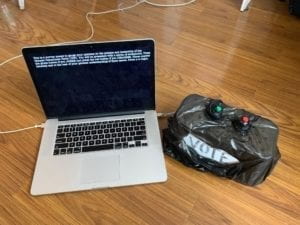
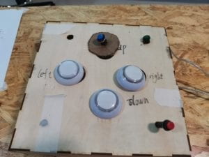
As far as other design choices, I knew early on that I wanted the response mechanism to be relatively simple, something where a user can choose only between a yes button and a no button. This is, first, to mimic casting a vote, although I wrapped the ballot box in trash bags to show that an individual opinion does not particularly matter when the CCP is creating policy. This is also to show the lack of much gray area in China in terms of what is acceptable to discuss. It seems that, more often than not, issues are clearly divided into safe topics and taboo topics, and there is very much a right or wrong stance to take. I originally coded the replies with keyPressed just to get everything working, then moved to the push buttons. I also had to adjust the code so that users could only record one answer for each statement, and added a counter so that the “safe” and “warning” tallies would correspond with the responses. For the processing interface, I used simple, black and white typewriter text as well as red flashes, photos, and live video feed (without really storing data) to, again, reinforce the “safe” or “warning” answers. The other consideration was to use more physical elements to drive the interaction, like placing little protestor or police figurines on pressure sensors in order to express an opinion. Ultimately, I decided that less was more, because I didn’t want to distract from the intensity of the statements and the need to make definitive, perhaps controversial, responses to them.

ILFinal

In the end, my project did align with my definition of interactivity as something that goes through multiple cycles of input and output between audience and product, and ultimately challenges the user in some way. Based on my observations of people using it, the experience was intuitive in its design and impactful in its message. It could be argued that the project is not interactive enough, and that the yes and no push buttons could be changed to something more meaningful or engaging. If I had more time to develop this idea, I would like to make it even more immersive, incorporating sound or light displays to draw attention to the user for “wrong” answers.

The most challenging moment of development was when my computer crashed and I lost the majority of my code. This happened on the Friday morning of user testing, which meant I was unable to get the full experience, although I did have a few people try my rewritten code on Monday and Tuesday. All in all, though, I learned a lot about the nuances of Processing, serial communication, and developing an interactive experience that blends technology and social issues in order to challenge an audience.

As I said in my earlier essay, I think this project is unique in that it addresses a particular group of people, who face all the nuances and challenges of attending the first joint US-Sino university. Our student body is in a position to both observe the affairs of China and to bring international perspectives and standards into our considerations of these issues. We have a distinct ability on our campus to discuss and debate topics that are taboo in wider Chinese society. Therefore, my goal was to take real-world current events and issues that are of huge concern to students in our position and force users to reconsider not only why they believe what they do, but how strong those beliefs really are when they are challenged, explicitly or implicitly. Watching people go through the survey, I believe my project did achieve its goal.

Final Project- Emily Wright

Map(Tweeter)

Purpose of Project

The idea to create this project came from my experience going throughout the American school system. In my school district, there was not a focus on current event in any of the classes, despite the knowledge of current events being an important part of education. Because of this, I wished to introduce a more interactive way to have news presented. My original plan was to take the most current events that I would find on Google, and program processing to display what ever news story I chose. While this would have worked, I wished to have information that was a recent as possible. The project “Moon” by Ai Weiwei and Olafur Eliasson, gave me the inspiration to include the news from regular people around the world, and from this we chose to use Twitter as our new source. This project was targeted more toward children, as it has a very whimsical look to it. It would be best used in a classroom setting where children can actively see where in the world they are receiving news from. This helps create knowledge on current events, and it also helps children further develop geography skills. 

Process of Creation

Coding- 

To integrate the use of Twitter’s information into our project, we used the API that connects Twitter with Processing. We had a difficult time getting this to work. In the beginning, we could not figure out how to get the permission to use the API at all. After this, it was a matter of integrating the components of the project into the API coding. We had to integrate the use of buttons, LEDs, the whistle sound, and code the interface in Processing to look nice. The most interesting part about using the Twitter API was that we would place any keyword we wanted into the code, and it would find the most recent tweet that has to do with that key word. This means that this project could be tweaked in many ways to serve more specific projects. We actually thought about focusing our entire project on climate, but we decided to keep the key word as news in order to generate more tweets. This was the most interactive project that I have made because of the programs ability to search for a keyword and then find the most recent tweet. It aligns perfectly with my definition of interaction, two parties able to receive information, think about it, and then respond. Overall, the coding proved to be the most difficult part of this project, but it reaped very cool result when we figured out how it worked. 

Physical Project- 

We were originally going to create the physical box by laser cutting a box, but the map that we used was far too large to cut a box. From this, we decided to use cardboard, but this meant that our original plan of our project being something that you can step on would not work. This proved to be a better option because the project would last longer through testing and presenting. After adding supports to the bottom, the project was very sturdy. The only thing that was a problem was integrating the buttons and LEDs. A lot of hot glue was necessary.

Fabrication- 

Our original fabrication plan was to print a compass and have it spin with a servo motor. We had the compass printed, but then we came back to find it after we had finished the rest of the project and it was no where to be found. In a mild state of panic, we decided to use the old printed parts from our midterm project to create another compass. While we were disappointed to have lost the original compass, our makeshift did the job. 

User Testing

Our physical project did not change very much from user testing. The buttons for Australia and the world did not work, so we had to fix that. The main change came in the interface that the viewer saw in Processing. We originally had the webcam working, and then the tweet would pop up next to the user’s face. The idea behind this was that we wanted to highlight the inclusivity of Twitter, that everyday people are able to voice their opinions. This was not received as well as we had hoped during user testing. We loved the feedback we received, and it defiantly moved our project to a higher level. We were suggested and decided to change the interface to resemble the physical map, and have the tweets pop up over the continent that the user pressed. This was to give the project more cohesion, and I think it paid off. 

Conclusions

I really enjoyed making this project. The interaction between the user and project was interesting because it took the the familiar idea of Twitter and put it into a new kind of interaction. Our final project received very good feedback, people were interested in continuing to interact with it because of the constant updates of information. My continuation of this project would be to make the physical display more like our original idea of having it be a carpet. I would like to continue to work with the Twitter API; to see what kind of projects can be made with it, and to see other ways we can spread news.