My partner Megan See and I created the interactive project called “Who Are You to Judge?” to teach users about the U.S Criminal Justice System as they play the role of a judge and navigate through various real cases and make decisions and final verdicts on whether or not to convict/punish the defendant.
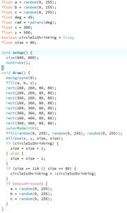
Final Code in Github: https://github.com/ashlelayy/IXLFinalProject/blob/master/WhoAreYouToJudge
Brainstorm & Questions: https://docs.google.com/document/d/1jjoqQw6s-It60DUhyJQ-1kpc4E0fh_xQ_T_JP1SYoU4/edit?usp=sharing
CONCEPTION AND DESIGN:
For this project, we were inspired by The Marshall Project‘s online journalisms about criminal justice, as the website creates stories about incarcerated people and tries to educate people about the on-going issues in hopes of changing the system and inspiring people to go out and vote, to change public policies. We hoped to also create a movement for people to learn more about U.S criminal justice, and to inspire change, especially in light of the upcoming 2020 election.
Initially, my partner and I wanted to create a game centered around who is most likely to become a criminal, to test their judgements. We wanted to create quizzes and a drag-and-drop game to allow users to interact and decide to incarcerate an individual based on a specific task they performed or based on their background description. Another idea we had was to have users decide their own faith through an interactive audiovisual game to punish themselves, as if they were a person who has committed a crime. Also, we were going to have users strapped down to a chair using velcro and a solenoid motor, so if they users make a wrong decision, they would be punished and get lightly ‘buzzed’ or ‘shocked’ on the chair, to simulate the electric chair effect.
However, after talking to our professor, we tossed the ideas and kept the quiz bowl concept. Instead, we made a judging audiovisual game to simulate a judge making a verdict in a court. We used a gavel and striking block to mimic a real court experience, as the users are essentially playing the role of a Judge and making decisions. Users navigate through the game by making verdicts on 9 real cases. For instance, we used some famous U.S court cases such as the Central Park 5, the Troy Davis Case, as well as the Rodney Alcaca case (Dating Game Killer). Our cases range from innocent defendants who received wrongful convictions to serial killer and school shooting cases. Some of the choices users need to make include giving life/death sentences, convicting a defendant, and determining whether or not the defendant is guilty or innocent.
When users select the correct answer (the real verdict), they move on to the next case, and when users select the wrong choice (wrongful conviction), the game stops and the screen displays texts that read “Check your assumptions. Here’s what actually happened…” and the real verdict (explanation of the case) is displayed, to educate users on what actually happened, as well as the implications of the case. This way, while users are interacting with the project, they are stimulated positively through thinking about the cases and how their decisions will affect a person’s life forever.
For the design aspect, we wanted to keep the project minimal and sleek, therefore, we employed black and white colors as the main colors for the project. In addition, we used the “TravellingTypewriter” font to match the typewriter music we have as the background music and plays in accordance with the displaying of text on the screen.
We also only decided to center around U.S laws and cases because my partner Megan and I were both very interested in the U.S criminal justice department in particular, and wanted to create a project centered around how sometimes our preconceived notions can cloud our interpretations of a scenario and case. Given the 10 second countdown, users are forced to quickly make a decision based on given information and what they believe in as the correct decision. We intentionally made the countdown option with 10 seconds to create a nervous feeling for the user, as they are rushed to make a decision that would determine a person’s fate, similar to real life scenarios, where a judge would have to make a final verdict given limited evidence and pressure/time crunch to make a ruling to a case.


FABRICATION AND PRODUCTION:
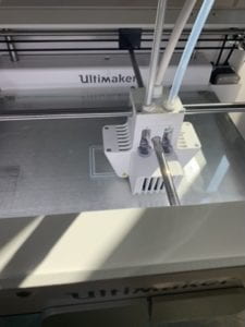
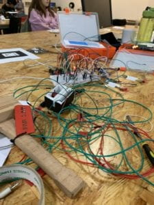
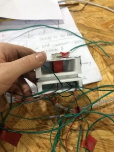
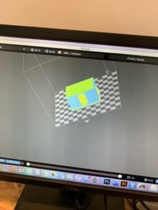
For fabrication, we used a 3D printer to print our interactive countdown timer as well as LED lights to display response from the system (ex. Red lights up with buzzer sound effect when user selects the wrong choice, which also lights up when users run out of time (10seconds)) The timer was used to create a nervous and rushed effect, so when users run out of time, they lose the game.


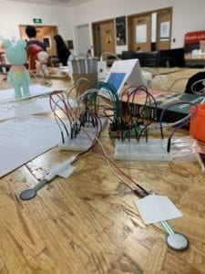
During user testing, we originally had the keyPressed function as a form of interaction, as users navigated through the game, they would press on the left and right arrows. Then, we switched that form of interaction to sensors for more interactivity. Some users also suggested using Chinese laws as part of the cases. However, since my partner and I had limited knowledge of the Chinese criminal justice system, and the fact that we wanted to concentrate on U.S criminology, we ended up not following that suggestion. But, users did suggest adding music when getting answers correct/wrong and we did adopt that recommendation later on.
CONCLUSIONS:
In conclusion, we accomplished our original goals of educating the masses about the U.S criminal justice system. Through interaction with our project, users act as judges and decide on the outcomes of individual cases, as well as the implications one could have over someone else’s life. In addition, we included the actual verdicts of the real cases for users to understand more about how and why a certain decision was made. In terms of interactivity, I think we did meet my expectations and aligns with my definition of interaction, which is input, processing and output. Users communicate with the project through hitting the gavel on the sensor pads to make a verdict after reading a case, while thinking about the right judgement to make. Then, the system processes it and displays output of texts on screen, informing users of different questions and outcomes of cases for them to understand more about the U.S criminal justice system. In terms of inconsistency, I think my project did not align with my definition of interactivity since users can only answer up to 9 questions/cases. I wanted the project to be more interactive, where users can continuously interact with the project in a loop, however, was limited in this project due to time shortage.
Users interacted with our projects with a lot of concentration, as many people took a long time to make a final decision and to judge the case. Sometimes, they would run out of time and would start over again to get the answers correct. Many users also liked the headphone component, so they can really immerse themselves in the game and think about the decisions that they make, since they can only hear music and sounds from the project itself.
If we had more time, we would want to code more scenarios for users to interact with, and add motors to ‘buzz’ users as a form of punishment if they got the answers wrong, in a form of negative reinforcement. In addition, we also want to add more media (ex. pictures , documents, videos) of the actual cases in the explanation for a more concrete and complete explanation of the cases. Also, we would want to make a box to store all the wires, so it would be more visually pleasing and easier to transport.
In terms of accomplishments, I learned a lot of UI/UX in terms of how the users interact with the actual product, and revising the product to produce a more user-friendly and satisfactory output. Moreover, I also learned more about interaction using Arduino and processing, as well as the collaboration between the two. Some values I learned from the project is to think outside the box, since we did have many different project ideas at first, which were scattered and all over the place. I learned about how to take one idea and develop the concept in a more focused and concentrated setting and to bring that ideation to life.
Therefore, I am satisfied with our project, considering how much work and effort we have put in throughout the process, as well as the final feedback from our peers. We hoped that this project allowed more people to understand the impacts of the quick judgements on people, and to never judge a book by its cover. Furthermore, I hoped our project allowed our peers to learn more about the U.S Criminal Justice system, as well as the changes that should be made in the future, to spark activism and for people to go out and vote in the upcoming 2020 election.
Works Cited:
https://blog.oup.com/2016/08/criminal-justice-10-facts/
https://www.naacp.org/criminal-justice-fact-sheet/
https://www.sentencingproject.org/criminal-justice-facts/
https://deathpenaltyinfo.org/policy-issues/innocence/description-of-innocence-cases
https://www.justice.gov/civil/current-and-recent-cases
https://theintercept.com/2019/01/13/misdemeanor-justice-system-alexandra-natapoff/
Inspiration: The Marshall Project https://www.themarshallproject.org/
