Recitation 7 Functions and Arrays

Nov 7

Step 1:

Make a function, similar to the one here, which displays some graphic of your own design.  It should take parameters such as x position, y position, and color to display the graphic in the desired way.  Your graphic should involve at least three different shapes.  Feel free to expand this function as much as you want, and make sure to run your function. 

Step 2: 

Create a for loop in the setup() to display 100 instances of your graphic in a variety of positions and colors.  Make sure to use the display function you created in Step 1.  Then move your for loop to the draw() loop, and note the difference
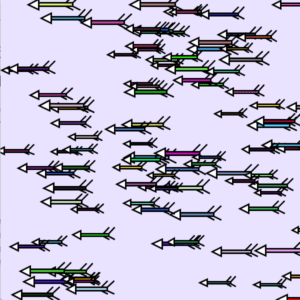
int Arrows = 100;

float posX[] = new float [Arrows];
float posY[] = new float [Arrows];
float size[] = new float [Arrows];
color c[] = new color [Arrows];

void setup(){
  size(600, 600);
  background(233,227,255);
  for (int i=0; i<Arrows; i++) {
    posX[i] = random(width);
    posY[i] = random(height);
    size[i] = random(4, 7);
    c[i] = color(random(255), random(255), random(255));
  }
  
  for(int i=0; i<Arrows; i++){
  shoot(posX[i],posY[i],size[i],c[i]);
  }
  
}

void shoot(float x, float y, float size, color c){
 strokeWeight(3);
 fill(c);
 rect(x,y,size*10,size);
 fill(255);
 triangle(x,y-size,x,y+size*2,x-size*3,y+size*0.5);
 fill(0);
 line(x+size*8,y,x+size*10,y-size*2);
 line(x+size*8,y+size,x+size*10,y+size*2);
 line(x+size*10,y,x+size*12,y-size*2);
 line(x+size*10,y+size,x+size*12,y+size*2);
}

Step 3:

Create three Arrays to store the x, y, and color data.  In setup(), fill the arrays with data using a for loop, then in draw() use them in another for loop to display 100 instances of your graphic (that’s two for loops total).  You can use this example to help you do this.  Make sure to use the display function you created in Step 1, and if you’ve added any other parameters to your display function you should create new arrays for them as well.

int Arrows = 100;

float posX[] = new float [Arrows];
float posY[] = new float [Arrows];
float size[] = new float [Arrows];
color c[] = new color [Arrows];

float speedX[] = new float [Arrows];


void setup(){
  size(600, 600);
  background(233,227,255);
    //speedX[i] = random(-3,0);

}


void draw(){
  background(233,227,255);
   for (int i=0; i<Arrows; i++) {
    posX[i] = random(width);
    posY[i] = random(height);
    size[i] = random(4, 7);
    c[i] = color(random(255), random(255), random(255));
   }
  for(int i=0; i<Arrows; i++){
  shoot(posX[i],posY[i],size[i],c[i]);
  posX[i] = posX[i]+speedX[i];
  }
}

void shoot(float x, float y, float size, color c){
 strokeWeight(3);
 fill(c);
 rect(x,y,size*10,size);
 fill(255);
 triangle(x,y-size,x,y+size*2,x-size*3,y+size*0.5);
 fill(0);
 line(x+size*8,y,x+size*10,y-size*2);
 line(x+size*8,y+size,x+size*10,y+size*2);
 line(x+size*10,y,x+size*12,y-size*2);
 line(x+size*10,y+size,x+size*12,y+size*2);
}

Step 4:

Add individual movement to each instance of your graphic by modifying the content of the x and y arrays.  Make sure that your graphics stay on the canvas (hint: use an if statement).

int Arrows = 100;

float posX[] = new float [Arrows];
float posY[] = new float [Arrows];
float size[] = new float [Arrows];
color c[] = new color [Arrows];

float speedX[] = new float [Arrows];


void setup(){
  size(600, 600);
  background(233,227,255);
    for (int i=0; i<Arrows; i++) {
    posX[i] = random(width);
    posY[i] = random(height);
    size[i] = random(4, 7);
    c[i] = color(random(255), random(255), random(255));
    speedX[i] = random(-3,0);
   }

}


void draw(){
    background(233,227,255);
  for(int i=0; i<Arrows; i++){
  shoot(posX[i],posY[i],size[i],c[i]);
  posX[i] = posX[i]+speedX[i];

  
  if (posX[i]> width || posX[i]<0) {
    speedX[i] = -speedX[i];
    }
  }
}

void shoot(float x, float y, float size, color c){
 strokeWeight(3);
 fill(c);
 rect(x,y,size*10,size);
 fill(255);
 triangle(x,y-size,x,y+size*2,x-size*3,y+size*0.5);
 fill(0);
 line(x+size*8,y,x+size*10,y-size*2);
 line(x+size*8,y+size,x+size*10,y+size*2);
 line(x+size*10,y,x+size*12,y-size*2);
 line(x+size*10,y+size,x+size*12,y+size*2);
}

Question 1:

In your own words, please explain the difference between having your for loop from Step 2 in setup() as opposed to in draw().

When the forloop is in setup(), the array of arrows only draw once which result in a still image. When the forloop is put in draw(), no matter if the background is updated in the drawloop, the arrows’ drawing is nonstoppable. 

Question 2:

What is the benefit of using arrays?  How might you use arrays in a potential project?

When a large amount of the same group of drawings is needed, then using arrays will save a lot of efforts and make the code tidy and clean. Also because all information are stored in the arrays, one only has to change the parameters in the arrays if many changes are wanted. I will use arrays when many images or sounds are needed so that I don’t have to load them to processing one by one. 
Final Project Documentation – Jackson Simon

Auditory ‘Temple Run’ – Jackson Simon – Rodolfo Cossovich

Conception and Design:

I started off just really wanting to create a game, and through conversations with Rudi “Temple Run” came up. I was not about to create a replica of an already made game, but I had this idea that “Temple Run” could be turned into a pure audio game. Audio of a direction played would let the user know where to go, instead of having visual aid. At first, this audio game  was intended to try and potentially help visually impaired people in some way (perhaps helping them know which way they could move in a day to day life, while walking down the street, with the directions being said out loud). However, this was quite presumptuous seeing as I do not know people who have lost, or never had, their eyesight. Therefore, I could not accurately figure out what best way to aid them. The game then turned into an inclusive game, allowing both people who can see, and those who cannot, to be on the same playing field and enjoy themselves. 

Fabrication and Production:

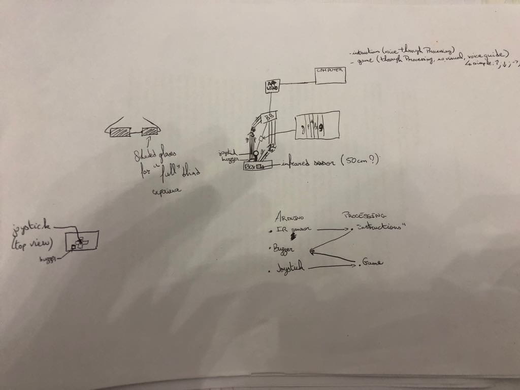
In the beginning (for user testing), I neglected to emphasize the experience of being blind for those who indeed were not. In fact, I started with a joystick as the means of going up, down, left or right. After the feedback I received, it was clear that I needed to switch the way of interacting with the game, and after conversations with Rudi: I decided to use an accelerometer attached to a headset with ‘blinding’ glasses. This allowed for an amplification of the dulling of senses. I realize now that a gyroscope might have been easier, and more successful, in reading the directions (now attached to the way the user moved their head) and in user usability. I believe changing the way the user moves directions, while having their eyesight dulled (for users who are not visually impaired), made it so that a sort of equal ground for playing games was added. Plus, it made it more fun and interactive in a different way then just a simple joystick.

Conclusion:

This game was meant to be able to be played by visually impaired and non-visually impaired people alike. My definition of interaction doesn’t necessarily involve a back and forth: it could be, for example, just reading a book, the words interacting with your brain, however, your brain doesn’t necessarily interact with the book. In the case of my game, there is a back and forth: the sound with the user, the user with the accelerometer (and by extension the game itself). Therefore, my game adheres to my definition but also expands it since there is more than just a singular interaction (which I believe is all that is needed for something to be called an interactive exchange). The audience therefore receives a stimulation, and causes a stimulation themselves. 

If I had more time there is some definite improvement that I could’ve done. For example, improve the ‘blinding’ of non-visually impaired people (even after tweaking the glasses multiple times you could still sort of see through the corner of your eye) and also make sure that the directional readings were as perfect as could be (they worked well, you could definitely get ten points by going in the right direction 10 times, but it still was a little off at times). It has taught me that the experience had by the user for a game is paramount. I got complaints about the uncomfortableness of the headset (which definitely could’ve been made to be nicer), which leads to people not necessarily wanting to where it: which means they wouldn’t play the game! If I were to make another game, similar or not to this project, I would put more focus on the experience (even though I had people that did enjoy it and have fun at the IMA Show) and not just the idea behind the game (even if it is still important).

So what? Why should people care about this project? It definitely did accomplish my goal to a certain extent: a level playing field, no matter if you can see or not. I feel that equalizing the way games are played, while enhancing user experience, is a goal all games should strive for.

Sort your trash; save the world – SalomĂ© – Eric

Sort your trash; save the world 

Salomé Demangeot and Stephanie Anderson,

Eric Parren

CONCEPTION AND DESIGN:

The interaction aspect of our project came along with a lot of brainstorming ideas. In my project proposal, I imagined physical objects to place on sensors such as weight sensors or pressure sensors that would indicate wether the right object was put in the right bin. however that was ruled out since we don’t have weight sensors.

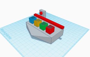
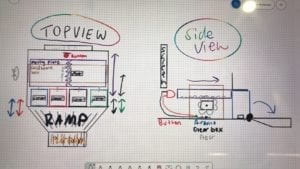
Then we thought of a lay out which would make the design look like a casino coin game such as : 

In such ways you would have the four bins in which the player would insert coins to indicate which bin they want to sort the image of the trash in. The red stick would be used to rotate and tip off the bins if the user sorts an image wrongly, and he would have to play again, if we wins then the stick would rotate backwards and press on the red button behind it which would indicate that the user won. Although we liked the interaction that came with this design, it was quite intricate and still did not solve our issue when it came to which sensor we needed to use.

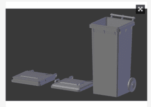
As we brainstormed, we came up with the idea to use light sensors as they are reliable and in our opinion more interesting than buttons to press. Once we had chosen the sensors, it was much easier to come up with the design, to make it understandable we originally wanted to 3D print four trash cans such as this example https://www.thingiverse.com/thing:3377785 

But we figured it would take a lot of the 3D printing materials, so we decided that the lid would be enough and we could design ourselves a clean platform to have the computer on, the lids, and the Arduino inside with the sensors. With the light sensors, we wouldn’t need the physical chips so the design would be very clean and the rest would be done through coding. Additionally for the sensors to detect the light, the users have to open the trash can, which meant they had to get used to the real life motion of opening and closing the bins. This is ideal for our project as we wanted to convey the importance of recycling in China, as I realised when coming up with these project ideas that at school, students struggle to know which bins to put their trash in as it is sometimes confusing. 

FABRICATION AND PRODUCTION:

Our coding strategy was divided as so: the sensors linked to Arduino, and on processing: instruction and cards displayed on the screen, fuse shrinking of one minute linked to a planet earth (to convey the end of the world if you lose the game), a timer displayed on the side, a counter of the player’s points, cross/check images when the player is right or wrong, and videos to show at the end depending on wether you won lost. 

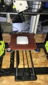
While Stephanie focused on designing the cards and the platform, I 3d printed 4 of the lids of the trashcans shown above, designed the Arduino circuit that we would need and started on the coding. After user testing, the design slightly changed again upon the suggestions of testers.  As I did not have the cards yet, I focused on the one minute fuse with the earth and the countdown which looked like this: 


This is the lid used from https://www.thingiverse.com/thing:3377785

picture from the 3D lab printing the bin lids 

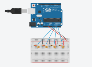
Designed circuit for 4 light sensors to Arduino 

Fuse of 1 minute and earth design video 

Countdown displayed video 

The coding for the game itself was fascinating, in order to have a functioning game we had to create numerous variables, if statements, for loops and booleans. Dividing our code in steps such as making the cards, the fuse of 1 minute, the timer etc really helped to be strategic about it and not messy. There came many challenges, from the creation of many timers (for the fuse, the timer of the game, the millis function taking into consideration the time of the intro, and the inability to add “delays” as it would delay all of our times). Something that we came up with during the coding was that we wanted the card to change to another one, only when the user got the right answer so they would keep going until they won. This was done to further highlight the pedagogic aspects of our project. 

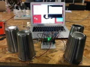
First test after coding for the sensors, the circuit and the cards code. Cups used to bring darkness to the sensors to check the cards were displaying correctly. 

User testing session 

By the time user testing came around, we had most of our project done, the design still needed finishing up pieces and we still needed to code the intro and the end videos so that the game would loop back. The feedbacks were useful for us to realise that we needed handles on the bins to make it easier for the players, perhaps add sound (which we did afterwards whenever the user made the answer correct). Additionally to add information following Tristan’s recommendation, we added “cheat sheets” in the back of the lid so that the users could see during the intro part of our game what goes in each bin. Overall, user testing was useful to polish our entire project and help achieve what I believe is reached its entire potential and more than what I ordinary thought it could be. 

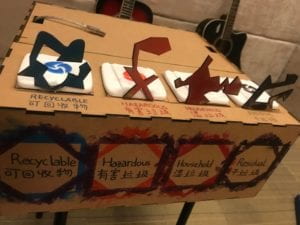
Designing using the official designs for the recycling trash cans as handles and writing the names of the bins in both languages to make it as clear as possible

CONCLUSIONS:

Our project had for goals to be a didactic interactive project where the user learns about recycling through a catchy and slightly competitive game without noticing that they learn. This was achieved through many of our coding and design techniques such making the cards reappear (not in a sequence but enough to make them learn), putting a timer with a goal of reaching 10 cards under one minute… Difficulties came with the fact that our game is for all age and all nationalities so we realised that surprisingly, young national Chinese kids tend to play better than international young-adult population who tried our game. During the IMA show, we saw many people wanting to try again to attempt “saving the earth”, and by seeing some of the cards again we could clearly see that they learned during the game. The interaction using light sensors was very effective as people were quite often surprised, almost amazed at seeing it working during the IMA show and often asked us question about how it worked.

An improvement suggested was to add a leaderboard to the game to make it more competitive but with hindsight I believe it was better done without as the game is meant to be didactic, a challenge with yourself to win, and not with others as it would create incentive to cheat and skip over learning potential.  The fast response of the game, without lagging due to the effectiveness of the sensors was a highlight. Furthermore, my project partner and I really worked well together as we both had similar ambitions, challenged ourselves with the coding and each of our qualities built on the other one’s weaknesses; combined we managed to make a well functioning interactive game. 

Stephanie and I strongly believe that this game could be more useful within the school, for example during orientation week or earth week during the semesters where we could make students play to win a prize a small prize at the end in the lunch-hall. In fact, we were approached during the IMA show by people wanting to further discuss our project and its potential.

Pirate Chase 2.0 – Jackson Pruitt – Rudi

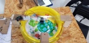
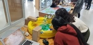
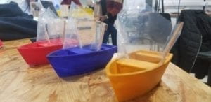
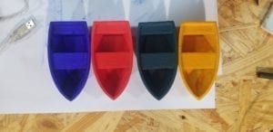
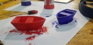
Having developed an adaptation of our midterm assignment, we had the benefit of hindsight when it came to designing our final project. In fact, our main source of motivation to continue developing the Pirate Chase game was to further realize our original concept with a better design. One of the first aspects we knew needed to be changed was that the game needed to be bigger and more dynamic. An initial challenge was finding an adequately sized base for which could fill enough water for the game to function properly while also not becoming too much of an impediment. The decision to use a small inflatable pool only came to mind once we decided that in fact having a circular base would allow for the game to be more dynamic as players would be inclined to move around the entire structure in order to blow the boats towards the sensor. Secondly, we knew that the boats needed to be secure enough so as not to break, fall apart, or immediately sink after several uses. For this, we made sure to leave ample time to 3-D print four boats of the same size, attaching plastic sails afterward. The boats were then painted a different color to distinguish each individual player’s boat. Thirdly, my partner and I decided to add an additional component to the design that would serve to make the game-play more challenging. Keeping in line with the theme of the game, we felt it would be most suitable to design a machine that creates waves for the boats as this would make blowing the boats across the body of water less consistently achievable. Lastly, with the infrared sensor, we felt the component didn’t require much alteration as we felt a light sensor would be less responsive and infrared allowed us to ensure that one user would account for the ending of the game. 

Project design during user testing:

Users interacting with the project during user testing:

Testing out 3-D printed wave-making component:

Painted 3-D printed boats:


I’d say that the most challenging part of the production process came from the Processing portion of our final project. I felt that, although we had a clear idea of how the design should be laid out and a basic understanding of serial communication, there was a steep learning curve required to finalize the coding to ensure the project would work every time. With enough time dedicated, however, we were able to fulfill this component to our satisfaction. Interestingly, during our user testing, we received very little critic in terms of functionality or concept. Most users enjoyed the concept and thought it was well-realized without much explanation. Additionally, there were few reservations with how users interacted with the game. That being said, we found that a lot of users wished the project had more of a pleasing aesthetic to make the game more inviting. Also, many users recommended we simply set up our project differently so that it would be easier for future users to go around the table and to interact with the computer screen without taking attention away from the physical structure. For the final presentation, we made sure to add several design components to make the game look more appealing. Additionally, we arranged the computer monitor to face users while they were playing in front of it. The results proved to be rather effective, especially during our showcase, as users were more intrigued with a better aesthetic design to our project. The shift in the layout also helped users to follow the narrative in which the game is played. 

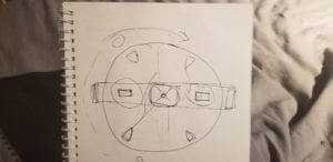
First sketch of project layout and design:

The purpose of this project was to develop a game in which users would challenge one another in order to reach a commonly desired end-goal, which in turn would demonstrate this sort of “tragedy of the commons” scenario seeing how individuals act independently against the common good of others. Through layers of challenges, both physically and to some extent emotionally, users would take part in a conversation with the game is the input/output system was apparent. The idea of having a boat being moved to reach a sensor, highlighting the end of the game, served as the main portrayal of this conversation. Although my definition of interaction being a form of conversation has not necessarily changed, the completion of this project taught me the scope in which interaction finds itself. Even though my intention was to create a series of functions resulting in a form of communication of a human-machine level, the interaction continued throughout the process. Users began communicating with each other, with us, to themselves, all based on one form of interaction. I’ve now understood that interaction is just a one-time event but rather links itself perpetually to a chain of communications that may take place in all different forms. 

I think if given more time and more resources, I would like to make this project bigger. The effectiveness of adding challenging components to the design worked so well at creating tension and furthering this form of interaction that I would really enjoy seeing this project at its largest state. For example, having more than just two users competing for the end-goal and as well as having stationary obstacles that would require users to maneuver through this course. In summary, I think this project has shown me the value of proper communication in the modern environment. With so many people putting others down to achieve seemingly one target or goal, the realization that life’s journey along the way is just as important becomes lost. 

Colla-Draw – Kris – Rudi – Interaction Lab Final

CONCEPTION AND DESIGN:

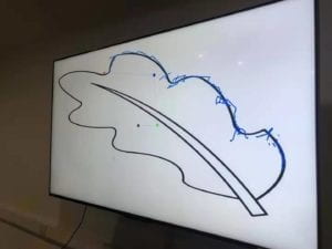
It is a collaborative drawing machine aims at promoting and inspiring collaborative work, cooperation and communication. In real case it could be used as an ice-breaking game; as the cooperative task provided is designed to be both simple (in terms of abstraction: i.e. it does not require players to manage a company together, but simply drawing a picture), but also difficult (in terms of collaboration: without collaboration it is almost impossible to finish the task ) it may also be used by researchers to study how human beings interact with each other in a collaborative work. The device requires 4 players to play with. In front of the m is a large screen with a special pen on it:


Notice the 4 colorful circles in the screen and the lines connecting them. These together are the pen. Three players will have a handy device in their hands, which contains a “spin-able” part. Players spin it to control the rotation of each circle on the pen. The last player has 2 buttons in hand, the red one is to draw (from the tip of the pen which is the red circle) and the black button it to undo the previous stroke:

three most important designs in this project are: the rotation control unit. The handle and the style of the pen. With the development of our project the design of these three kept changing.

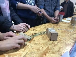
For the spin control unit, the ideal choice is to use a rotatory encoder. We tried it for several days, but then we realized we were facing a fatal problem. (The only time I stayed overnight since college is to solve the problem) with the help of Tristan I almost hacked the microcontroller of Arduino Uno but finally failed (It will be detailed recorded in the next part). The second alternative is quark: to use motor inversely, as we learned at class if we spin a motor it will generate electric signals. But then I realized it needs complex circuits to make the motor able to send out signals in two rotation direction. As the due time is approaching, we have to go back to potential meter. A drawback is that I can only rotate it 360 degrees then got stuck. In observing the players in ima show we find occasionally it slightly affects the performance of the device.

We paid attention to very details of user experience, and the handle is designed very smartly using human engineering. The shape of it fits very well with human hands (see the pic above) and people are happy holding it. We laser cut the boards and put them together. I suggested of using 3D printer before but steve reminded me that there are some small and delicate parts in it and 3D printer is not accurate enough.

As for the style of the pen. We pursue a simplicity in the design of the shape, yet we, again, paid attention to very details of user experience. The color of each circle corresponds to a color tape in the players device. We adjusts the radius of the circle, the size of the circle, the size of the pen stroke many times and ask people to test different versions to hasve best visual effect. The function of the pen is actually inspired by a visualization of Fourier transformation, but I’ll stop talking about math here.

FABRICATION AND PRODUCTION

#A Full Record on Rotatory Encoder#

To me it is the most exciting part. Indeed as Rudi said we should have changed our direction the minute we realized the problem, but my problem is that I could not resist new knowledge (A conflict on pin interrupt?? what’s that?? & I need to control registers in microcontroller to solve it? cool!). Although I failed, that night offers me knowledge and experience that I could hardly get in class, and I’m not regret of that.

This part is also a review for myself about what I learned in that breezeless night.

1.
The problem starts with the library that use the rotatory encoder: it asks as to make an object:

Encoder myencoder

Then call the counting function like:

encoder.counting()

yet weirdly we don’t specify pins here! After Steve tried every pins he finds only when we connect the encoder to pin2 and 3 it works. But we need to connect 3 encoders on the Arduino. Anyway this default use of pins is weird so i checked the source file in cpp.
In the source I found many unfamiliar things: some hexadecimal value assignment to a constant called PCINT, and another called some MASK, a function call “sei()” appears in the middle of nowhere, a function define “ISR()” without any return type… But I do recognize one lines: digitalRead(2) (and 3).

2.

Tristan gives a simple solution. He suggests me to copy paste the file, reset the pins in the digitalRead, then I can have to different objects in my code using different pins. But the IDE raised errors of “redefine variables”, then Tristan reminds me to change all the variables to avoid that. In doing it most of the problem got solved, with only one left: “Error: redefinition of __vector_5()__”.

3.
I scroll the codes up and down without finding and words in the text that looks like a “__vector 5__”. Finally I realized it is a situation I had no experience before, and it might has something to do with all the “sei”s and PCINTs above. Then I google.

after about 1 hour I had some basic ideas about it

#vecter 5 is a variable of Pin Interrupt that governs a range of pins including pin2 and 3.
#A PIN interrupt can be considered as a event listener, when the value on a pin changed, it will trigger the interrupt, which will stop the current calculation in processor and run a new function
# the function is ISR()
#There are three pin interrupts: vector 3 4 5: they are not defined explicitly: the variable PCINT refers to a register with 2 bits that controls the open and close of a pin interrupt; as each interrupt governs a range of pins, MASK is another register that specify a certain pins to listen to.
#sei(); means to start monitoring interrupts

4.

That’s why it specifies pin 2 and 3. Therefore if I could set the code to use a new pin interrupt, say vector 4, I could set new pins and solve the problem. Understanding all the theories in the next several hours, the last thing to do is to study the documentation of the microcontroller on Uno: basically to find which interrupt corresponds to which PCINT and MASK register digit and correspond to which pins.
In fact it worked. I changed the pins and connect it to the encoder, it gives correct output. But when I tried to put two together, there is always one of them not working. I did various experiment and found one thing: as mentioned I copy pasted the codes so I have two of them compiling together, only the encoder connected to the code that is firstly compiled works. It means there are still some hardware resource that are shared by the codes.

Then I found the code refers to another library, a look at it shows it is a timer library uses processor clock pulse, other types of interrupts (there are other types besides pin interrupts) …. Fine.

——————————————————————-

We missed user test because on it, yet we conduct our own user test later. many useful suggestions were offered and I have recorded some of them in the first section. The idea of different color circles is a feedback from the users, also based on feedback I improved the rotation algorithms to make the drawing process more smooth….

CONCLUSIONS:

It is a great success in IMA show. There are always people in front of our table. Strangers came together, had a great time in this collaborative game, and some of them even become friends and exchanged wechats. Among them, one representative from the manufacturer of Arduino is very interested in our project. Hearing our problem in the encoder, he assed steve’s wechat and told us he could help with the problem and provide us with better equipment to remake it. In general the final project does not fail us.

*Interestingly, as a work focusing on collaboration, it is also done collaboratively. Steve and me have been partners since midterm and we worked together extremely well. Here I would like to show my gratitude to Steve.

*At thus end of the semester, I would also like to say thanks to Rudi, for… well for everything in these two semester.