Final Projectļ¼šChicken Little Is Afraid of Sky Falling Down-Hangkai Qian-Rudi

My Project on IMA Show
My Project on IMA Show!

Chicken Little is Afraid of Sky Falling Down-Hangkai Qian-Rudi

CONCEPTION AND DESIGN:

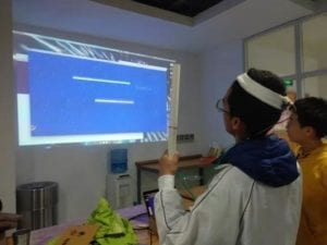
We have played so many games on our computers and phones and it seems normal for people to play games using multi-touch or keyboard and mouse. What I wanted to do is to change the way the players play this game (how the players interact with the game) from click or touch or something to move the whole body to act in order to control the object. The root of the games is the idea 3 in my proposal of getting the fruit on the top of the window. However, I find that If the fruit is only on the top of the window, then the whole gaming process time will be very slow, so I decided to make an infinite game with score system. Moreover, in my proposal, I said it will be two players ā€˜game. However, when I considered further, there are two bad things if itā€™s a two players game: firstly, lots of people who come to IMA show are alone, so that it will not be comfortable to compete with a stranger. Secondly, if I make a two-players game, the device will be extremely big. Also, with the score system, we are in fact already can compete with each other. So, in my final version, the game finally come up with a form of single player game. The gameā€™s concept seems simple: the object flying up try to get rid of the obstacles falling from upward. I used a distance sensor, an accelerometer and a hair band to make this game. I want to make the game easy to playļ¼Œso I chose these sensors. The player needs to wear a hair band with an accelerometer behind his/her head which will detect the angle of inclination and move the chicken Left, right and up and down.

FABRICATION AND PRODUCTION:

My final product is very different from what it is in user test. In my user test, the player cannot move on the y-axis and can only move through x-axis using a distance sensor. There are many feedbacks of my first version of product. Firstly, the height of different people is different, so that I have to adjust the height of the distance sensor to fit different users. Secondly, the velocity of the pillars is the same, so that itā€™s not like falling from up to down. Even more, they want to move on the y-axis and also, they do not know the story of the game. Luckily, Tristan gave me the story of chicken little and it fit very well in this game. So I changed my title from helicopter to ā€œChicken Little is Afraid of Sky Falling Downā€ (much cuter!) The biggest change is that I changed my sensor in the suggestion of Rudi. In fact, the biggest problem I got is that the distance sensor often lose track at some time, which tend to get choppy in the UI. So, I studied an afternoon trying to figure out how to use the 3-axis accelerometer to detect the movement of the user.

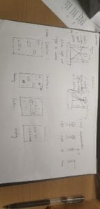
sketch

CONCLUSIONS:

My project’s goal is to create a gaming experience with the player’s body instead of interacting with mouse or keyboard or button. My inspiration comes from a game by Nintendo “RingFit Advanture”. In that game, player  need to move their body to continue the game. The project is align with my definition of interaction: the player receive the gaming animation and move their body in order to move the chicken on the screen, which is a continous loop. Moreover, a good interaction should create joy, and I think I had done it perfectly because all the players loved this game and want to try again when they finished.

Though it is a good interactive experience, there still exists something that need to be improved. Firstly, I used a hair band,which is unfriendly for the users with long hair because the hair band is hard for people with long hair to fit in… I didn’t expect it because both Rudi and me are short hair users… If I have more time I’ll change my design into a pair of glasses and put my sensors there so that it would be more easy for players to play.

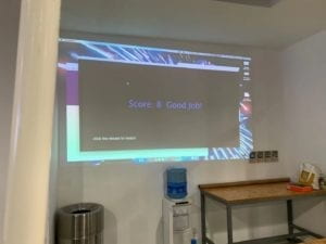
Since I did my project alone, it is very hard for me to go over some difficulties, especially for coding (most of my project is on processing) at that time. But when I kept on working on it and ask fellows for help, I will finally get over those obstacles like class, OOP, boolean, switch,and the logic of checking position(quite hard to figure out! The chicken is moving through jumping, so that I shouldn’t write like if x=h but h-50<x<h+50),etc. I find it very interesting to work with my interactive project though it’s hard. When I finally accomplished my project, I felt true happiness that even bigger than when I play computer game! (Seriously!) And I’m really thrilled to see that my project runs perfectly and gain responses like “interesting!” that’s enough for me. That is my goal of my interactive final project.

ending

ring fit adventure

Haiyan Zhang – Project Proposals

Project Name: Hear Frida Kahlo

Project Statement:

The visual part of his project will be a Frida Kahlo painting or some icons extracted from Frida’s paintings that will equivalently symbolize her ideas as an embodied material of her statements. 

Ideally, this interactive installation needs to be set up in a room. On one of the walls, Frida’s painting will be projected. At the entrance of the room, there might be flowers prepared for visitors so that they can take some and put in front of Kahlo’s painting to demonstrate respect to this person’s legendary yet ordinary life. This is also motivating the users/visitors to feel the sense that they are participating in a ritual, a tribute to someone they might not be familiar with and they are on the way to know this person.

In the room, a nonstopping soundtrack of heartbeats will be played and looping in order to surround the users by strong sounds. While Frida’s paintings/ portraits are projected at the center of the wall, some 3-D printed organs such as (Frida’s)eyes, (Frida’s) heart are presented. In the heart is a distance-detector that senses the audience approach. Once the users are close enough, the painting on the wall will shift to next – in other words, the user’s approach triggers changes. The change represents the change of Frida, different stages in her life. 

I want this installation project to offer a rather immersive experience to the users where they can feel surrounded, familiar and unfamiliar, known and unknown. I hope this can be an introduction as well as a tribute to Frida Kahlo. Like her paintings and life stories that always lure people’s attention and awe, I hope that this immersive experience can lure people’s curiosity and reflection. So the visitors can leave with questions: Who is this person? Why am I introduced to this person today? What is this person’s story? Do I know this person? Do I know her well enough? 

The Epic of Us ā€“ Tya Wang ā€“ Inmi Lee

Concept and Design

Me and my partner started with an idea that we want to call upon peace and lead people to rethink the relationship between countries in the current world given the exponentially developing technology in the recent 50 years or so and the recent international incidents related to military such as the Cuba missile Crisis and more recently, the North Korea nuclear crisis. We donā€™t see a winner in such incidents, and thatā€™s when we agreed upon that we want to make a game that either has two winners or none. We think that combining the traditional dice-rolling board game and digital interactions would be a great idea because computer programs can add more surprises and assistance to the inter-personal communication nature of board games. Specifically, we can throw out different endings during the game, impressing the players by catching them unprepared; we can add more fun with Arduino interaction; and we can use LEDs to indicate each ā€œstepā€ in traditional bard games and let the computer take over the movement of characters to avoid this unrelated process to the experience and message we want to deliver. Letting our users think from a macro-perspective by making each of them player the role of an entire civilization, we wanted to create a kind of ā€œeventā€ that would happen at some ā€œstepsā€ that would lead the users to attack the other but at the same time have a choice of not harming the other. When the previous steps can make our players form a pattern of attacking each other, the last step will be in the same form yet give two different endings depending on whether a user sticks to the same pattern or change their mind.

Fabrication and Production

Realizing the idea took much effort from me and Katherine because this is such a huge project. During the starting stage of our production, we had an incredibly long list of to-dos: fabrication designs, connecting LEDs, serial communication, and the excessively complicated program that we wanted to realize. But an improvement from midterm was that this time we seemed to have more confidence in each other and split the work clearly. In the meantime, we asked each other and people around us of advice every time we achieved something on our own portion of work, making the entire teamwork experience dynamic and communicative. Katherine was in charge of the physical board and I was in charge of programming. She gave me some great advice of adding an instruction page or giving a game tutorial to the users to make sure that there isnā€™t any confusion among our players. And I asked whether we could make the board larger and have the computer integrated onto the board to make the experience more immersive and user-friendly. Another improvement is that even though we went directly to the final version during midterm, we both chose to make a prototype before user test to see whether our ideas are effectively delivered. I made a rough version of the program and Katherine made a board half the size of the one we had in mind. When these were shown in the user test, we saw a lot of problems as well as motivation in peopleā€™s reactions, and these reactions finally lead to a lot of our final improvements. We saw that when people have to move their characters by hand, it takes up too much of their time and distracts them from the information we show on computer. Also, people got confused by the program easily because not only whose turn is not specified on the screen, the time we left for people to read them is very limited. But in the meantime, many fellows and students appreciated our idea, which drove us to always make a better version of the project. For me personally, the largest challenge I got was figuring out how we could let buttons on Arduino to tell processing when to react, and also let processing tell Arduino back how many points a player rolled to blink the LEDs. Because we only learned one-way communication in class, we were so afraid that this might not be achieved because if it doesnā€™t the entire idea of the board would be tedious. Therefore, we spoke to several fellows to ask for help and a senior student at the studio gave us a lot of assistance and inspiration. To be honest, a lot of knowledge we made use of in our project wasnā€™t mention in class, like Katherineā€™s converting a picture into lines in illustration, and P3D environment in my program. But at the end of the day, we both went out and seek help with a clear purpose in mind. The feeling of finding a way to realize what weā€™ve always wanted for our project since its proposal was so wonderful and we thank everyone who helped us during its production.

Reflections

While we are both proud of what weā€™ve achieved at the end of the semester, we have also thought about things we could have done better. For example, a lot of people complained that itā€™s weirdly quiet because we never incorporated music. I also thought that I should have add more animation when we ask our users to press the button really quick to give them feedback when their pressing is successfully recorded by the system. And we definitely could make the endings more visual and graphic to make the message feel more powerful. On the other hand, there are also cheers that I want to give both of us about the design. My favorite part of this project has to be how self-explanatory weā€™ve made it to be. The choice of one button for all interaction was particularly brilliant because it makes the game more fast-pace and easy to play with when the users do not need to switch from sensor to sensor. Even small children at the end-of-semester show can quickly get the rules even though itā€™s been a massive undertaking to explain to the whole class in words during the ideation stage. Weā€™ve also nailed the system of LEDs to let them be a powerful source of telling players where they are in the ā€œdevelopment of civilizationā€.

Conclusion

We said we wanted our users to understand the consequence of unlimited arms race and we want them to rethink international relationship. I think we have delivered the message quite well based on how people react when they saw the ending of the world is doomed. However, we could definitely make it better by giving our users a clearer hint of another choice other than attacking each other to see how they would choose under the same circumstances. But I guess the current approach creates better suspense and brings the feeling of waking up from the traditional mindset for our players. Throughout the semester, Iā€™ve been defining interaction as

ā€œthe process in which two parties involved repeatedly send information through media such as words, sound, image, physical movements, etc, while receiving the other’s information simultaneously. The more types of information are involved, the more interactive this relationship is.ā€

According to the criteria I set for myself, I think our project has successfully met my previous expectation because weā€™ve incorporated light, image, animation, and touching experience into our interactive project.

One interesting fact about our project is that, not a pair, no matter in user test or in class, has achieved the peaceful (good) ending the first time they try out our game. Weā€™ve seen them astonished by the sudden black screen, yelling in regret, and showing an expression of dawning comprehension on seeing the bad ending. Thatā€™s when we know theyā€™ve gotten what we want them to take away from our project. There was one boy who played with his mother and saw the bad ending during the show. He asked her what just happened, and she told him exactly what we want our audience to know. Although our effort seems trivial compared with the scale of international politics, this is the impact we want to make.

Code

https://github.com/brilliantTya/Interaction-Lab-Final.git

Recitation 9: Media Controller by Haiyan Zhang

In this recitation, work individually to create a Processing sketch that controls media (images or video) by manipulating that mediaā€™s attributes using a physical controller made with Arduino. Reflect on this weekā€™s classes to guide you in your coding process, and think about how you can incorporate interactivity and computation into this weekā€™s exercise.

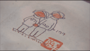
I chose one screenshot image from one of my favorite documentaries called Life is Fruity. (image attached below)

import processing.serial.*;
Serial myPort;
int valueFromArduino;

PImage pimage;

void setup() {
  size(1440, 824);
  background(0);
  pimage = loadImage("pimage.png");
  printArray(Serial.list());
  // this prints out the list of all available serial ports on your computer.

  myPort = new Serial(this, Serial.list()[ 5 ], 9600);
}


void draw() {
  // to read the value from the Arduino
 image(pimage,0,0,width,height);
  while ( myPort.available() > 0) {
    valueFromArduino = myPort.read();
  }
  if (valueFromArduino == 1){
  filter(BLUR,10);
 }
  println(valueFromArduino);//This prints out the values from Arduino
}

[code] int button = 6;

void setup() {
// put your setup code here, to run once:
Serial.begin(9600);
}

void loop() {
// put your main code here, to run repeatedly:
int buttonstate = digitalRead(button) ;
Serial.write(buttonstate);

// too fast communication might cause some latency in Processing
// this delay resolves the issue.
delay(10);
}
[/code]

Above are respectively processing sketch and arduino sketch for this exercise. Basically, I used a button for the physical interaction to trigger the BLUR filter over the original image in processing. The video below shows the effect.

Document your work on your blog. Use this weekā€™s reading, Computer Vision for Artist and Designers, to inspire you to write a reflection about the ways technology was used in your project.

The documentary itself is about two elderly people sharing their life stories in the countryside to the audience who are interested in and eager for encouraging power and wisdom from their life experiences. At the end of the documentary, as an audience, I witnessed death as well as life. Therefore I chose this image in which two of them are holding each other – showing trust and love towards each other. I want to trigger the blurry effect over the image to mimic the sight when someone is in tears, to earn a blurry sense of this life fruit. 

Strike!-Barry Wang-Inmi

Finally, this semester’s journey has come to an end. With the final project done, I am now writing this blog post to record the process of the whole project in the meanwhile try to reflect and synthesize the achievements and flaws to be improved.

Part I. CONCEPTION AND DESIGN

When started thinking about our final project, we have defined that the experience we would like to create should involve body interaction rather than just pressing down keys and buttons. As Joseph and me are both game players, so we decided to bring a game with body interaction controlling. We chose a retro aircraft war game, because its classic and easy to be understood. We thought that it would be more interesting while adding some difficulty if the user can open up their arms and control the aircraft with their body by tilting left and right. Just like the way aircraft banks. Thus, we decided to use accelerometer to detect the motion of the user and mapping them into the game. Besides, we think that such a body interaction game should completely get rid of touching the computer, so that the users don’t have to press the keys or move the mouse while wearing devices with long cables. Thus, we decided to make our game, all the menus and selection controlled by body interaction too. On the material side, since we modelled a retro game, we would also like to recreate and arcade game box to bring some sort of retro feeling. So, we designed the box that fits the test computer, and laser cut it out using wood plank. To be frank, using a projector might be simply a better choice, since the interaction involving body should be displayed on a huge screen. Using a computer gives a feeling of unbalance while the user has to stare at a small screen while standing at a distance from it. We did not think about this point, this is an idea that definitely worth improving. Besides, on the material of wearable devices, there were several choices, like gloves, bands, and even clothes. Finally, we decided to use bands. Just like the way people wear a watch. In one way, a light band does not add any extra unnecessary weight to the device. In another way, using a band can make sure to the largest extent that our sensor gets the correct value. Since most people wear a watch in the same way, that makes it much easier when detecting the motion.

Part II. FABRICATION AND PRODUCTION

In the process, there were a lot of achievements that we had never done before, but also, I have to say that there were simply a lot of difficulties that were completely beyond our imagination. I would like to start with the successes. First of all, is the most basic game elements and aircraft controlling. The basic component of the game includes music effects, images, and game logic. The music effects and images are relatively easy to solve. The game logic, which includes collision detection, grade and level, multi forms of enemies take some time. For the collision detection, we set a radius for each enemy aircraft, adjust them until they are accurate to the best. For the level system, we let the aircraft adjust the bullet images and amounts according to the current score. Though they are not difficult, but they are indeed time-consuming. For the controlling part, we used serial communication between Arduino and Processing. But one problem is that, the accelerometer is actually quite sensitive, causing the aircraft flickering on the screen. Also, using an accelerometer means that there might be a possibility that when user make severe movement, the acceleration value might be too big for the map function. Thus, we define a threshold that, when the value of accelerometer changes minutely, the signal does not send, and while the value change drastically, we let the value change slowly and gradually and finally to the point where the user wants to be. All these mechanisms work invisibly behind the screen, but it takes a lot of time and effort to tuning and choosing different threshold values to make sure the aircraft is stable on the screen so as to create a better user experience. Another important achievement we make is the body-controlled cursor system. It moves the cursor on the screen by moving the arm up and down by the user. This important system makes our ideal, free of keyboard and mouse controlling mode come true. To be specific, the mechanism is that, the user moves the cursor by body, stay on an item for three seconds, boom, the item is selected. The latency, in our case, is three seconds. This is set to make sure the user only gets into the item that he or she wants to get in. To give the users clear information, we have to use an indicator to show that the system is running, don’t worry. We use an empty circle, that completes itself a third every one second to indicate the cursor status. Once the circle completes, the system chooses the item where the cursor stays at. This mechanism is also user friendly to avoid users moving and clicking while dragging long cables. Besides, we have the well-cut case that is done completely by Joseph. I know it is not easy to make those finger connections between boards, especially for a not rectangle box. But he finally did it, making the computer looks a small arcade. Also, I would like to express my gratitude to him here. I believe all of these achievements are what we can be proud of.
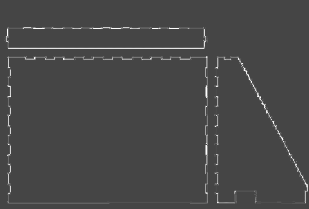
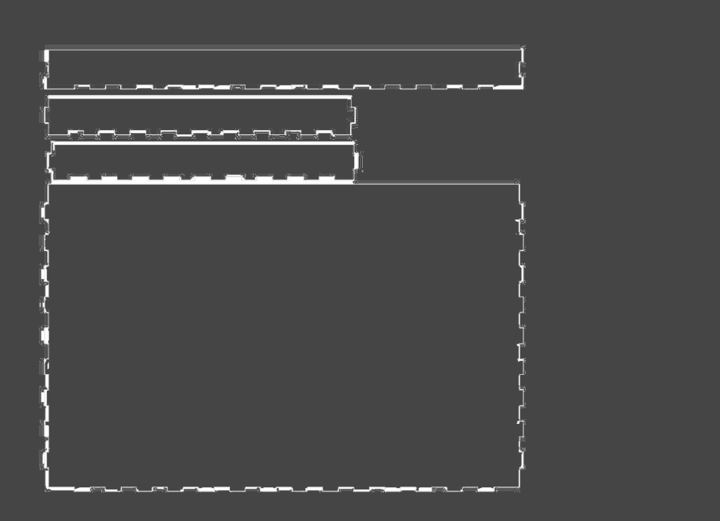
Next comes to the difficulties. The biggest one is the I2C communication. We planned to have a two-player mode, which obviously requires two sensors. However, the two accelerometers have the same physical I2C address. It is basically impossible (or just impossible for my level) to communicate without an I2C shield or a multiplexer on a Arduino with one SDA&SCL pin. We tried different ways but did not get improvements. This is why we were showing up in user test session with only one sensor.

Speaking of user test, the trouble of using one sensor immediately reveals. The users only use one arm to control, which is not the way that we expected it to be. Using one arm does not feel like an aircraft at all. Besides, some indicates the instructions could be clearer and more new playing method can be involved. But still, most of our feedback are positive. A lot of users think it is cool and they like it.

User Test Session Videos

After the user test session, we made according improvements. First, the sensor problem. We finally choose to use two Arduino boards with one sensor on each. And to utilize this sensor, we develop another advanced mode, where user can control the aircraft vertically. Though this mode is extremely difficult which really requires coordination between arms since they are not moving in the same way. At least, with two sensors, the users start to use both arms, which creates that feeling of flying. Besides, we improved our instruction to make it as clear as possible. These improvements are quite effective, since a lot of users, enjoy our game in the IMA show.
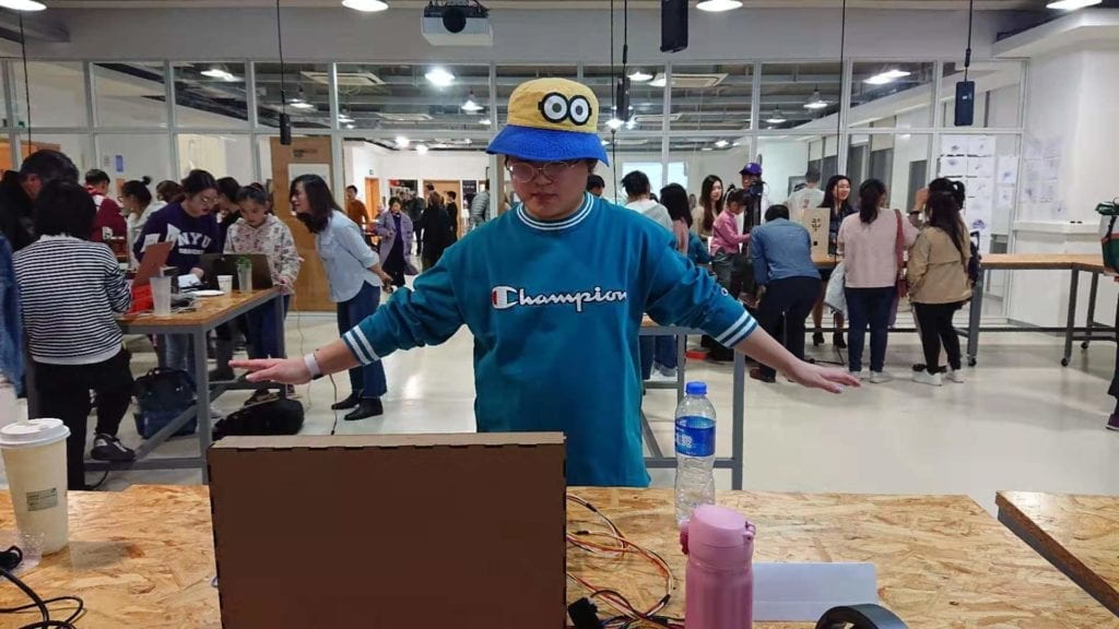
User Playing During IMA Show

Part III. CONCLUSION

Reflecting back to our definition of interaction. We defined it as a highly user-involving, body interaction. I think our project has tried to align with it as much as possible. In order to make the user concentrate and being involved, we used game as the carrier of the interaction. In order to make body interaction, we try to model a motion controlling experience. The users seem to enjoy it. They play with their arms open, trying their best to hit every enemy plane. Some users tried the advance mode, alone or cooperate with friends. It’s difficult, but they play with smile on their face. We have developed a leaderboard, and the users are really competing with each other in the IMA show. A lot of users take pictures or record a video of him/herself enjoying the game. Another user who reached the highest score, (really high score) took a photo of the leaderboard. All these makes us happy. But this is not a perfect project. There are flaws that we need to improve. Using two simple sensors are definitely not the best way, we will try to use Kinect in the future projects if possible. Also, we will try to utilize the code so that the game runs more smoothly. We can also definitely make this game complete rather than playable by now. Moreover, we can definitely create more new elements into this game or adapt the body control concept to another application to create a who new experience. But on this point, I still want to say that, being new does not mean a completely new way of controlling for me. The application of the body control idea on this game is new because not much people tried to do so and not much player enjoyed this new application. It is because of new that a lot of players would enjoy our game. However, the keeping the idea of being new is always good and enlightening point in any interactive developing process. We will persist in this idea and try to do better in the future.

Finally, to wrap the whole thing up, to make a game is to make the gamers enjoy it. That is why we choose to make a game. And it is the ultimate goal that this project wants to bring. This is the significance we are doing this. The most important thing from this project, or even from this class is to always keep trying. A lot of our successes are resulted from some accidental trials. And keep moving, no matter what the failure is.

Thank you, to the best professor Inmi, my partner Joseph, all my classmates, and the people who are reading this page.