Final Project Reflection

FeedBot – Russel Sy – Rudi

As I have said previously, the conception of my ideas were based off of the goal to encourage a new and beneficial idea. In this case, the original goal of my project was to encourage a user to eat healthier. The original plan was to lay out different healthy and unhealthy foods on a table, and the user would but the food into a basket and then a screen would tell the user how good or bad the food is for you, as well as nutritional and health facts. 


After user testing, I listened to the feedback given to me and made adjustments to my final idea. In order to incorporate the physical part of my project with the digital, as well as creating a more cohesive and creative take on eating better, Rudi helped me think of putting a robot head on top of a computer that eats food cards, while the screen displays the robots body. If the robot were to eat a bad food, the robot would malfunction and then the screen would show bad facts about the food. On the other hand, if the robot were to eat good food, the robot would work perfectly and facts about healthy eating would appear. Later on, the idea expanded beyond food and went into life habits as well like smoking. One thing that I did not think about previously, but heard from user testing, was to incorporate sound into my project. Thinking back over it, the final project would not be very interesting at all if there was no sound and auditory feedback when the user interacted with it. I incorporated background music, as well as positive and negative auditory feedback like “yay” or “malfunction” when a good or bad card was placed into the robot mouth.


The conception of this final idea started with a drawing, which then went to 3D designing and finally printing. The thing about the 3D printing process that I would have liked to change is the size of my 3D printed robot head, as well as the amount of inside cross fills. The robot head for the purposes of my project was too big, which made it a little heavy for attaching to the screen of my laptop using a hook. If the laptops screen were to be angled too far back, the screen would bend all the way down due to the weight of the robot head. Other than making the head smaller, another way to solve this problem would be to reduce the filling crosses in order to make the robot head lighter. This would make it so that the screen wouldn’t fall backwards due the the the robot head weight. Other than those problems that I couldn’t fix, I also had to solve problems before the printing process. For the design of the robot head, the outside was quite simple, but the inside was hollow. From experience, 3D printing something that is hollow on the inside can lead to problems and bad printing. In order to solve this, I printed the head in 2 separate parts – the bottom which housed the hole and the mouth opening, and then the top which just acted as a cap for the hole. Since the cap was printed separately from the main part, the plastic did not get the chance to melt and start sagging into the hollow space. I also made the inside of the mouth opening angle downwards so that when a card was inserted into the mouth, it would slide down with ease. One thing I wish I could’ve done after the fabrication process would be to spray paint the whole unit, in order to give it a more final and polished look.


In the IMA showcase, I was able to show my project to strangers who had no previous knowledge of the class. Although I had to prompt them to put the cards into the mouth, they were able to figure out the purpose of the project without any further explanation. After going through all the cards, the users would ask me if they were correct in their thoughts on the purpose. Most thought it was a good way to teach young kinds about good life habits, and that the idea could be expanded upon further using more cards and visuals. In this sense, the goal of my project was met. For my definition of interaction, I think that my project was interactive. The audience was able to participate and even children were able to use my project. Inserting a card into the mouth of the robot was like feeding a little pet or baby, which added to the interactivity. And the audience was able to leave learning something new. A great comment I had received was from a teacher who said this project would be really useful in her classroom since her class was just starting to learn about balanced meals and healthy diets.

If I had more time, I would have liked to create more food cards, as well as improve the design of the cards to make it more obvious as to what the cards represented. I would have also liked to redesign the head to make it less bulky and a lot lighter. As for the visuals, I would have liked to create an animation to complement the “malfunction” animation, since there was no animation for the “yay” part of my project. For the future, I now know that 3D printing is a whole process and the first 3D printed object may not be the best representation of your work. Subsequent versions have to be made after the first in order to improve and evolve with your ideas.

To conclude, I feel like this project can be used to give a different approach to teaching children good life skills and habits, as interactive learning is always better than reading bland and boring texts.

Recitation 8: Serial Communication by Haiyan Zhang

Part One: Etch A Sketch

For this exercise, use Arduino to send two analog values to Processing via serial communication. To do this, build a circuit with two potentiometers and write an Arduino sketch that reads their values and sends them serially. Then write a Processing sketch that draws an ellipse and reads those two analog values from Arduino. This sketch should modify the ellipse’s x and y values based on the input from Arduino. Just like an Etch A Sketch, one potentiometer should control the ellipse’s x-axis movement, and the other should control the ellipse’s y-axis movement. To see how an Etch A Sketch works, you can watch the video here.

Once you have it working with an ellipse, modify the code to use a line instead (like a real Etch A Sketch).  To do this, you will need to keep track of the previous x and y values so that you can draw a line from there to the new x and y positions.

Arduino Sketch

void setup() {
Serial.begin(9600);
}

void loop() {
int sensorValue1 = analogRead(A0);
int sensorValue2 = analogRead(A1);
int mappedvalue1 = map(sensorValue1, 0, 1023, 0, 600);
int mappedvalue2 = map(sensorValue2, 0, 1023, 0, 600);
Serial.print(mappedvalue1);
Serial.print(“,”);
Serial.print(mappedvalue2);
Serial.println();
delay(1);
}

Processing Sketch

import processing.serial.*;
String myString = null;
Serial myPort;
int x;
int y;
int NUM_OF_VALUES = 2;   
int[] sensorValues;      

void setup(){
 
 size(600,600);
 background(210,237,254);
 setupSerial();
}

void draw(){
  updateSerial();
  
  stroke(random(100),random(100),0);
  strokeWeight(3);
  line(x,y,sensorValues[0],sensorValues[1]);
  x = sensorValues[0];
  y = sensorValues[1];
}

void setupSerial() {
  printArray(Serial.list());
  myPort = new Serial(this, Serial.list()[ 5 ], 9600);
  // WARNING!
  // You will definitely get an error here.
  // Change the PORT_INDEX to 0 and try running it again.
  // And then, check the list of the ports,
  // find the port "/dev/cu.usbmodem----" or "/dev/tty.usbmodem----" 
  // and replace PORT_INDEX above with the index number of the port.

  myPort.clear();
  // Throw out the first reading,
  // in case we started reading in the middle of a string from the sender.
  myString = myPort.readStringUntil( 10 );  // 10 = '\n'  Linefeed in ASCII; 10 means linebreak in ASCII code 
  myString = null;

  sensorValues = new int[NUM_OF_VALUES];
}


void updateSerial() {
  while (myPort.available() > 0) {
    myString = myPort.readStringUntil( 10 ); // 10 = '\n'  Linefeed in ASCII
    if (myString != null) {
      String[] serialInArray = split(trim(myString), ",");
      //put them in the array in this way. remember to put a coma between so that the computer understands 
      if (serialInArray.length == NUM_OF_VALUES) {
        for (int i=0; i<serialInArray.length; i++) {
          sensorValues[i] = int(serialInArray[i]);
        }
      }
    }
  }
}

Preparatory Research and Analysis by Haiyan Zhang

 
Part one 

My visit to Choronus Exhibition was a confusing yet adventurous experience, I would put it this way. Compared to other exhibitions of non-technology based artwork, the significance of the technology-based art pieces seemed to be rather ambiguous and indirect at the first encounter. Apart from looking for a literal introduction, I was always wondering “Is this project interactive? Can I touch it? What changes are taking place?” However, my past experience of non-technology based exhibitions were more straightforward. Although most of the time I need to actively think about the non-tech work’s meaning too, these tech-based artwork seems to require more active thinking and a full body interaction sometimes. Therefore, as a visitor, I have to be more active to recieve information or even generate information. Below attached are videos of a couple of projects from the exhibition.

PART TWO

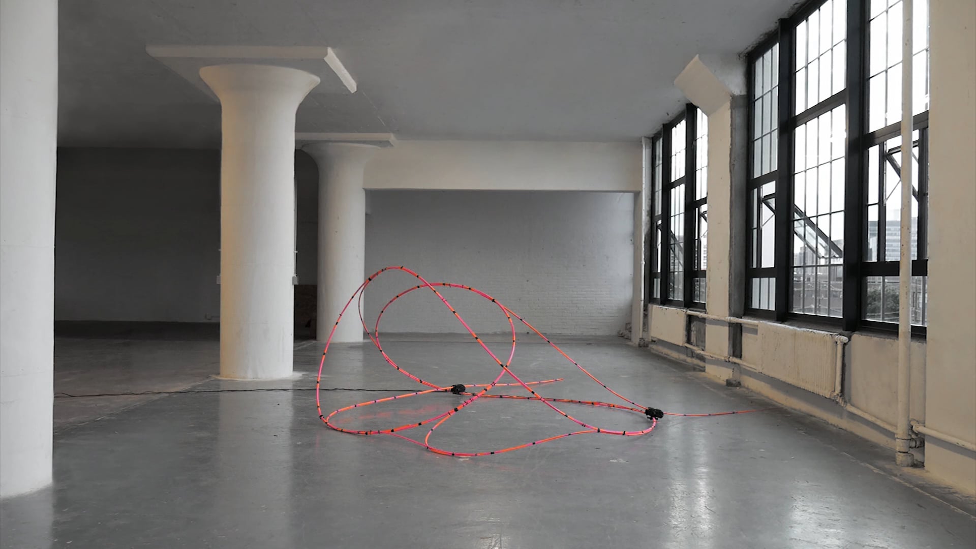
The first interactive project that I researched into is ‘Self-Choreographing Network’(link shown in reference). It is “created by Mathias Maierhofer and Valentina Soana at the Institute for Computational Design and Construction (ICD / University of Stuttgart)”. This is a project “that aims to challenge the prevalent separation between (digital) design and (physical) operation processes of adaptive and interactive architectural systems”.

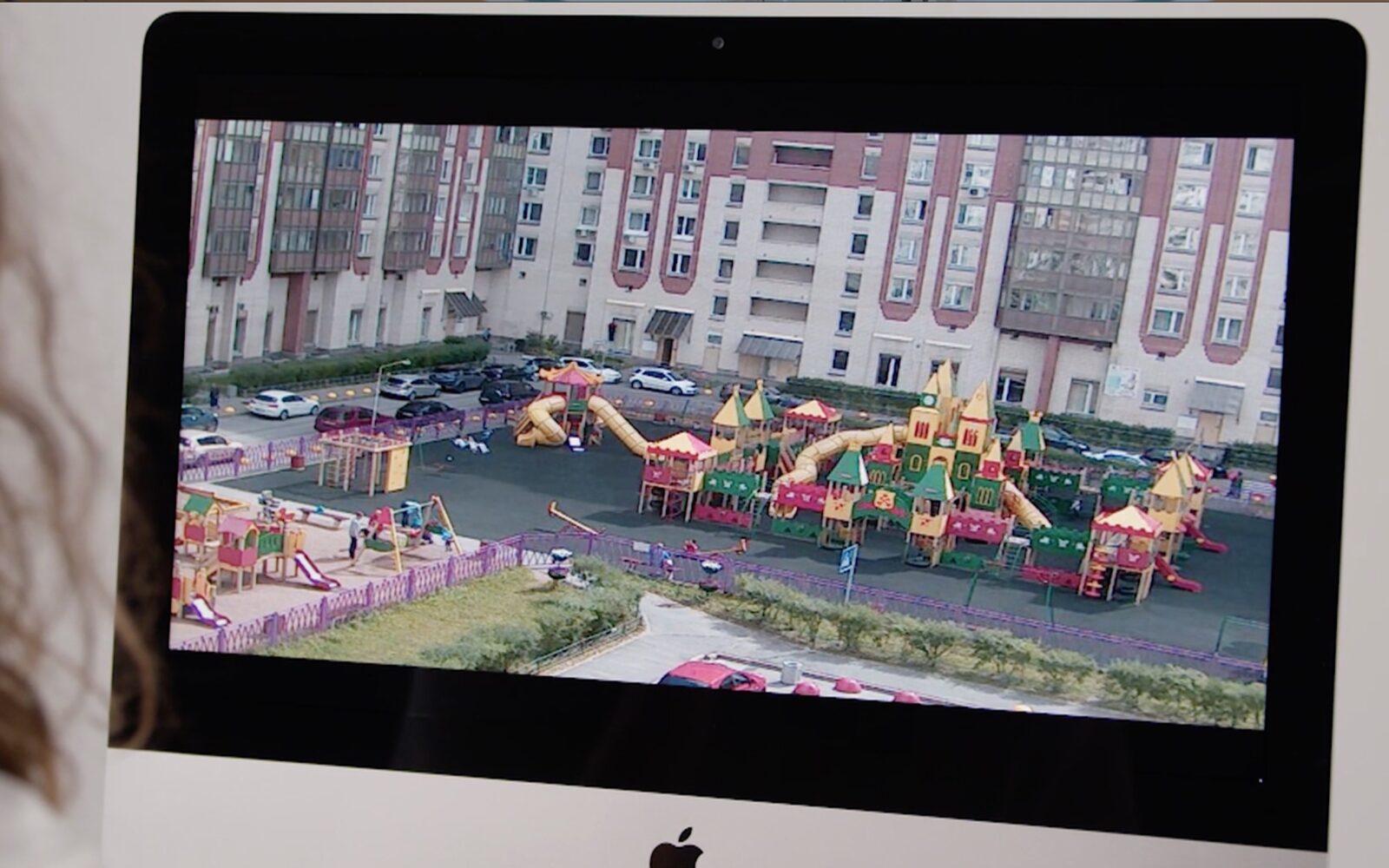
The other project that I looked into is “Ordinary Places” created by Anouk Zibaut.  “The project makes use of surveillance cameras available and completely free of charge on the Insecam.org website. By Anouk’s desire to contemplate the ordinary, she used a selection of cameras to produce an experimental film. Idea here is to be able to edit the video streams she selected live to drive a narrative, themes and images to build a fictional story”. (Link to the full article is shown in the reference.)

Unlike my first research when I decided that an immersive film experience (the Bomb) is less interactive than the other one in which the users interact with the installation by approaching it and seeing changes in its projection of a radio spectrum(Hertzian Landscapes) for by then I had contemplated on interaction as a process that requires more physical movements and the installation will respond in real-time according to those movements. However, this research and my experience in the Chronous Exhibition lead me to think in the other direction. I would say the second project “Ordinary Places” is more interactive to most users rather than the first project “Self-Choreographing Network”. Of course both projects require equal contribution to technical engineering and programming. While the first’s algorithm seems to be more complicated, its concept being a lot about movements, spatial arrangement and human-object interaction in real time, the second seems to be a medium that I, as an ordinary audience who might watch the “Ordinary Places”, am more familiar with. The fact that I am more familiar with the medium triggers more possible and profound interaction in my mind and life after I visited the installation. It is a matter about contemplation and reflection from the user themselves rather than the predetermined interaction in the first project (definitely no offense and I’m going to make a clarification about this statement). 

To me personally, “Self-Choreographing Network” seems to be a complicated interaction. Though it doesn’t require so much pre-knowledge about how the creators made it, the concept itself seems foreign to me. Also, although the movement varies from time to time, the format is quite pre-determined. The variation is of course amazing and deserves my awe. Nonetheless, I wonder how long my curiosity will last and how soon it will be defeated by my confusion. 

However, still, I think this is a question depending on the targeted audience. But for the second project “Ordinary Places”, although receiving information from a film-like format seems to be more passive on the surface. I think the fact that “surveillance in our daily life” is a subject that the targeted audience cares about so much that their curiosity and attention would immediately be drawn towards this installation/ film. It requires active commitment from the audience as long as they are intrigued by the subject and eager to understand. Therefore, it is not a one-way speech spoken towards anyone. Rather it is a mutual conversation happened in silence but in long term. We bring the confusion and inspiration back home and stay aware of the issue in days after that experience. For this point, “Self-Choreographing Network” will definitely do the same to its targeted audience. But for me at this point, “Ordinary Places” is a project that speaks more to me regarding its research subject. And it is more interactive for I will definitely be inspired and contemplate more in my life.

PART THREE

During my group project stage, I defined interaction/interactivity as:

a multi-actor participating process which normally conveys preset ideas and generates new messages in various relationships built by actors. Messages are conveyed through medium and received/ mutually communicated by different senses. 

This definition is substantially supported by reading we’ve done in the first two weeks.  In “What Exactly is Interactivity?”,  Crawford chooses the word “conversation” and accordingly gives a concise definition of “interactivity”: “a cyclic process in which two actors alternately listen, think, and speak”.

However, when executing my mid-term project and watching other colleagues’ presentation of their mid-term projects, one thing that inspired me is: interactivity doesn’t necessarily have to be literally “multi-actor”. Of course, when speaking of “multi-actor”, we tend to include the installation itself. But for human part, one actor can be enough. Moreover, it doesn’t have to ambitiously involve “various relationships built by actors”. Rather, one single format, one relationship is adequate and efficient if the preset ideas are clear and inambiguous to the audience. Also, supported by my reflection over the research projects, I reckon that the level of interactivity also depends on the targeted audience. Are the audience related to and familiar with the research subject or the medium itself? In other words, if the audience are not familiar with the subject, then is the interface clear enough to inform them what to do and what to get? More importantly, interactivity never stops at the sensory levels such as hearing, speaking, smelling, seeing etc. It should ultimately involves thinking/reflecting or intuitively feeling something. 

Based on these contemplation through experience, my improved definition of interaction/ interactivity is: 

An experience that invites the other actor/ actors to activate their multiple senses and gives back real-time reactions. A higher level of interaction, however, will further stimulate an inner experience/ journey of mind contemplation and intuitive reflection rather than all kinds of external movements. 

Reference

Choronus Exhibition

Self-Choreographing Network – Cyber-physical design and interactive bending-active systems

Self-Choreographing Network – Cyber-physical design and interactive bending-active systems

Lieux Ordinaries(Ordinary Places) – Surveillance as a storytelling medium

Lieux Ordinaires (Ordinary Places) – Surveillance as a storytelling medium

Individual Reflection of Group Project 1 by Haiyan Zhang

Individual Reflection of Group Project 1 by Haiyan Zhang

“What exactly is interactivity?” from The Art of Interactive Design, Crawford (pages 1-5)

Final Project Individual Reflection by Amy DeCillis

Line Riders – Amy DeCillis – Marcela 

CONCEPTION AND DESIGN

From the start, I really wanted to stress interactivity via multiple inputs. To do this, I reinvented Line Rider, a one player game I used to watch my brothers play growing up, and made it multiplayer. Another key goal of mine was to include multiple sensors and tools that would force users to move their bodies and coordinate with each other rather than just sitting still looking at a computer screen alone. In order to achieve this goal, I used a motion sensor, a distance sensor, a joystick, and a potentiometer. Some of these made perfect sense in terms of the actual game while others were used purely to make users move their bodies. For instance, the potentiometer and joystick made sense for the users actually drawing the line and moving the rider’s position on the line. The motion sensor and distance sensor were less intuitive for the rider and were included to make people move and for added fun.

 FABRICATION AND PRODUCTION

Because I wanted to emphasize collaboration between users, I designed a single box that held all of the inputs. I could have had separate boxes and increased distance between users, but I wanted the users to be physically close. In order to not make it too crowded for the players who had to physically move around, I put the motion and distance sensors on the end of the box/control panel to give them more room.

During our final presentations, someone suggested that I design the box in a way that connects to the project more, which I agree with. Someone else suggested that I create separate boxes for each input. I disagree not only because I wanted the users to be physically close, but also in discussion with the lab assistants during laser cutting, that would have actually wasted more material than creating a single big box.

One failure I noticed after laser cutting was my design for the labels on the sides. Instead of having them at the top of the box, they were written sideways which was a little inconvenient for users to read. During user testing some of the feedback I got suggested that I should decrease the number of inputs and that not all users have equally important roles. I disagree, however, because without each input, the users are not able to ultimately reach the target and the users must coordinate with each other and collaborate because of the unique roles at the very end.

CONCLUSIONS

I ultimately wanted to recreate a game I played growing up but with multiple players and a high level of interactivity. In this game, users not only had to interact in various ways with the game itself, but also with each other. From the line’s y position, the riders x position/speed, the rider’s size, and the visibility of the rider, there were many ways that the users influenced the game. Additionally, each user had to communicate and collaborate with the other users to reach a goal. In this sense, the interaction was a true conversation that was constantly changing and adapting. 

During user testing, before I had laser cut the final box/control panel, users seemed to genuinely enjoy playing with my project. Unfortunately, during final presentations, users seemed less enthused. I definitely should have added a sound component and designed it so hitting the target was more obvious and there was more of a reward. I also think that different difficulty levels would have made it more appealing to different skill levels. I do think that even if users did not necessarily enjoy playing it the way I had hoped, they still nevertheless had to collaborate with each other and that to me is a success.

There are of course many multiplayer games out there in the world, but Line Rider is part of my childhood. In talking with other Americans my age, it also was a big part of theirs. I am happy that I was able to recreate this game and make it multiplayer because as someone who is the youngest of five children, I think the best times are spent with others. Had my siblings and I had this version of Line Rider when we were younger, maybe our relationship would be even closer. In an age where everyone is on their cellphone and becoming more isolated in many ways, I hope there are more collaborative games that get people moving and talking with each other. 

Our Planet Final Reflection–Vivien Hao–Professor Inmi Lee

Our Planet—Vivien Hao—Professor Inmi Lee

CONCEPTION AND DESIGN:

            We have made some small changes after the user testing. Like what Professor Marcele has suggested, if we put the two boxes of sand on the two sides, it might make participants feel like they are in a competition, which we do not want to see. We want to promote cooperation. In addition, participants had a hard time seeing the screen. So they did not understand what the purpose behind planting a tree is. With all these confusions from the participants in mind, my partner and I decided to move the screen to an eye-level, at which participants can easily see the image of a growing tree. Instead of using sand, we have filled the boxes with dirt because participants would grab the idea of planting a tree well if we use dirt instead of sand. We think that when the participants can see the growing tree in front of then, they would understand why they have to dig dirt and plant the trees. For this project, we were very careful with the choice of materials. Since the message we want to communicate is a global issue, so in this process, we did not want to raise other global issues such as wasteful usages of materials. We want to be as much environmental-friendly as possible. We used reusable boxes to put dirt. We placed the weight sensor on the table without destroying neither the sensor nor the table. We knew that we did not want to destroy anything in this process, if possible. I think because we had this belief since the beginning, so throughout the material selection process, we knew clearly what are the materials that we would not consider due to the unsustainable issue they might have. In the beginning, we had the idea of laser cutting four boxes. And use those four boxes as containers for dirt. But we then rejected this idea because if we did so, we could have wasted so many materials. And certainly enough, a better solution would be to use reusable plastic boxes. By using reusable plastic boxes, we could well communicate our idea of being environmental-friendly.

FABRICATION AND PRODUCTION:

            In the User Testing Session, we have encountered several issues that we did not previously thought might have occurred, such as participants did not know what they were supposed to do, they did not understand the purpose of planting a tree, participants treated the cooperation process as a competition, we did not have enough dirt, etc. After the user testing, we knew clearly that we have to make changes to solve these issues. We added a monitor screen that could display the growing tree. We placed the monitor on the floor so that participants can see the outcomes directly. We have also placed the weight sensor on a table so that it would be more stable than just simply grabbing it by hand. These changes could not have been made if we did not have the User Testing Session. We could not have seen those issues. I think these changes were very effective. In the final presentation, we could see that participants knew what to do. Like I have mentioned earlier, in this project, we wanted to be as much environmental-friendly as possible. So we have tried to only to use reusable materials throughout the process. This resonates with our overall project goal—to make people aware of the global warming issue—and with such a goal in mind, so we wanted to communicate this idea throughout the entire project.

CONCLUSIONS:

            The goal of this project is to raise people’s awareness of the global warming issue that we are currently encountering. Throughout the project, we encourage interactions between the participants and the project. We also encourage cooperation among the participants. Through this cooperation process, interaction occurs. Participants need to cooperate simultaneously in order for the project to give a satisfying outcome. However, I think this part could have been more interactive if we have made the project offer a second response to the participants. For the current project, people could only see one outcome—the earth will explode no matter what. The audience did participate in a way that we wanted them to participate in. They were willing to cooperate with each other throughout the process and understand the final outcome would be the earth will explode no matter what we do. I think if we had more time, we could have enlarged the project by size. We could have added more dirt so that more participants could join the game, and by have enough participants to play this game, the earth will not explode. By doing that, we would not be so pessimistic. I think throughout this project, we have been very pessimistic. And from the feedback we have gathered from the participants, we know that we could have been more optimistic. I have learned that no matter how terrible the situation might be, we have to be optimistic and always have hope. Even though we know that due to our irresponsible actions, the earth is facing serious dangers, we still need to try to put in the effort and save the earth. Throughout the process of building this project, we were very on-schedule. We did not really push things till the last minute. We did not have to pull all-nighters in the lab the night before the deadlines. I think this is one of our most noticeable accomplishments. Through this imperfect project, we really want to make people aware of the fact that our home planet is facing serious dangers due to our irresponsible action. We have to take immediate actions. We have to, and we must care about this planet.