The Truman Show—Tao Wen–Rudi

PROJECT TITLE – YOUR NAME – YOUR INSTRUCTOR’S NAME

The Truman Show—Tao Wen–Rudi


CONCEPTION AND DESIGN:

During the design process, I had to put my users on a clear position. Are they playing the role of Truman, or the director in the movie? Or a role that is a part in the film? The webcam used to look over the whole house is not accessible to Truman, the one trapped in a reality show. And it can definitely not be the director, for the director would never want Truman to escape. Therefore, I decided that the user plays as an outsider who accidentally intrude into the live studio, understand the situation, sympathize with Truman and help him out. This is important in terms of user experience, since it affects my choice of texts shown on screen and interface displays. The other important question is how much should my target user know about the storyline. At the beginning of the movie, Truman is already suspecting the world he is in, and the main plot is about how more weird things happened to him, driving him to make up his mind to escape. For those who have watched the film, the concept manifests itself as soon as the camera is on. However, for those haven’t, how they can learn the story through playing is a big problem. Given limited amount of time, it is hard to walk the user through the complete story. Therefore, I decide that The Truman Show only serves as a subsidiary idea to the main concept of the project. In other words, the project is more of an escape room than a new form of storytelling, an idea I had at the planning stage. In this way, to users that haven’t watched the film, the project is merely is an escape room and is playable. For those who have, ideas from the movie could be hint to the password, which is “LIE”. Also, I hesitated upon the ending effect. When user has done all the right things, should the box open itself, or should I simply play something on the screen? Due to both time restriction and consideration of user experience, I chose the latter. Looking at online escape room games, the ending effect is no more than a short animation showing that the door has opened. For real life escape rooms, it is just the door opens. I came to the conclusion that the biggest reward for user is the fact that they have done the right things, and it does not really matter how fancy the form of the feedback is. Hence, I choose to show some screenshots from the movie at the end of the game.

FABRICATION AND PRODUCTION:

The most significant step is designing the screen display. At first, there was no clear design from which the user can learn how to interact with the computer. As said by my professor “I just click click click and don’t know what’s going on”. Therefore, I followed his advice and designed an interaction board, including six buttons and a progress bar. The buttons don’t need to be clicked in order, so the user can explore their functions at one time. Also, which reaction should the button trigger was also important. During user testing, users were confused with the functions of buttons, for their functions are so different and cannot be told by texts written aside. In users’ expectation, buttons similar in appearance should have similar functions, like lighting up an LED. Therefore,  I redesigned the functions of my buttons, and deliberately make one of them functioning weirdly, so that the user can know there’s hint hidden inside.
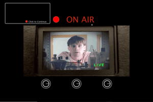
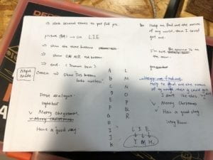
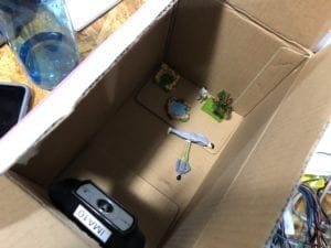
designing the password test the appropritate distance for webcam
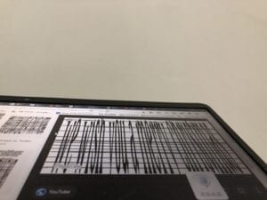
explore how to make best use of the webcam
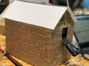
the user-unfriendly webcam handle and hole

CONCLUSIONS:

My project is effective in creating an immersive experience for the user. The opening dialogue brings the user into the setting of the story immediately, creating a sense of mystery. The detailed interior settings of Truman’s world is even more intriguing, for the users’ expectation of what would happen next is raised high. I know this because during presentation, assigned the goal of saving Truman out of the room, users actually enjoy playing the role of a “discoverer” or a saver, exploring the room and thinking deeply to find out the password. Users enjoy controlling the brightness of the LEDs, probably because they like to see how pressing a button can trigger an immediate response. The webcam, in particular, gives them a sense of control and gives a lasting feedback, which makes it the most successful interaction in my project. For, in an  online escape room game, the user can only see what the game-designer give them to see, the angle and range of which is highly restricted. Also, a significant reason for users to like my game is that it has a clear goal. There is a complete and well-known story (The Truman Show) serving as its background, and the mission of finding out a password is given at the very beginning. Users just want to complete the mission and get the rewarding feedback. Once they started the game, few of them would stop without playing it till the ending.

However, there’s one big problem in my project—-the lack of instructions on how users can interact with my project. During presentation, I found that users were all surprised to know that the webcam could be moved around; even if they did, they hesitated to push or pull up the webcam, fearing that it would break my model. Therefore, the design of this part is not user-friendly. There is lack of hint that could let user know “this is something I can touch and move”. Besides, even if I have written a long dialogue before the game starts to let user have a brief idea of what they should do, users are still somewhat confused without my instructions. Hence, the way I would improve my project is to redesign the hole through which the webcam is put, and add a handle to the webcam in order to show it’s part of interaction.

To conclude, my project succeeds to reach its original goal: to create a new form of escape room, combining real life model and online interface. The choice of The Truman Show as its theme not only elevates the meaning of my project, but the story itself can only be presented in this way, making it a perfect fit. Also, the user, learning the story, gets more interested to finish the goal. Although it still needs to be improved to make users clearer of the ways they can get engaged, the project is essentially original, different from other existing forms of escape room, and it also succeeds as merely a game—-the users really enjoyed playing it!
Who’s Ordering your Food – Xueping Wang – Marcela

Project Photo
Project Photo

Codes: Arduino + Processing

We wish our users do not interact with our project simply by clicking some buttons  only but get more involved and think during the process when they are interacting with it. Therefore, we add more sensory experiences during the interaction to get users more focused and interested. Images, videos and sound responses are presented with this aim. We also tried to choose or create images which are bright-colored and kind of animated so that they look more inviting. Movement of images during the third scenario about news both help attract attention and resembles how people encounter news that massive information show up and change all the time. We could have use more words or one simple scenario but we think that might become more responsive instead of interactive and users will lose interest. The  mode that letting users go through three scenarios and make choices before teaching them anything makes results more convincing and provokes thoughts in this process too.

Video of the whole interaction process (shoot in the final show)

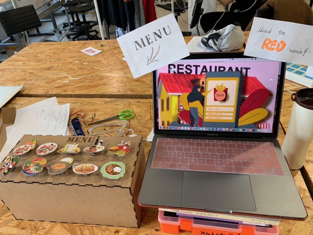
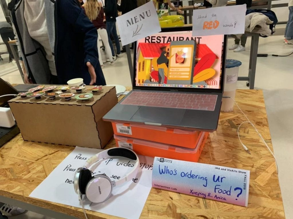
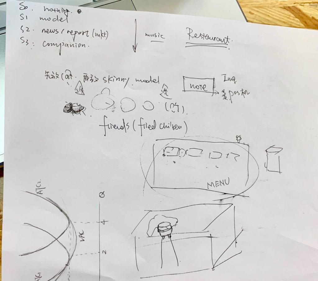
The most important part in our production is creating the three scenarios in processing and creating indications to tell users what they are supposed to do without being too direct. Since we want our users to make their food choice in a social context similar to reality to see how social media might have influenced their food choice so that they learn to be more aware in their later lives, we first let them choose dishes for a meal and then after being primed with video and news/advertisements, they are going to do the choices again. The menu is not made in processing but as fabrication also because we intended to make it look more like a real menu with images of the food combination which we assume can be more interesting and inviting. Nevertheless, since it is now a box-like thing, I personally feel it does not fit our plan and I do agree with some comments that maybe making it look more like a real menu or having other buttons all on this menu helps improving this project.

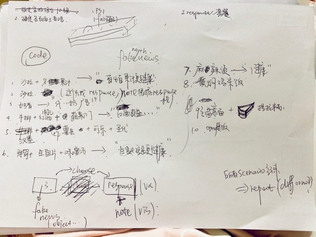
Initial Overall Plan
Detailed Plan of the menu and related news in the third scenario

Our whole research & production process documented in doc

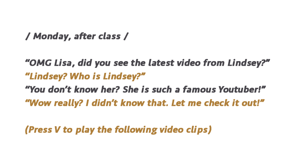
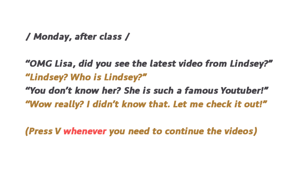
Because we spent too much time coding the third scenario and dealing with all images, videos and audios; we only have our third scenario for user test. We are very glad that most our users get the message we want to convey by this project before we explain anything to them. Their suggestion mainly fall into two categories: one is adding more instructions so they will not feel lost and the other is having a explicit feedback at the end. Although we already planned to do similar things, some detailed comments are really helpful. One advice we followed is to develop on the character Lisa we used originally for the front page only and to create a more conversational guidance so that all three scenarios are connected fluently as a full diet story of Lisa. The videos and “fake” news reports are also embedded into this story so users will not get a wired feeling why they need to do this before choice (since during the user test some users especially male users are impatient and skip everything they thought unnecessary before making their choice which ruins the experience and cannot get the whole idea of the project). 

Conversational Guidance example
example of Conversational Guidance to connect scenarios and the social media

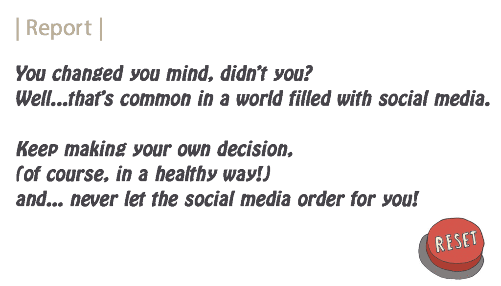
This adaption seems to receive welcomed feedback as now most users report they feel the whole experience makes sense and they are willing to go through this project scenario by scenario. It also resembles how people interact with social media in reality and makes them more aware next time when confronted with these information relating to food choice. We also complete our “report” session and inserts a reset button as response to certain suggestions we get from user test.

Report for those who change choices after primed with social media (with a reset button)
Report for those who change choices after primed with social media

After we fixed all bugs in codes and are almost complete, we invited some of our friends and classmates to test our project again and there are still some confusions about which key they should press to continue and sometimes they get lost where the menu is so we change some of the guidance again with red words hoping users can see the emphasized part at least and put on notes to inform them again. However, as we have seen in the presentation, the effect is limited.

Changed version of instruction
Changed version of instruction emphasizing the need to repeated use of “v”
Final Project with notes emphasizing the place of Menu and the red words
Final Project with notes emphasizing the place of Menu and the red words 

The goals of this project is to call for awareness that our current food choice is so easily influenced by all kinds of social media and information we receive no matter it is in form of live-streaming, Youtube videos, news, scientific reports; or it is in essence for educational purpose, for advertising purpose or purely recommendations. I have friends who are easily influenced by the fashion trends to be fit or by advertising articles about new restaurants or popular snacks so some of them develop eating disorders or have obesity problems. So I wish this project would help arouse awareness and awareness certainly affects decisions. 

Our project overall align with my definition of interaction that it creates a personal experience since it is aimed to be used by a single person and his/her choices combined with the specific response considering those choices creates a unique experience for that user. And they need to take in various information and process different sensory experience into thoughts to make decisions. Something not so align with our definition of interaction is that we only involved buttons as a way to interact with the scenarios which is kind of a very simple physical interaction. We do wish more interesting ways of receiving information could be used such as having something similar to a POS to print out the result which is both interesting and creates the context of a restaurant too but that is hard to put into practice. 

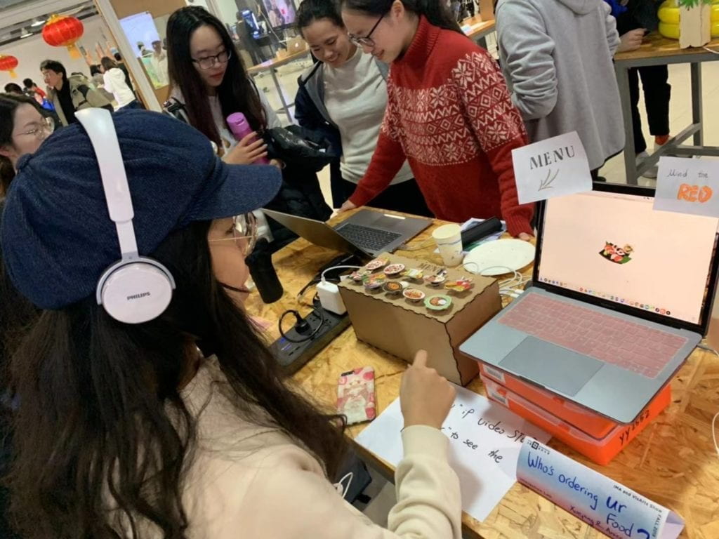
User interact with this project on final show

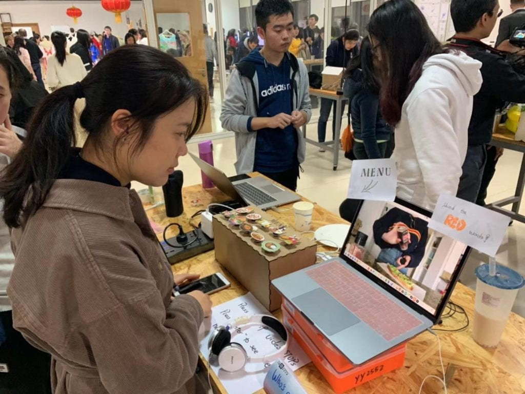
Nevertheless, we are still glad that during most user tests and in the presentation users can go through with the scenarios with interest and after their experience, they all give some feedbacks about their current feelings on the impact of social media. Most of people who change their choices after being primed by videos or news/advertisements report that they never realize social media has such influence on them. And we are also happy to see some people are not influenced by social media. For these users, they are also satisfied to see there are responsive feedback for them. Since our project does not aim at telling users what information are correct and what are not valid but to let them be more aware of all information that might change their choice or behavior in some ways, it is great to see different results but all get the expected reflection on their previous choices. I am also surprised to learn some stories from users who had been impacted by the exact news or advertisement we choose to include here (three users report to have used the SlimFast shake because of its believed effect). And I even get several feedbacks in the final show that suggest me to use this project to have a social research in this area.

If we have more time, first thing we would do is to fix the problem in instruction to be clearer and apparent. We might create some more buttons on the menu so there is no need to ask people to press certain key which is somehow confusing and we will try to make something really look like a menu. Another thing we have wanted to do is to change the third scenario to have two versions. Some people report in the user test that there are too many information and they lose interest in the long “lectures” of news. So we were considering to have two different ways to read the news, one is the detailed version which is the current one and the other is a brief “skim” version which has all the news and big titles moving while the voiceover will be a combined soundtrack with varied voices telling different news or slogans. The “skim” version will try to create the effect of a “explosion of information” to  the user so that even if they are not patient to see the news one by one, they get the idea and some big titles. Also, if I have more time, I wish I could get the IRB approve and use this project as a device to observe and record people’s food choices after being primed with social media and research on this topic.

The most important thing we learn from the previous mentioned failures apart from coding is to think from the user side. Because of the fact that we are the people who have researched a lot in this topic and have a general knowledge what our project is and what is the aim, sometimes the “common knowledge” or “things easy to figure out” in our minds are not common sense at all for users which confuses them and make them feel lost what to do. Also an important thing is to target a specific audience group and keep that in mind while deciding certain interactive ways, the context where the project will be shown or presented is also something needs to be think of in order to create a coercive experience. But having a specific audience group does not mean they will perform or react in similar ways. We have observed how users interact with our project during the user test and be amazed at the different ways they interact. So if we do want everyone to behave in similar ways (e.g. in our project we want everyone at least to go through the three scenarios), there should be a explicit guidance or there should be ways to restrict users’ control over the project (e.g. set timer to restrict users from skipping everything). And differences should be allowed and valued so that there need to be “responses” toward the users’ different choice and decision.

User interact with the project on final show

Another really essential thing to keep in mind as learned from all work done in 826 is that never assume any job/work to be easy and simple. Whenever I assume some part of coding is easy and believe I can finish in minutes there turns out to be bugs… Like I think the second scenario will be the easiest to code because it is purely movie playing and the other interaction is the same as in the first scenario which I can copy. But there turns to be errors which later we find out is due to the fact that mov. does not work properly in Processing. And then more problems pop up such as being shown as an image instead of movie and that  images supposed to stay for a while just flashes.  So every part of the work needs to be carefully dealt with and when you arrange the plan there should be left enough time to accomplish each step.

Our project aims at raising awareness of impact of social media on food choice. Studies have shown that choice of food is essential for both physical health and psychology wellbeing. The blind choice of using some food to lose weight in a short time might lead to Bulimia or other eating disorders as well as depression or anxiety while the inordinate consumption of certain foods causes health issues like obesity or heart-diseases. In recent years, with the development of social media such as live streaming, photos, online short videos or other ways which might be used as ways to popularize some product or fashion; the ideology of regarding “thin” as pretty prevails and the massive information about certain food products and their pros and cons. These things ultimately alter people’s choices either in the way of leading to the expected way or causing opposite results. With our project, users experience themselves how some social media works to influence their choice unconsciously. And this awareness they get after this experience will help them follow their own heart for decisions instead of easily get affected by information around them.

Recitation 7 Documentation – Jackson Simon

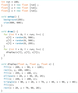
This documentation asked us to create an image made up of different shapes, then to display that image 100 times. After that, to display the 100 times on an infinite loop (using draw() ). The main challenge of this recitation was to use certain functions (i.e. a for loop), and arrays. A for loop allows the user to repeat a certain task as many times as they want until the amount is met (without having to copy paste it the amount of times you want it executed). An array allows you store different values in a same variable, making the randomness (or specific randomness, depending on how you store the values in the Array) much easier.

I started by making a simple square, adding an ellipse and triangle as eyes, and a rectangle as a mouth. Then I executed the code so that it would display it 100 times, and keep display it 100 times on top of the last ones displayed, infinitely (while still staying within the sketch).

My code:

My code in action:

Question 1:

The difference between having the for loop in setup versus draw is relatively simple. When it is in setup() it creates the image 100 times and just displays it as such, when it is in draw() it creates the image 100 times over and over, displaying on top of the previous 100 images (unless background() is put into draw, in which case it will keep printing the 100 images but the previous 100 images will disappear).

Question 2:

The benefit of using arrays resides in the use of the same variable, but with different values. In simpler terms, it means that you can have a variable x (for example for a position), and if this variable is set to an array then you can have multiple x positions depending on your needs. You can specifically make x[1], x[2], x[3]  etc. whatever values you need and call on them when necessary; or make x[i], a large amount of x positions, and have them linked to one random value, which would make each x random.

You could potentially use arrays in serial communication, between Arduino and Processing, to allocate each sensor to a specific sensor[i]: rendering the calling on these sensors (in Processing specifically) easier. That is to say, instead of having to recreate values for each sensor, they get allocated to the specific sensor[i] to allow for the values to be transferable between both programs.

Walking in the Forest-Yiwen Hu- Inmi

CONCEPTION AND DESIGN:

We originally want to create a VR experience where the user can feel like they are physically interacting with the virtual world.  My definition of interaction is a continuous conversation between several actors.  The VR experience will encourage the user to explore their way of interaction with the virtual forest. Since our goal is to encourage the user’s way of interaction with the virtual world, we borrowed multiple sensors, ranging from pressure sensor to distance sensor.  We decide to test all those sensors first before selecting the specific ones to use because from the midterm experience I’ve learned that the functionality of sensors determine to a large part the outcome. So it’s better to ensure that the sensors work (the sensor can clearly identify a pattern so that I can monitor its value to serve my purpose).  In addition, we also think about the context of interaction. For example, we later abandon the sound sensor because it’s hard to think of the context in which human sound can generate effects on the environment.

FABRICATION AND PRODUCTION:

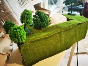
We finally choose distance and color sensor as our main sensors. The idea is that as people with different intentions approach the forest, there will be different effects shown on the screen. We aim to make people aware of the effects of their interaction with the forest. We decide to create 3 kinds of costume, each representing a symbol of human’s intention. For example, the white clothes with plastic attached represent human-induced plastic pollution. We cut down cardboards into several squares and paint them with different colors, like green, red and white. Fortunately the color sensor could differentiate between these colors. The user wearing the suit will be encouraged to approach the forest. During user test section, we were told that the interaction was not obvious and the user will not know that they have to run towards it to trigger the following effects. This is a tricky question for us. We ponder through it for some time. And later professor Inmi told us that the box had better be more relevant to what’s happening on the screen. A thought suddenly hit me: make the box a physical representation of the forest. Since our box also have a hole on top, I think of another way of interaction: instead of they wearing the suit and approach, the user could put elements into the box and see the corresponding elements. This completely changed our way of interaction of running towards the box.Our sensors are now reduced to only the color sensor. 

CONCLUSIONS:

I think our project, though deviating much from our initial plan, realizes the VR effect in some way. Through interaction with the physical forest, they’ll be able to see effects on the screen, which serves as a connection between virtual and real world. However, I think the interaction is not very engaging and a little bit confusing. From the feedback we get to know that the user find the throwing act confusing as they feel like they are compelled to throw and then receive an educational video. It’s not out of their intuition and therefore not engaging.  The ideal version in my mind goes like this: the user is put inside an immersive “forest” that has tangible existence, where they are encouraged to interact with the forest in any way they can imagine. For example, when they step on the grass,  the grass may generate some sounds to inform the user about their existence. Or when they are trying to approach a tree and touch it softly, the tree will slightly vibrate and generate a welcoming sound, but when the user tries to do too much like they are touching the tree in an less respectful and aggressive way the tree would be unhappy. In this way the user will realize that the nature also has their own feelings and are equal beings like us that need to be treated carefully. 

Our physical forest:

Recitation 6 Documentation – Jackson Simon

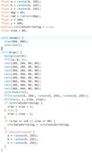
For this recitation, I took the image I had made for Recitation 5 and made some changes. The circle now expands and contracts (staying within the bounds delimited by the squares in the image), and also sporadically changes color. Furthermore, I simply added that when mousePressed() , all the squares change color. I realize this is not much change, however, I wished to further the art aspect of Vera Molnar’s piece of art Untitled (1952).

It was educational to use the boolean function, to make sure the circle never went over the squares. And even though it was easy, to use mousePressed() to change the color was fun. However, I do wish I had been able to figure out how to rotate the shapes (I am still confused on how to translate a specific objects height and width!).

My code:

My code in action: