Final Blog Post by Steve Sun, instructor: Rudi

Interaction Lab Final Project: Collab Drawer

by Steve Sun and Kris Chen

Instructor: Rudi

I would say our project went through a very tough and long way.

The first stage was the concept stage.

From here we went from our first thought which the first blogpost on this project shows, to deciding this idea needs too many advanced technologies which has too much uncertainty that we cannot control, to finally completely abandon this idea and start a new one based on similar inspirations.

Our first idea: everyone carrying a hand gadget and walk around to make contact with other people using it, with a little light spot which is projected on the ground indicating the characters of each player. How this game works is that if you don’t constantly make contact with people, your character will die. This project indicates the importance of human connection. However several components of this project are just too advanced to our level, like how to track and record the information of each player and how to use individual Arduino board and transmit the signals to other devices. These things are just beyond our control so we decided to abandon it.

Modified idea: we still want to highlight human connection, but this time not through making contact but through collaborating and communicating with each other. So we generated an idea of “the collab drawer”. Which basically is several circles which is connected to each other with sticks. Each player will be in charge of the control of the rotation of their small circle. The circle on the end of the whole thing is a pen, where another player can decide if it draws lines or to go back to the former step. This project encourages communication and promotes team collaboration, which fits our initial goal, and the whole thing seemed way easier to achieve using the materials and knowledges we have.
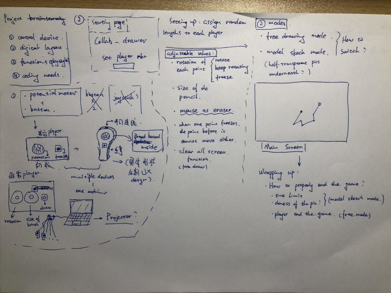
initial design sketch

my initial designing sketch

The next phase I would call it design and functionality.

For our second idea we first decided not to use the potentiometer if possible, which turned to be one of the dumbest decisions that we made. Because what we used instead was a set of rotary encoders whose coding and functions are completely new to us. Anyways, we spent about two whole days trying to figure out how this little thing works, only to discover that the current library we are using does not support multiple inputs, even on multiple Arduino boards, which is completely opposite to out initial thought.

Up to here we actually got almost nothing done before the user testing session. So during that we argued quite aggressively and decided to choose between to alternative thought, one being we use only one encoder but with other inputs like changing the length of the stick or changing the color of the pen etc. The other one is we go back to our initial thought which is using the potentiometer. We agreed on the latter one and began assembling stuff.

We plan to use an algorithm that Kris wrote before to rotate the sticks. It takes one input from the potentiometer and convert it to the angle (in π) and send it to processing. And also there are two buttons that control the draw and “go back one step” function. We also added some simple templates
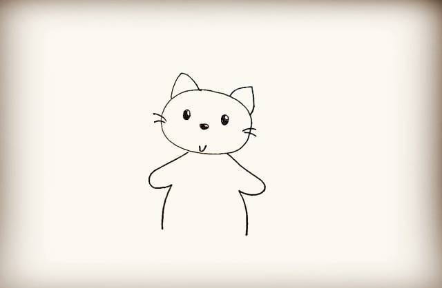

312


(some good works……)

that the users can draw along with, which turned out to be crucial for the goal of our whole game because if we don’t set up certain missions for the users to follow there are a lot less likelyhood for them to collaborate, if any.

We assembled most of the wires and according to the wiring I began designing the fabrication.

The next phase of course is the fabrication.
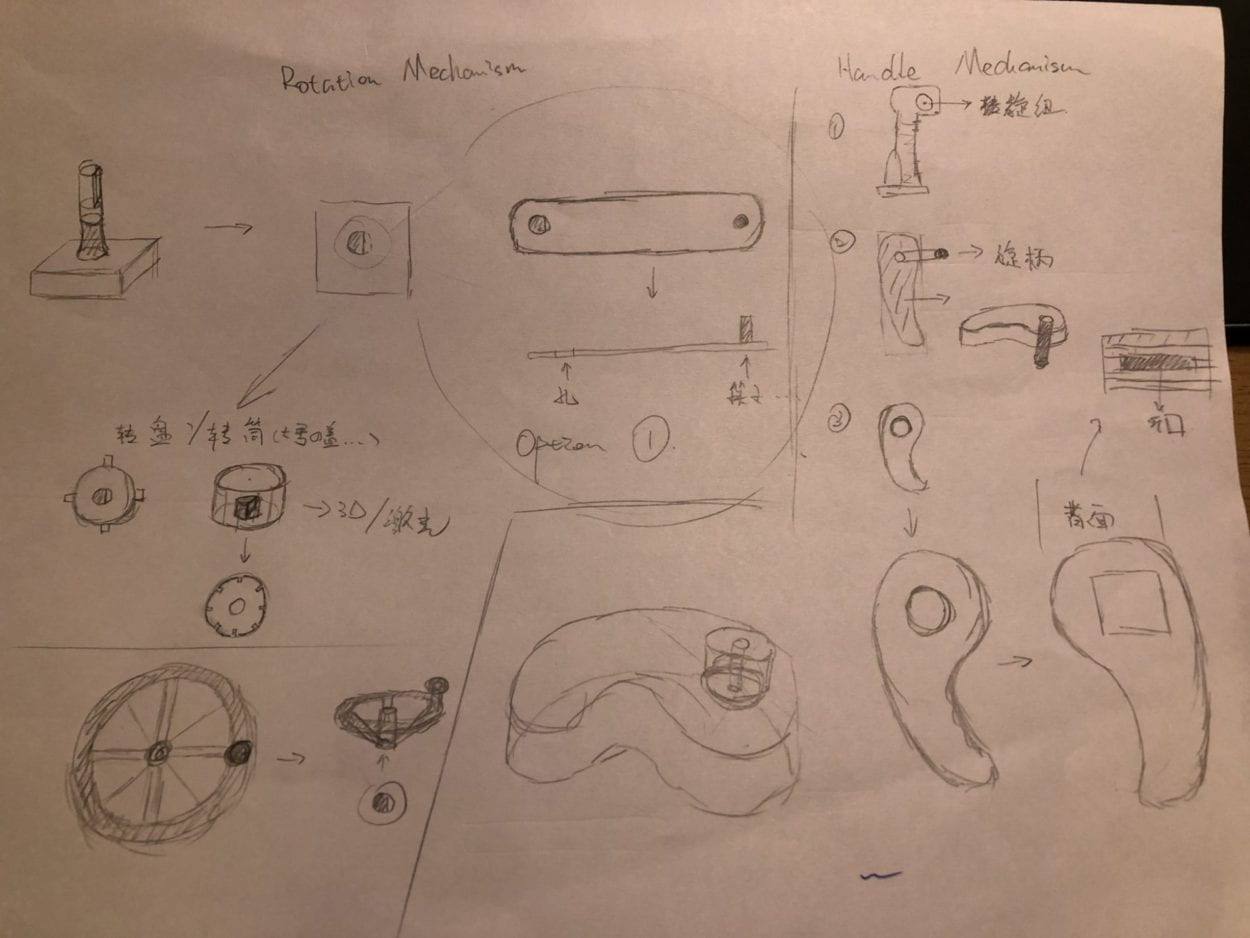
fab

fabrication sketch

At first I thought I could cut out pieces to assemble a “comma-shaped” box with hook face side walls, and put the potentiometers right into the box. But then I figured it would take more time than I excepted so my alternative options is that I made individual little boxes for the potentiometers and put them on “comma-shaped” handles which I laser-cut and made space for the boxes to fit in. I drilled holes for the cables to go through and I cut out the rotary knobs.

For later final adjustment’s sake I gave every box a way to open. And once it’s done, I could seal them with paper tapes. This is mainly time and energy consuming rather than brain and patience consuming……

Also on the handle I drew different shapes that indicates which ball the handle is controlling, but is turned out not as clear as I though it would be, so instead I changed the color of the balls and put tapes of the matching color on each controller. 

The debate on whether it is necessary to add more functions.

For this project I felt like we were always struggling between better UX/functionalities and less work.

For example, the using potentiometer or rotary encoders. The advantage of the latter is that the user could keep rotating without having to stop because of the device has a limit of rotating. Which indeed turned out to be a problem that our current version of the project have.

Also, I always had this idea that if the users could change the radius, drawing straight lines would be so much easier. But after several round of user testing it seems that it is not really necessary if out goal was not to draw a perfect picture at the first place. But nevertheless I’m still curious to see how things would turn out if I added this function.

One thing Ezster pointed out was if we could add the function of changing the color. We thought that although it could bring more to the idea of drawing, it still seems a little redundant of a function. Again, the idea is not to draw a perfect picture but is how people interact and communicate during the process. However, we do have an idea how to incorporate the changing color function which I will expand on in the future development section.

About achieving our goal (aka. Significance)

So this project is all about collaboration. From our inspections in the reaction of multiple user-testers and the users in the IMA show, the groups with people who has the patience to slowdown and talk with their teammates usually do better in the game. Also the teams that played the game seemed more close with each other which is a good sign. (That’s when I figured out that this could be a good ice-breaking game) And that’s exactly what we are looking for in this game. So in terms of how we achieved our goal I think we did a pretty good job.

Mistakes, things that we could become mistakes otherwise, and (possibly) further developments

There are still some obvious mistakes in our project. First, the handle. In the show I found that no one is using the handle the way I wanted them to

(look at their hands……)

… so that is a big mistake in designing the thing. (I didn’t feel that way before because the handle looks quite straightforward to use to me…… but during the show even with my instructions most people still just put it on the table……). Similarly is the shape I drew on the handle indicating the ball one person is controlling. (another thing I thought would be clear enough but no……). Also the fabrication on the two buttons seemed to be just a little rushy…… I could have printed or cut a box for the two buttons to fit.

Things that we would regret otherwise: 1. Not going with our first version of the project…… 2. Switching back to potentiometer fast enough. 3. Using only three controllers (otherwise if I used more, like five, the whole thing will just become too much on the screen and people would just be not as collaborative as this version, I could imagine that……) I’m actually glad that we only did 3……

Further improvements: 1. Better fabrication (but like you can improve your fabrication indefinitely so that’s not really a good point……) 2. Add more functions like changing colors or changing the length of the stick (might get confusing but I would still like to see) or like the thickness of the brush and all the stuff we might see on a drawing software (we literally wanted to reuse the color censor to pick the color from the real world for the brush…… I thought it would be really cool on another project) 3. Better inputs! The potentiometers are just about enough to finish the job and with a crappy UX, so if we could get some kind of input with more precise rotation recording and can rotate without limit. Maybe not the encoders this time……
The Truman Show—Tao Wen–Rudi

PROJECT TITLE – YOUR NAME – YOUR INSTRUCTOR’S NAME

The Truman Show—Tao Wen–Rudi


CONCEPTION AND DESIGN:

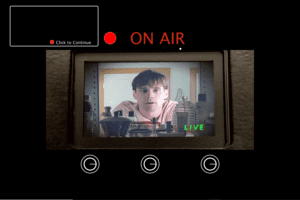
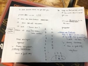
During the design process, I had to put my users on a clear position. Are they playing the role of Truman, or the director in the movie? Or a role that is a part in the film? The webcam used to look over the whole house is not accessible to Truman, the one trapped in a reality show. And it can definitely not be the director, for the director would never want Truman to escape. Therefore, I decided that the user plays as an outsider who accidentally intrude into the live studio, understand the situation, sympathize with Truman and help him out. This is important in terms of user experience, since it affects my choice of texts shown on screen and interface displays. The other important question is how much should my target user know about the storyline. At the beginning of the movie, Truman is already suspecting the world he is in, and the main plot is about how more weird things happened to him, driving him to make up his mind to escape. For those who have watched the film, the concept manifests itself as soon as the camera is on. However, for those haven’t, how they can learn the story through playing is a big problem. Given limited amount of time, it is hard to walk the user through the complete story. Therefore, I decide that The Truman Show only serves as a subsidiary idea to the main concept of the project. In other words, the project is more of an escape room than a new form of storytelling, an idea I had at the planning stage. In this way, to users that haven’t watched the film, the project is merely is an escape room and is playable. For those who have, ideas from the movie could be hint to the password, which is “LIE”. Also, I hesitated upon the ending effect. When user has done all the right things, should the box open itself, or should I simply play something on the screen? Due to both time restriction and consideration of user experience, I chose the latter. Looking at online escape room games, the ending effect is no more than a short animation showing that the door has opened. For real life escape rooms, it is just the door opens. I came to the conclusion that the biggest reward for user is the fact that they have done the right things, and it does not really matter how fancy the form of the feedback is. Hence, I choose to show some screenshots from the movie at the end of the game.

FABRICATION AND PRODUCTION:

The most significant step is designing the screen display. At first, there was no clear design from which the user can learn how to interact with the computer. As said by my professor “I just click click click and don’t know what’s going on”. Therefore, I followed his advice and designed an interaction board, including six buttons and a progress bar. The buttons don’t need to be clicked in order, so the user can explore their functions at one time. Also, which reaction should the button trigger was also important. During user testing, users were confused with the functions of buttons, for their functions are so different and cannot be told by texts written aside. In users’ expectation, buttons similar in appearance should have similar functions, like lighting up an LED. Therefore,  I redesigned the functions of my buttons, and deliberately make one of them functioning weirdly, so that the user can know there’s hint hidden inside.

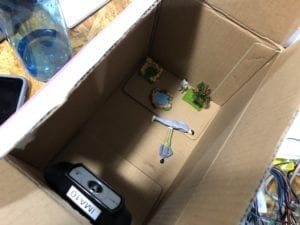
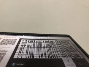
designing the password test the appropritate distance for webcam

explore how to make best use of the webcam

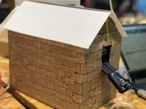
the user-unfriendly webcam handle and hole

CONCLUSIONS:

My project is effective in creating an immersive experience for the user. The opening dialogue brings the user into the setting of the story immediately, creating a sense of mystery. The detailed interior settings of Truman’s world is even more intriguing, for the users’ expectation of what would happen next is raised high. I know this because during presentation, assigned the goal of saving Truman out of the room, users actually enjoy playing the role of a “discoverer” or a saver, exploring the room and thinking deeply to find out the password. Users enjoy controlling the brightness of the LEDs, probably because they like to see how pressing a button can trigger an immediate response. The webcam, in particular, gives them a sense of control and gives a lasting feedback, which makes it the most successful interaction in my project. For, in an  online escape room game, the user can only see what the game-designer give them to see, the angle and range of which is highly restricted. Also, a significant reason for users to like my game is that it has a clear goal. There is a complete and well-known story (The Truman Show) serving as its background, and the mission of finding out a password is given at the very beginning. Users just want to complete the mission and get the rewarding feedback. Once they started the game, few of them would stop without playing it till the ending.

However, there’s one big problem in my project—-the lack of instructions on how users can interact with my project. During presentation, I found that users were all surprised to know that the webcam could be moved around; even if they did, they hesitated to push or pull up the webcam, fearing that it would break my model. Therefore, the design of this part is not user-friendly. There is lack of hint that could let user know “this is something I can touch and move”. Besides, even if I have written a long dialogue before the game starts to let user have a brief idea of what they should do, users are still somewhat confused without my instructions. Hence, the way I would improve my project is to redesign the hole through which the webcam is put, and add a handle to the webcam in order to show it’s part of interaction.

To conclude, my project succeeds to reach its original goal: to create a new form of escape room, combining real life model and online interface. The choice of The Truman Show as its theme not only elevates the meaning of my project, but the story itself can only be presented in this way, making it a perfect fit. Also, the user, learning the story, gets more interested to finish the goal. Although it still needs to be improved to make users clearer of the ways they can get engaged, the project is essentially original, different from other existing forms of escape room, and it also succeeds as merely a game—-the users really enjoyed playing it!

Recitation 7 Documentation – Jackson Simon

This documentation asked us to create an image made up of different shapes, then to display that image 100 times. After that, to display the 100 times on an infinite loop (using draw() ). The main challenge of this recitation was to use certain functions (i.e. a for loop), and arrays. A for loop allows the user to repeat a certain task as many times as they want until the amount is met (without having to copy paste it the amount of times you want it executed). An array allows you store different values in a same variable, making the randomness (or specific randomness, depending on how you store the values in the Array) much easier.

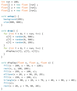
I started by making a simple square, adding an ellipse and triangle as eyes, and a rectangle as a mouth. Then I executed the code so that it would display it 100 times, and keep display it 100 times on top of the last ones displayed, infinitely (while still staying within the sketch).

My code:

My code in action:

Question 1:

The difference between having the for loop in setup versus draw is relatively simple. When it is in setup() it creates the image 100 times and just displays it as such, when it is in draw() it creates the image 100 times over and over, displaying on top of the previous 100 images (unless background() is put into draw, in which case it will keep printing the 100 images but the previous 100 images will disappear).

Question 2:

The benefit of using arrays resides in the use of the same variable, but with different values. In simpler terms, it means that you can have a variable x (for example for a position), and if this variable is set to an array then you can have multiple x positions depending on your needs. You can specifically make x[1], x[2], x[3]  etc. whatever values you need and call on them when necessary; or make x[i], a large amount of x positions, and have them linked to one random value, which would make each x random.

You could potentially use arrays in serial communication, between Arduino and Processing, to allocate each sensor to a specific sensor[i]: rendering the calling on these sensors (in Processing specifically) easier. That is to say, instead of having to recreate values for each sensor, they get allocated to the specific sensor[i] to allow for the values to be transferable between both programs.

Recitation 6 Documentation – Jackson Simon

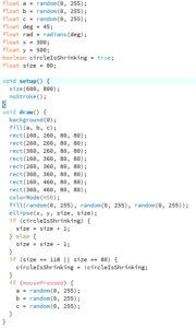
For this recitation, I took the image I had made for Recitation 5 and made some changes. The circle now expands and contracts (staying within the bounds delimited by the squares in the image), and also sporadically changes color. Furthermore, I simply added that when mousePressed() , all the squares change color. I realize this is not much change, however, I wished to further the art aspect of Vera Molnar’s piece of art Untitled (1952).

It was educational to use the boolean function, to make sure the circle never went over the squares. And even though it was easy, to use mousePressed() to change the color was fun. However, I do wish I had been able to figure out how to rotate the shapes (I am still confused on how to translate a specific objects height and width!).

My code:

My code in action:

Recitation 10: Object-Oriented Programming Workshop – Ashley Zhu

For recitation, I chose to work on the object-oriented programming workshop with Tristan to learn more about this topic as well as animation. Tristan went over some fundamentals about classes, arrayLists, and objects. I learned how to use the animation function with classes and arrayList, so it’s good to practice and use the map function for more interactivity. I manipulated the map function so every time user click on the left arrow, the balls would appear and when clicked on a different key after pressing the left arrow, the balls will disappear.

Video:

CODE:

Ball ashleyBall;
Ball tristanBall;

float x;
ArrayList<Ball> ballList = new ArrayList<Ball>(); 

void setup(){
  size(1600,900);
  ballList = new ArrayList<Ball>(); 
  
  for(int i=0; i<100; i++){
  ballList.add(new Ball(random(-10,10), random(-10,10),color(random (255))));
  x=map(x,0,1023,0,width);
  }
    
}
void draw(){
  background(137,207,240);
  if (key == CODED) {
    if (keyCode == LEFT) {
     for(int i=0; i<ballList.size(); i++){
    Ball temp = ballList.get(i);
    temp.display();
    temp.move();
    } 
    
  }
  }
}

class Ball{
  float x,y;
  color c;
  float spdX, spdY;
  float r;
  Ball(float newSpdX, float newSpdY, color newColor){
    r=50;
    spdX= newSpdX;
    spdY= newSpdY;
    c=newColor;
    
    x=width/2;
    y=height/2;
    
  }
  void move(){
    x= x + spdX;
    y= y + spdY;
    
  }
  void display(){
    fill(c);
    ellipse(x,y,r,r);
  }
  
}